Design concepts · Cleaning
Concept: Window and solar cleaning, Chula Vista
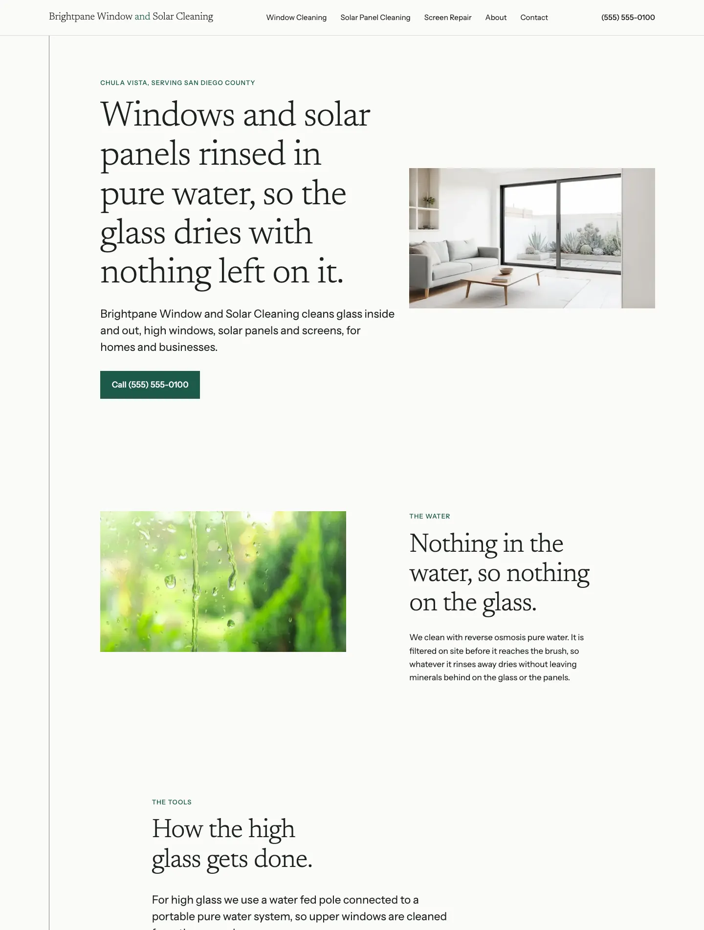
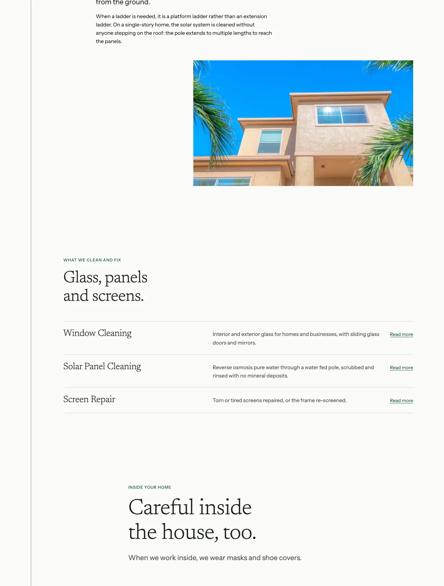
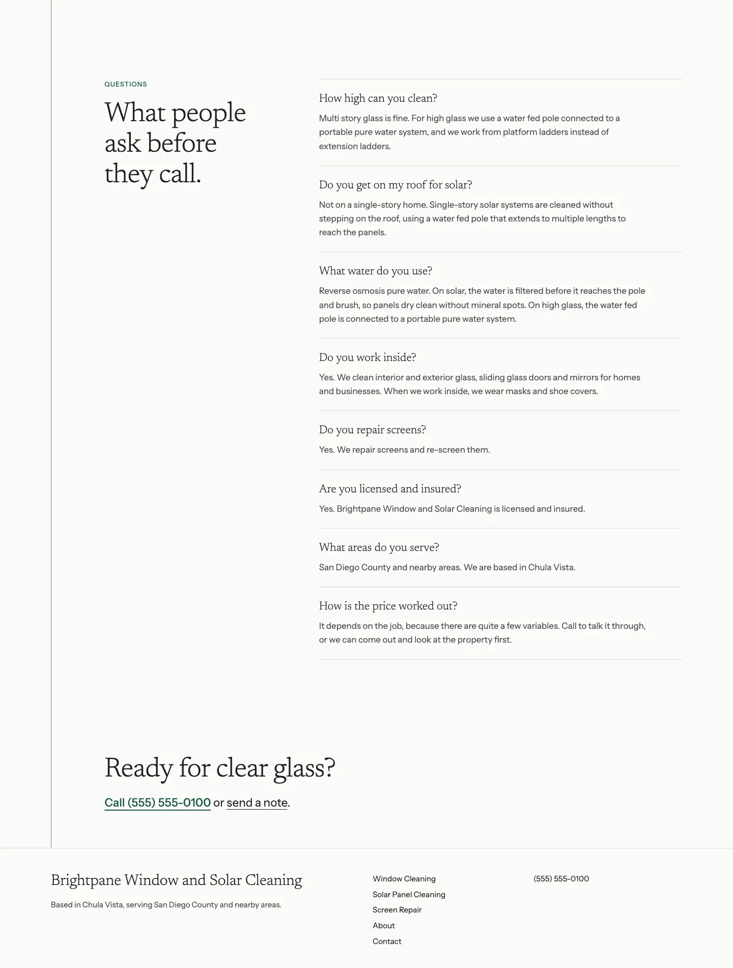
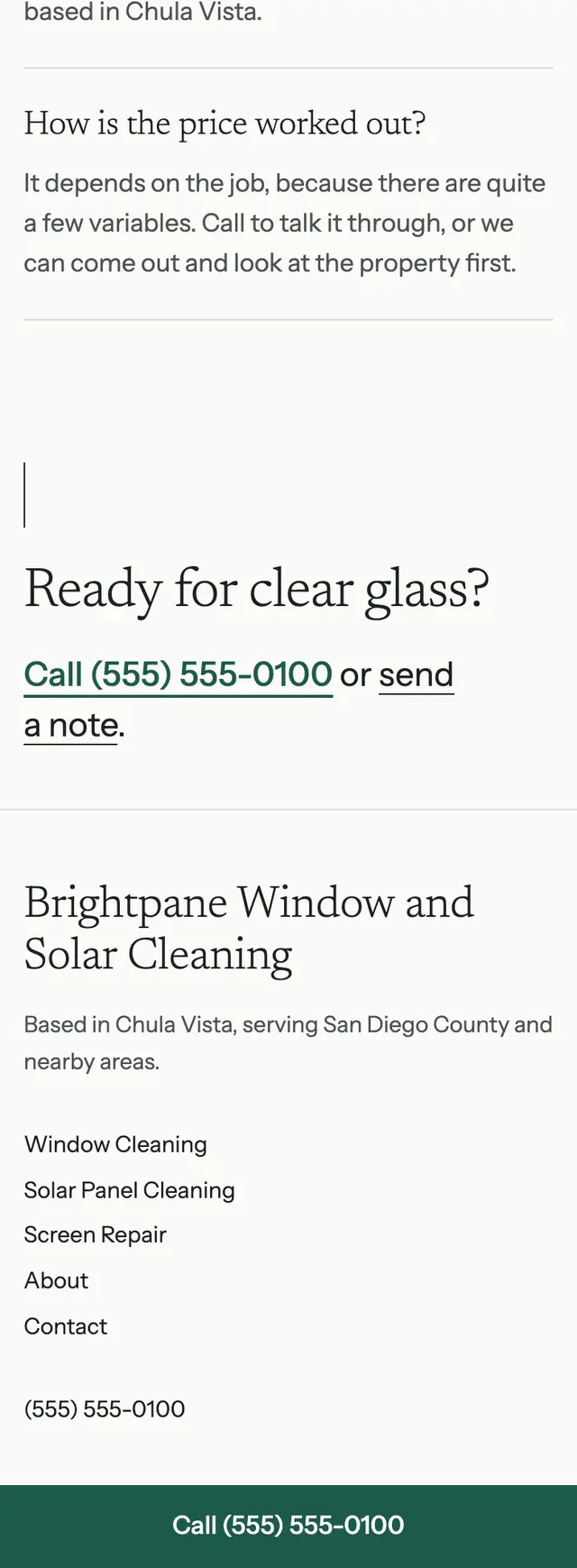
A window cleaning site that is as clear as clean glass: paper white ground, light serif type, nothing boxed or shadowed, and one fine vertical rule running down the page like a water fed pole.
A design concept, not a client site. The name and every detail of the business it was drawn for have been replaced.
The design decisions
- Newsreader Light sets the display type and Instrument Sans the body, so headlines read like thin lettering on clear glass.
- The palette is paper white, soft near black ink and hairline grey, with a single deep glass green for the wordmark's middle word, eyebrows, links and the call button, and no gradients.
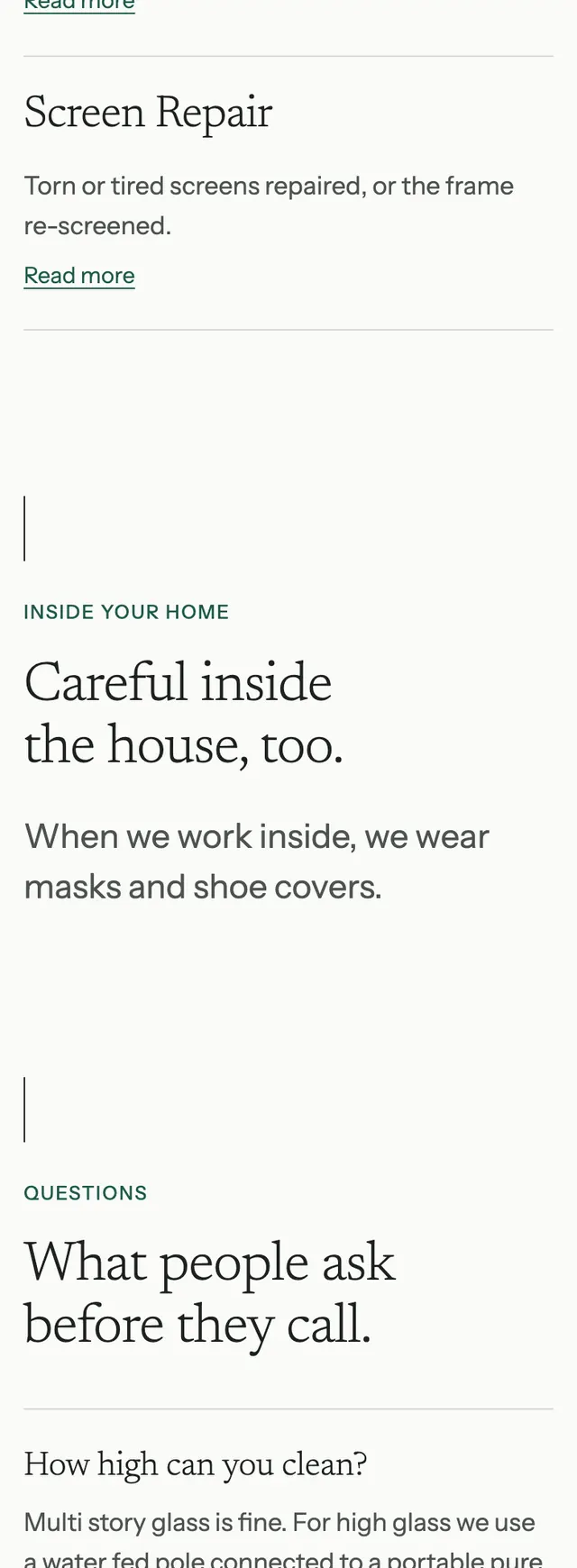
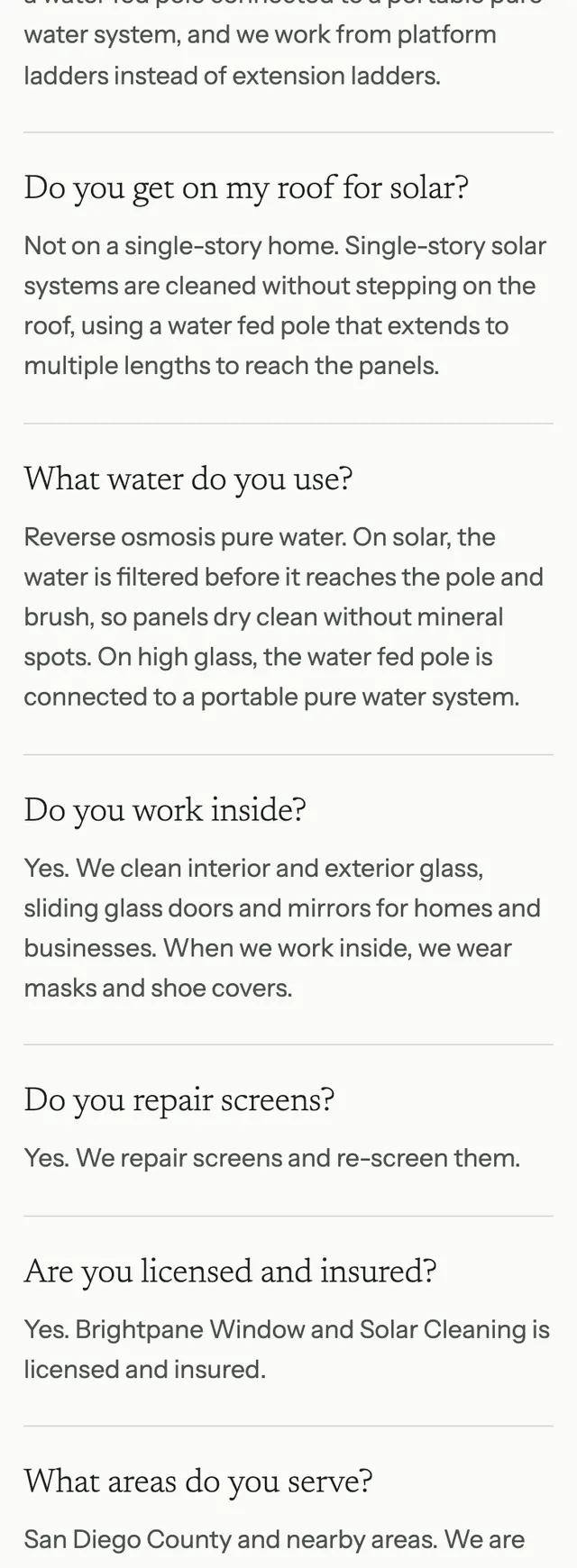
- The layout is asymmetric on a twelve column grid: the hero sets text left and photo right, the next section flips it, the tools section indents, and services run as full width hairline rows rather than cards.
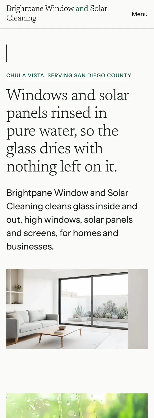
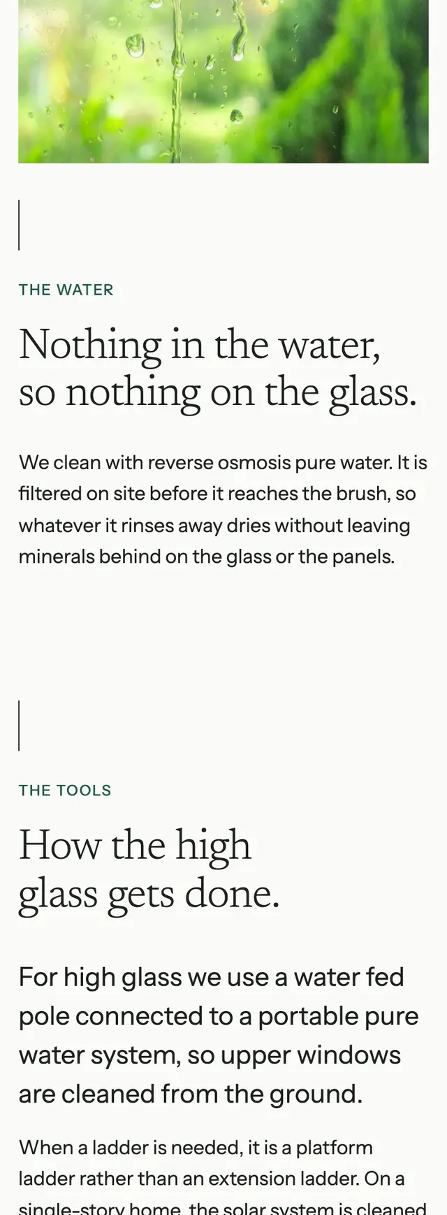
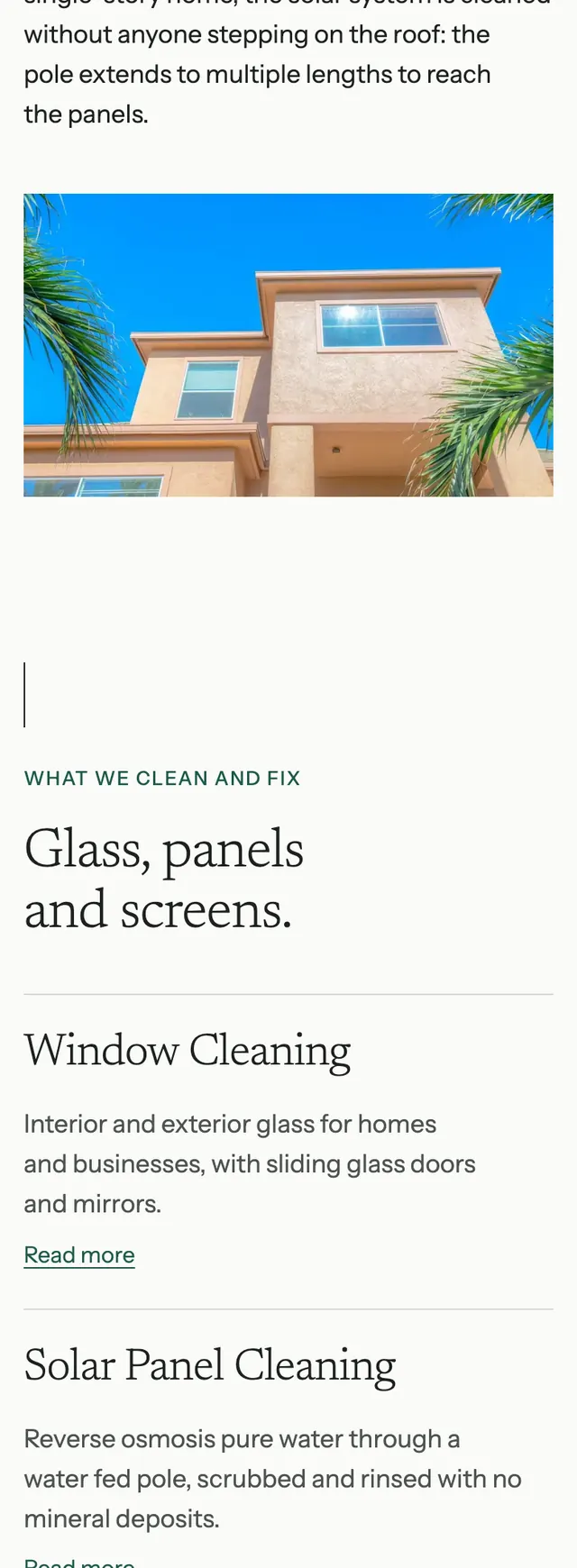
- No text sits on any photograph, and on phones the vertical rule becomes a short rule at the head of each section while the phone pins to the bottom of the screen as a full width green bar.
Desktop and mobile