Design concepts · Landscaping
Concept: Turf and concrete, San Diego
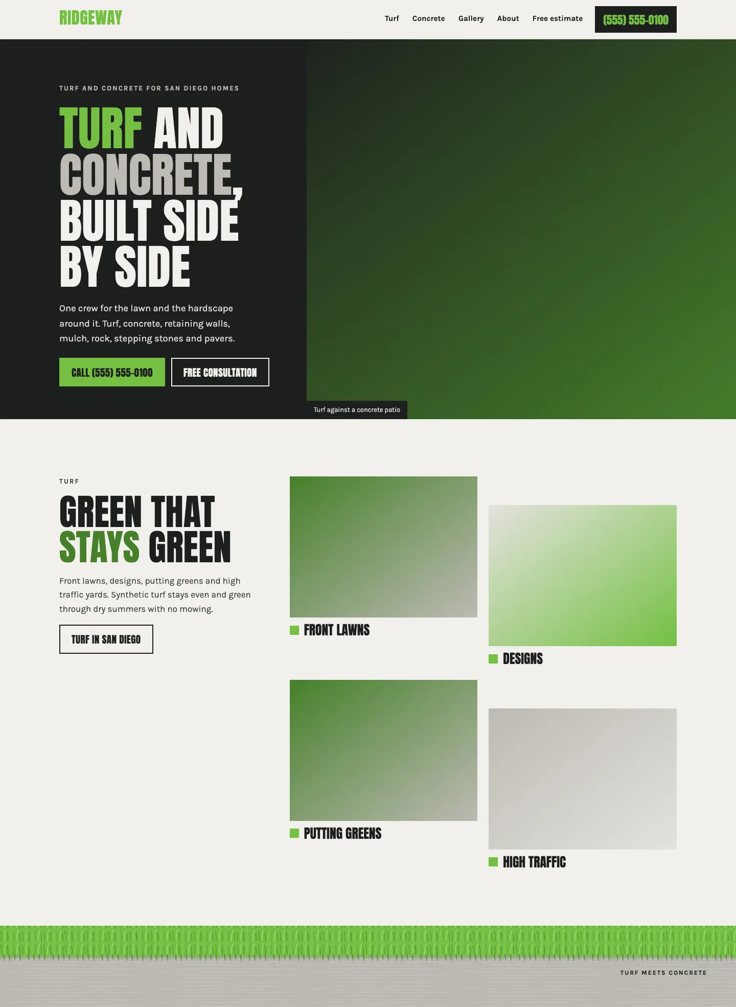
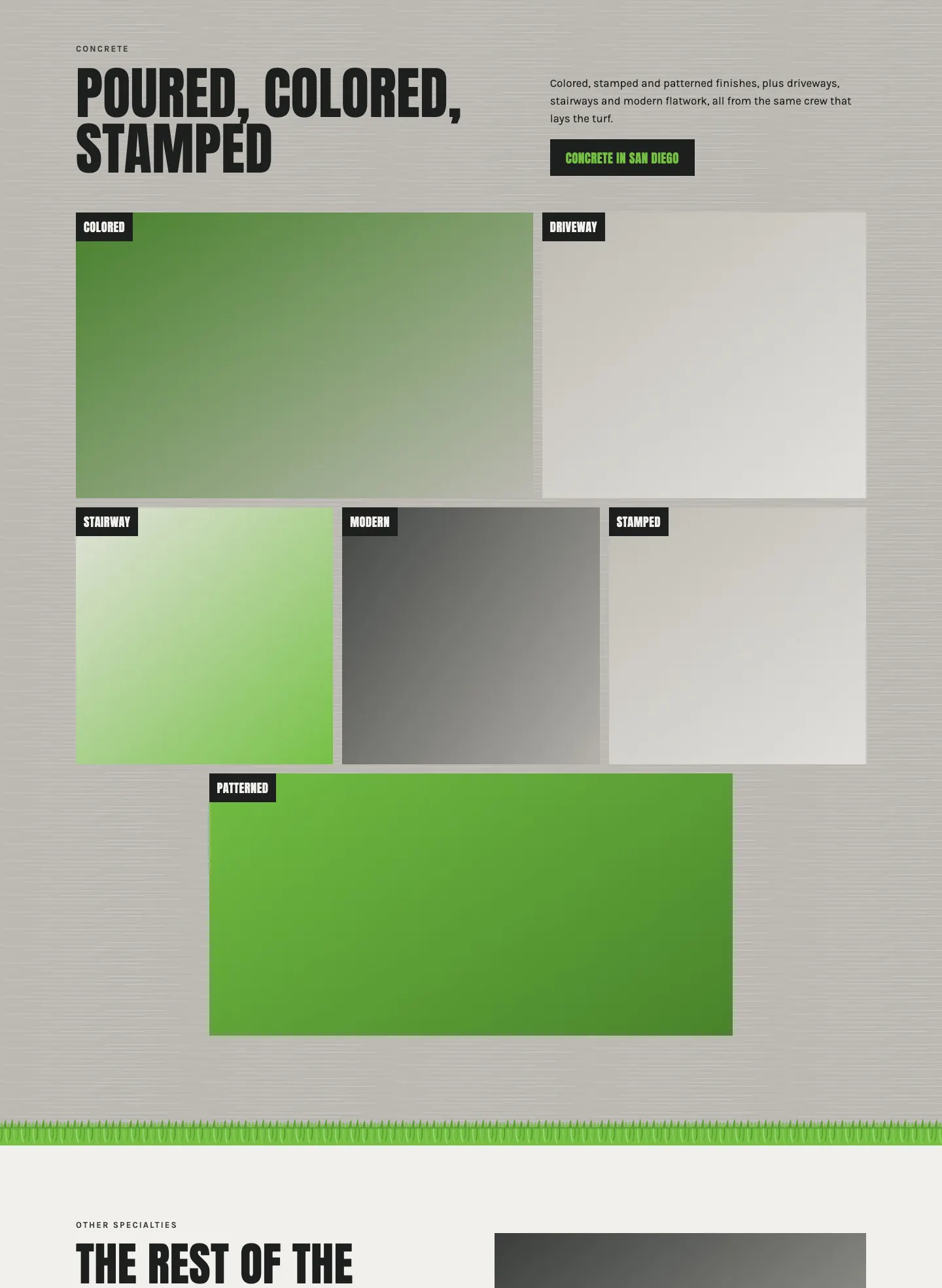
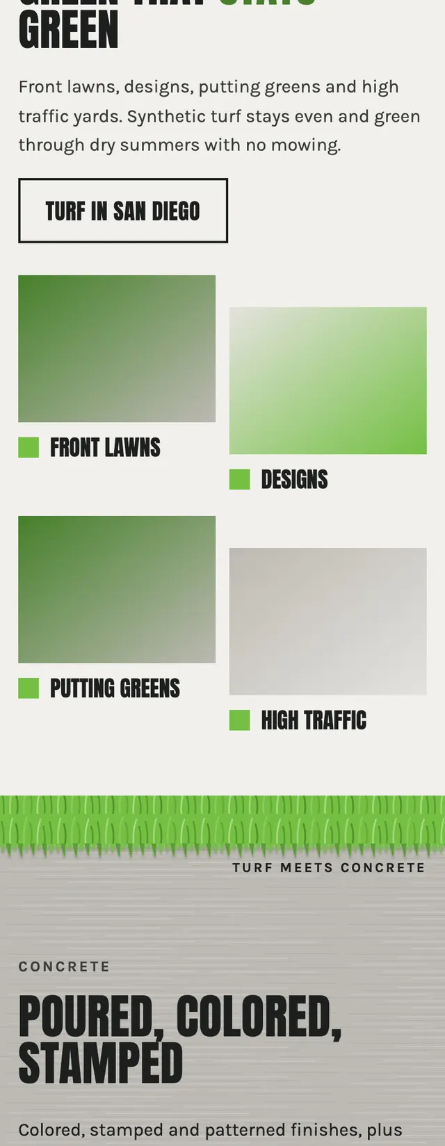
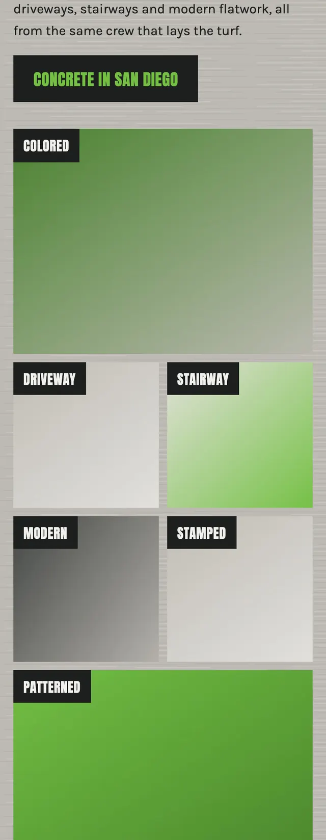
The whole page is organized around the line where a lawn stops and a slab begins, with turf green and concrete gray as the only two accents and a drawn seam between them as the one ornament.
A design concept, not a client site. The name and every detail of the business it was drawn for have been replaced.
The design decisions
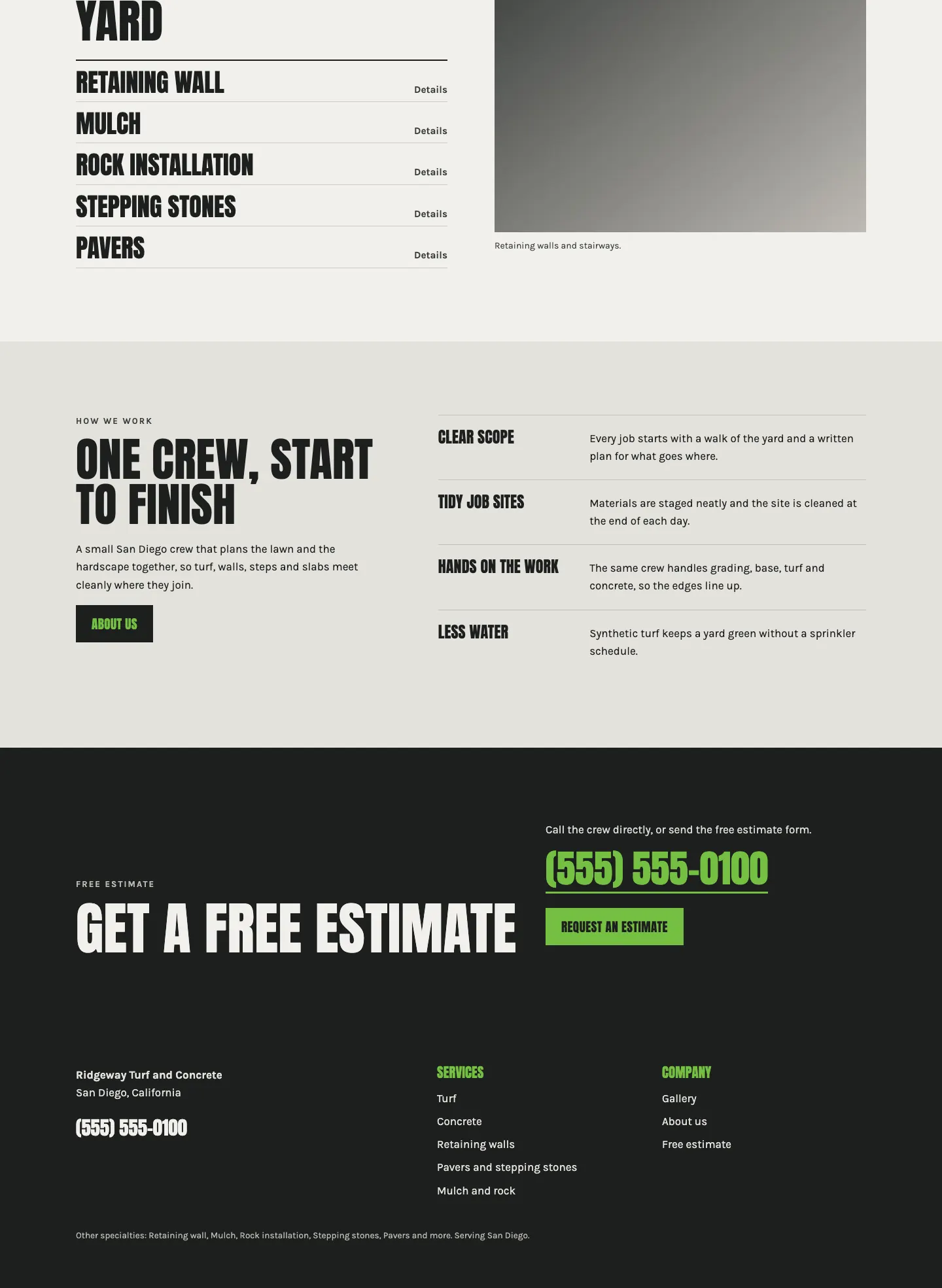
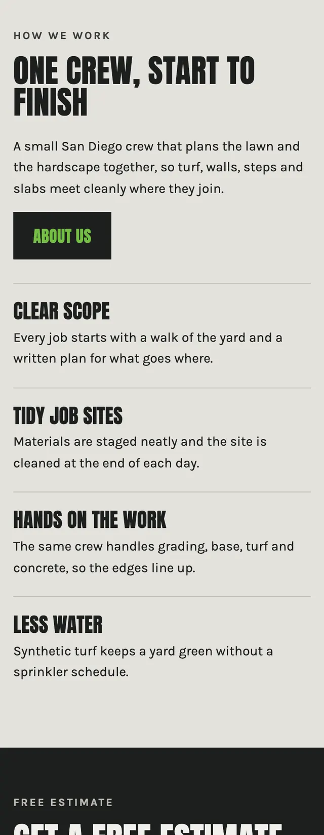
- Headlines are set in Anton in tight uppercase and body copy in Karla, so the display type feels blocky and job site while the reading text stays plain.
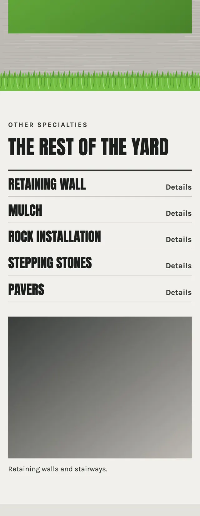
- A full width seam drawn in and , with grass blades hanging over a broom finished concrete band, splits the homepage between the turf section and the concrete section and flips to close the concrete band.
- The hero is a split layout with a dark ink panel holding the headline and phone first actions on the left and a full bleed photo on the right, with the words turf and concrete colored in their own material tones.
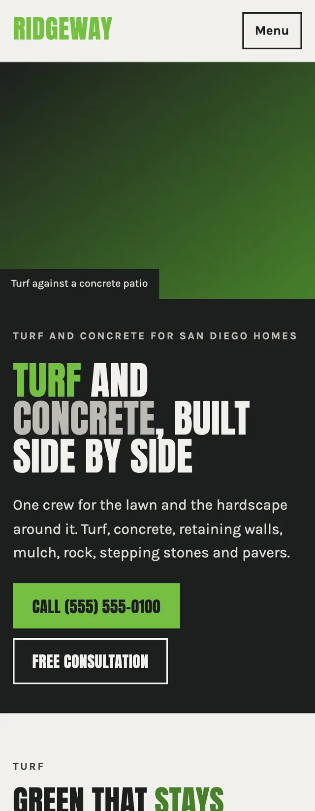
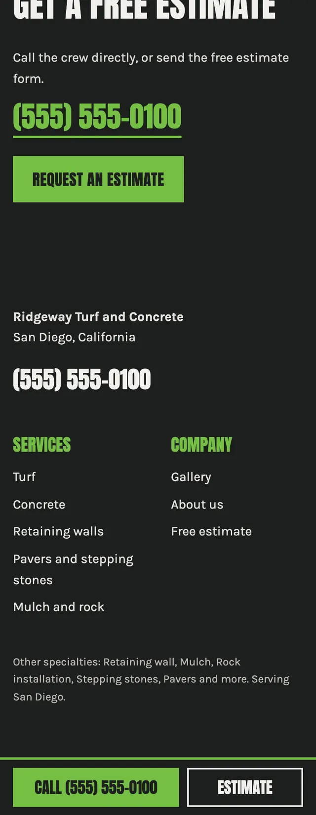
- On mobile the hero stacks photo over copy and a fixed bottom bar keeps a call button and an estimate link in reach on every screen.
Desktop and mobile