Design concepts · Roofing
Concept: Roofing, Chula Vista
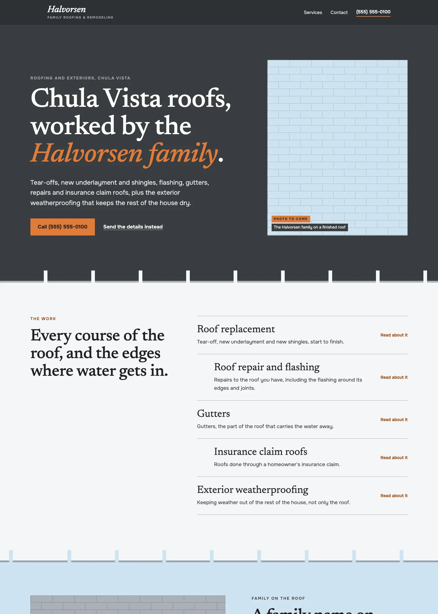
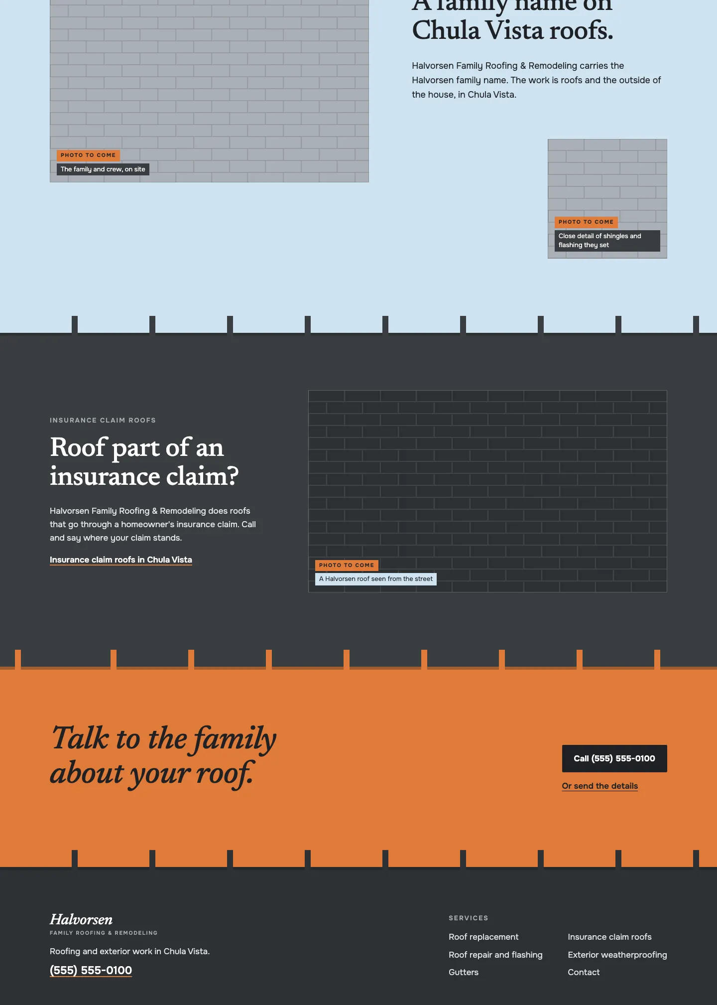
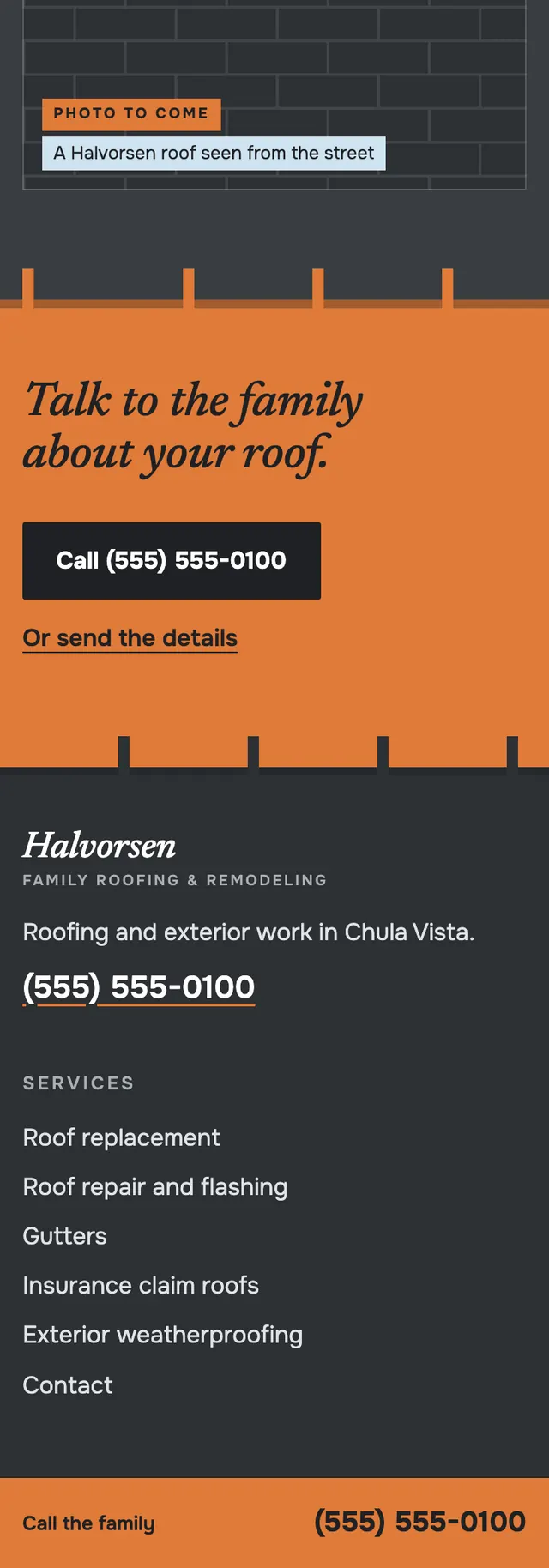
The page is built the way a roof is, in courses: each section's bottom edge hangs over the next like a row of shingle tabs.
A design concept, not a client site. The name and every detail of the business it was drawn for have been replaced.
The design decisions
- Newsreader serif carries the headlines with its italic reserved for the family name in the hero and the closing call band, paired with Onest for service copy, labels and the phone.
- The palette is shingle charcoal, sky blue, flashing silver and a warm orange that marks the phone, buttons and the family name, with a darker orange for text on light grounds.
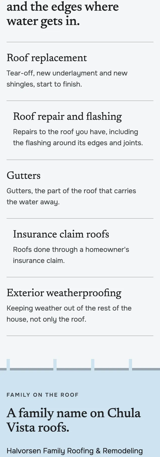
- Sections alternate charcoal, paper, sky, charcoal and orange at shifting column splits, the service list steps every other row inward like the next course up, and its heading stays sticky beside the list.
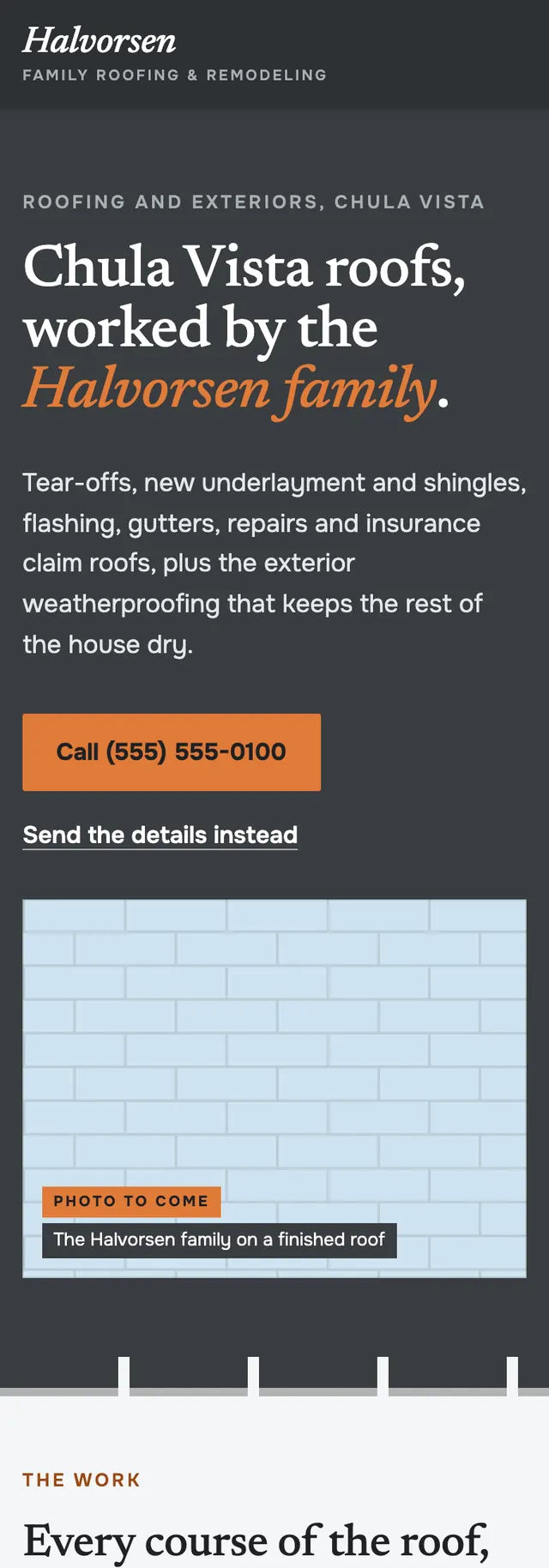
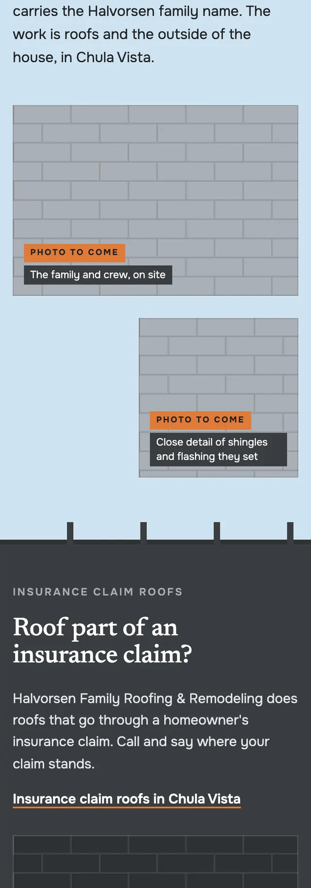
- Photo positions are drawn as staggered shingle pattern slots with a small Photo to come label, so the layout reads finished before any photography exists, and mobile adds a pinned call bar.
Desktop and mobile