Design concepts · Construction
Concept: Remodeling contractor, San Diego
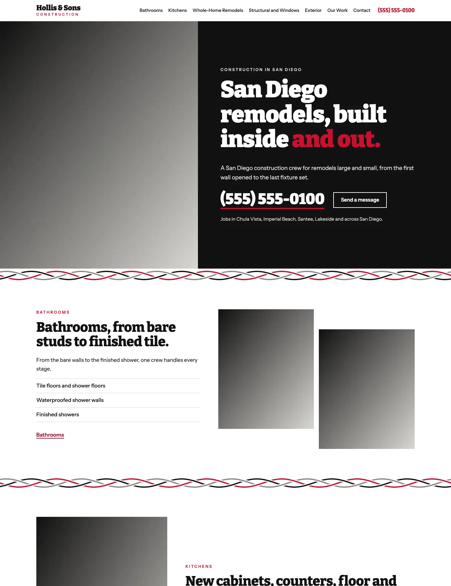
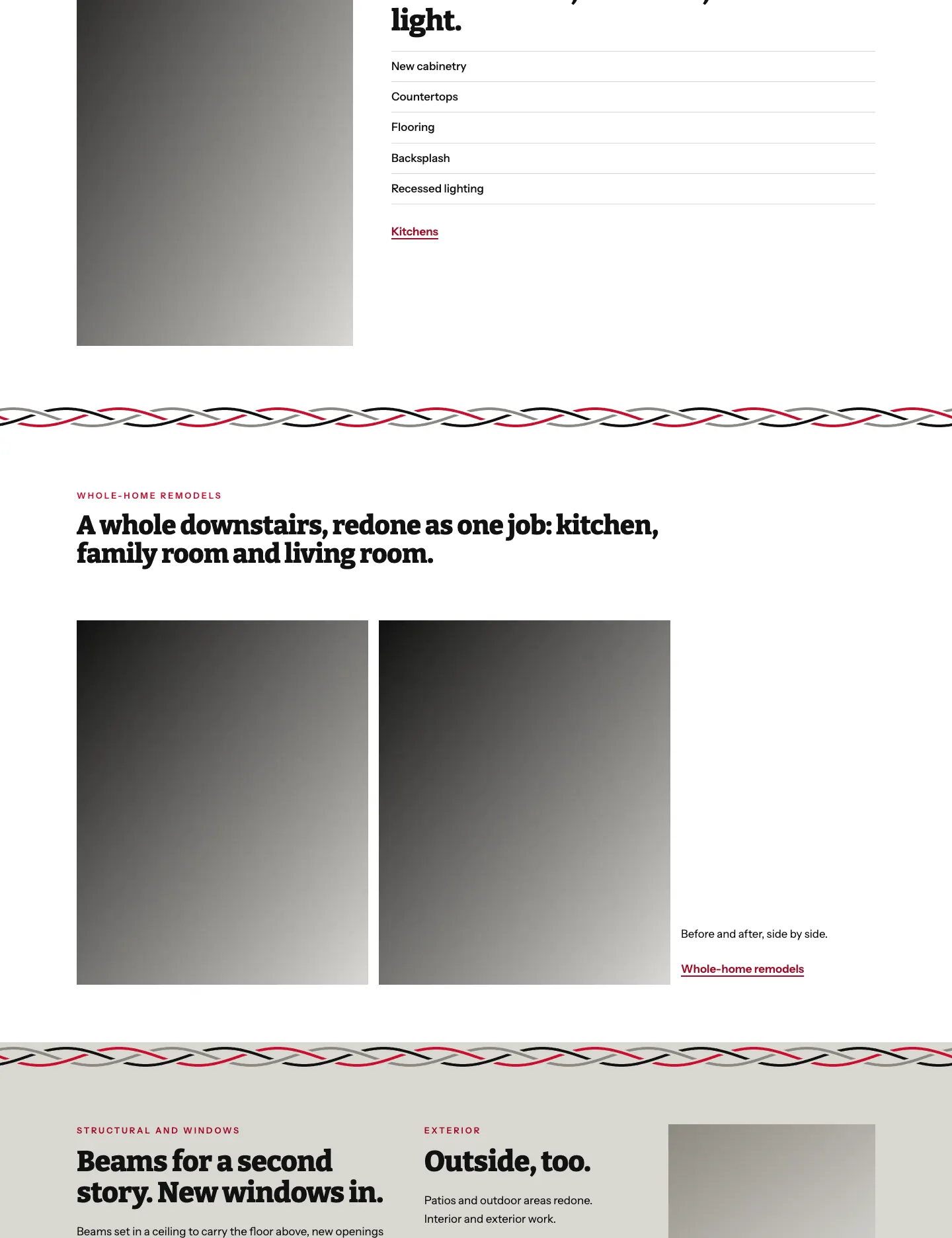
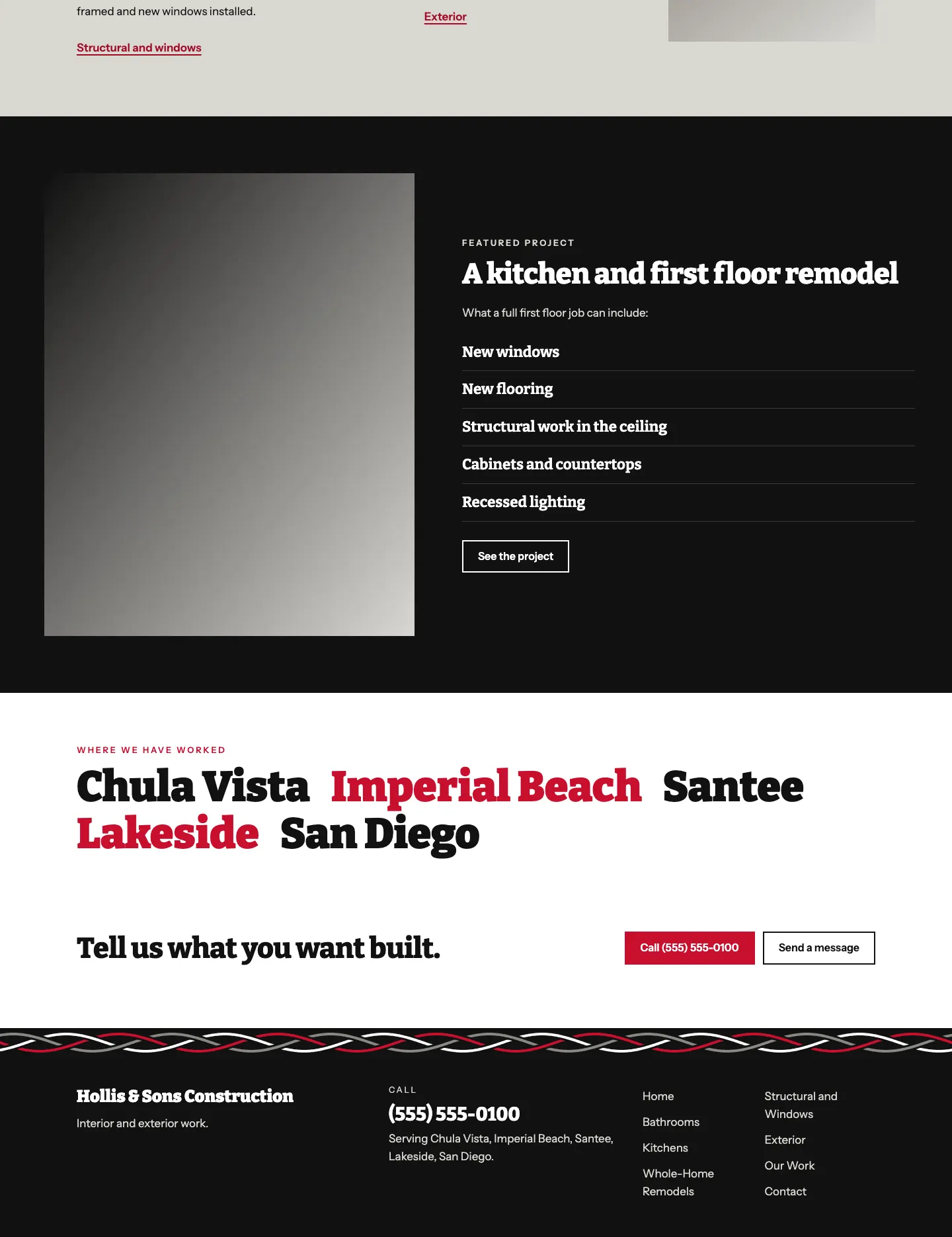
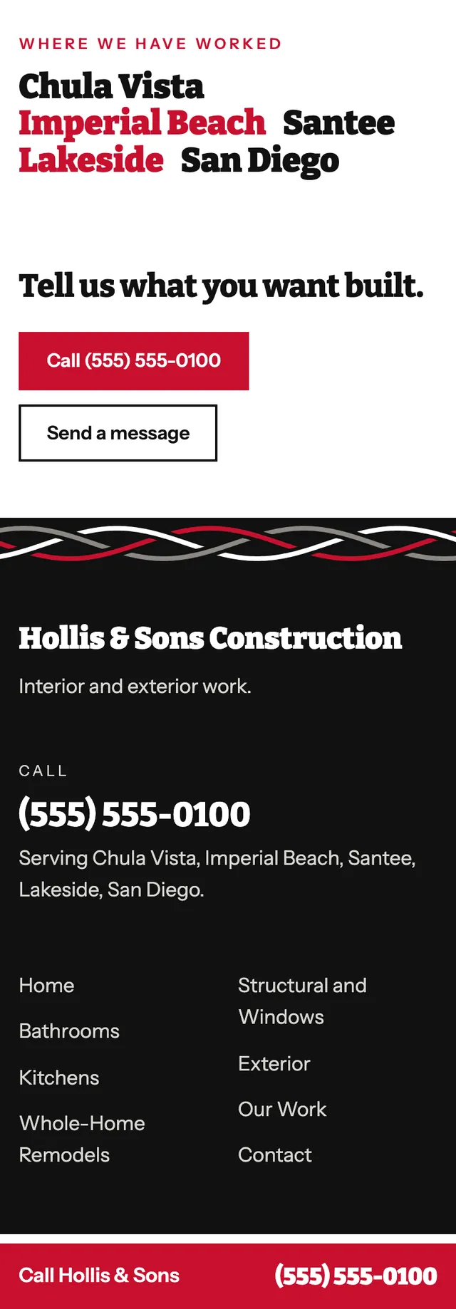
A remodeling crew's site tied together by a woven line of three strands that runs between sections like a seam, standing for separate trades worked into one finished house.
A design concept, not a client site. The name and every detail of the business it was drawn for have been replaced.
The design decisions
- Bitter at heavy weights sets headlines, the large phone number and the city list, against Instrument Sans for body copy and labels, so the type reads stamped and built.
- The palette is white ground, near black for the hero panel, featured band and footer, a concrete grey band, and a single strong red used for the phone underline, the call button, eyebrows and one strand of the woven line.
- Sections never repeat a width: a split hero with a tall photo beside black copy, staggered photo pairs, a tall photo against a ruled list, a before and after row, uneven thirds on a concrete band, then the served cities set huge in display type.
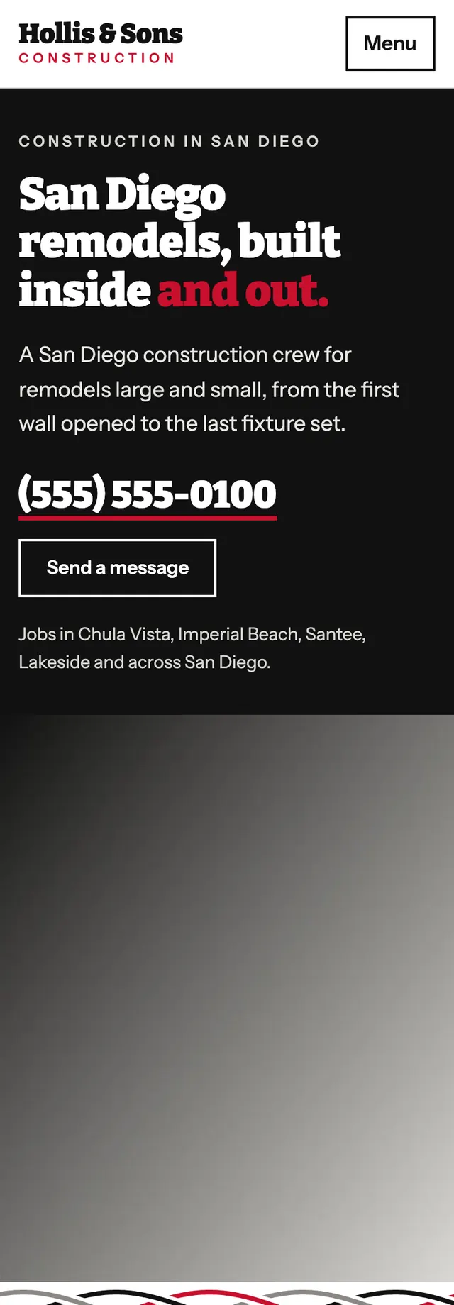
- No text sits on any photograph, the phone number is the hero's main action, and on phones the words come first and a red call bar pins to the bottom of the screen.
Desktop and mobile