Design concepts · Real estate
Concept: Real estate investment, San Diego
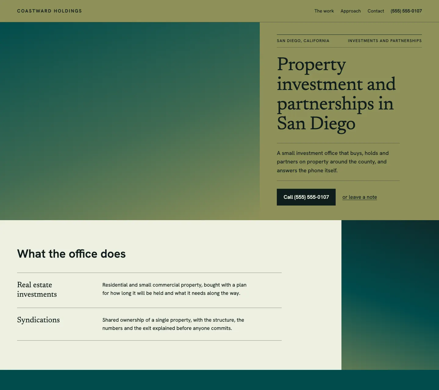
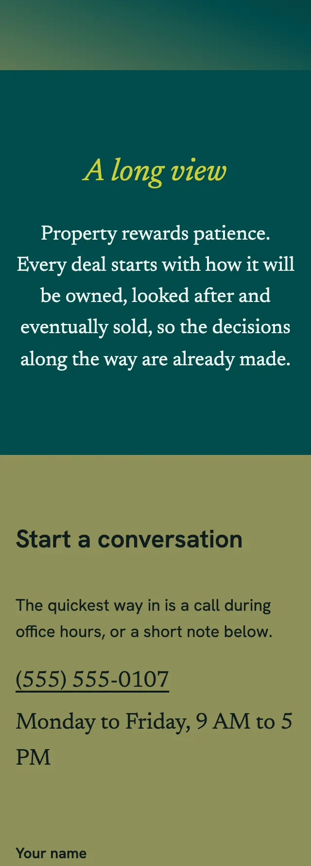
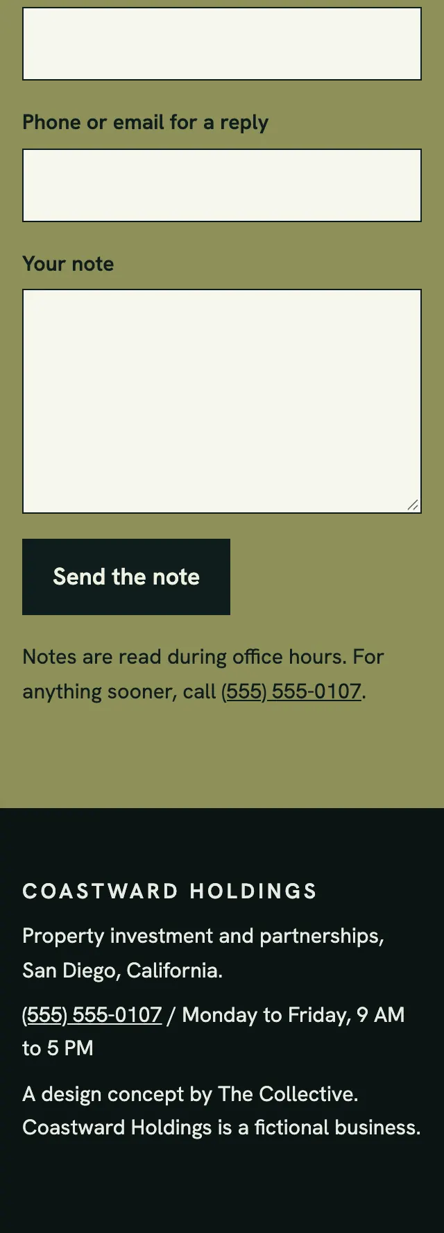
A real estate investment site that reads like a printed prospectus, a deep teal photo block beside an olive column with a ruled dateline and a calm serif headline.
A design concept, not a client site. The name and every detail of the business it was drawn for have been replaced.
The design decisions
- Newsreader, a book serif, carries the headline, the ledger names and the italic section title, with Hanken Grotesk for body copy, navigation and the tracked dateline.
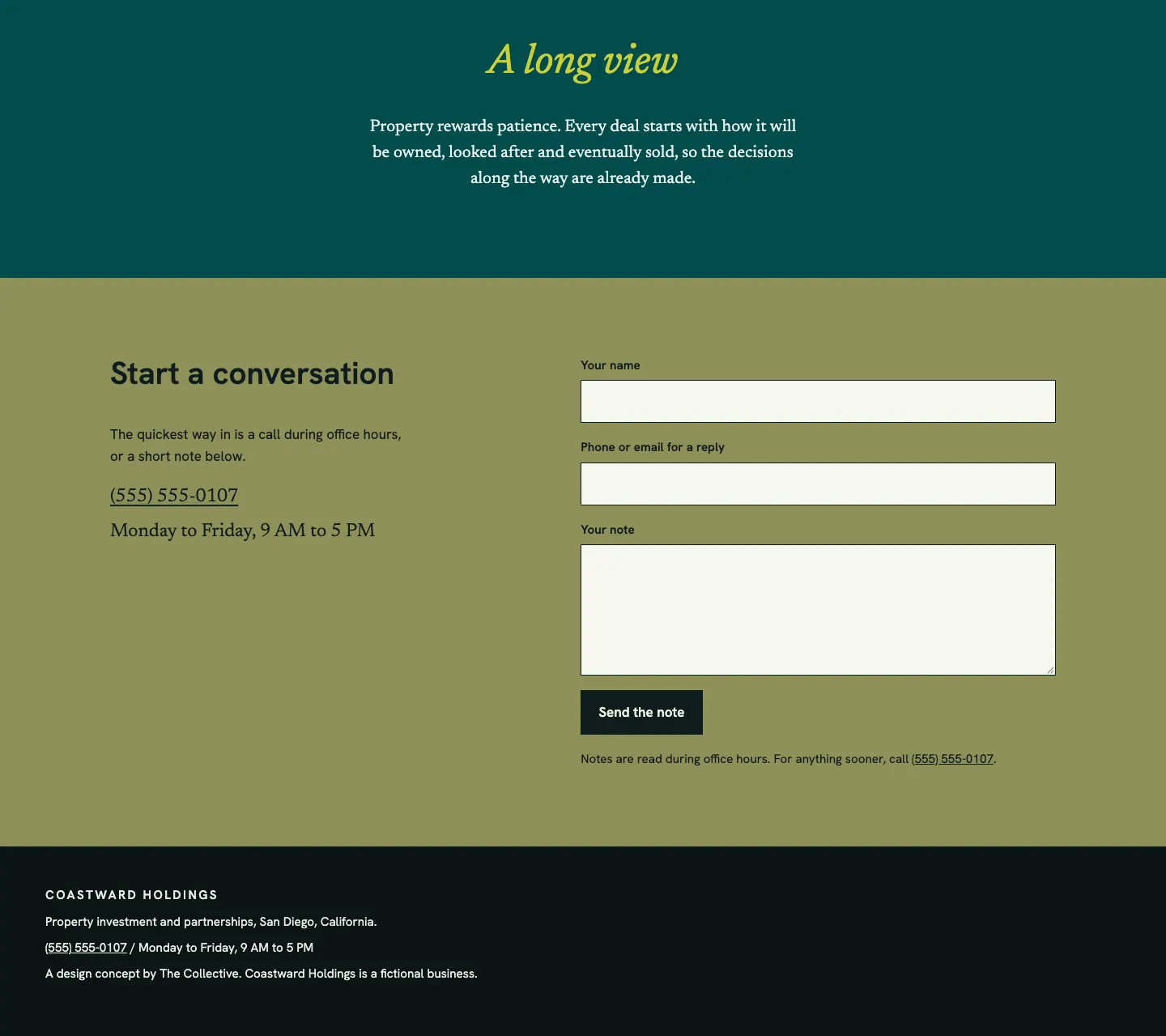
- The palette is olive for the masthead, hero column and contact band, a deep teal and near black for the photo blocks and footer, a pale paper ground, and one chartreuse for the italic heading.
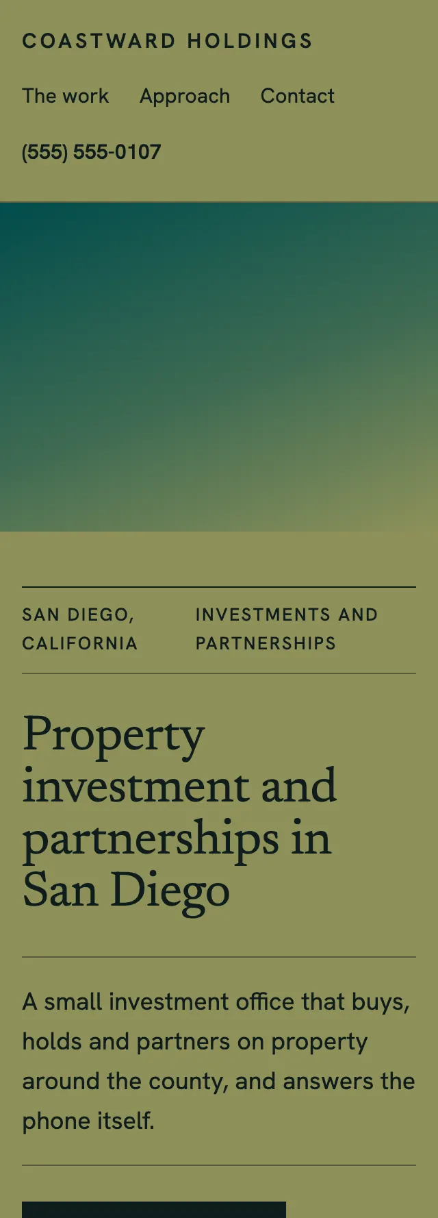
- The hero splits into a large photo slot and a narrow column opened by a two part dateline between thin rules, so the page starts like a document rather than an advert.
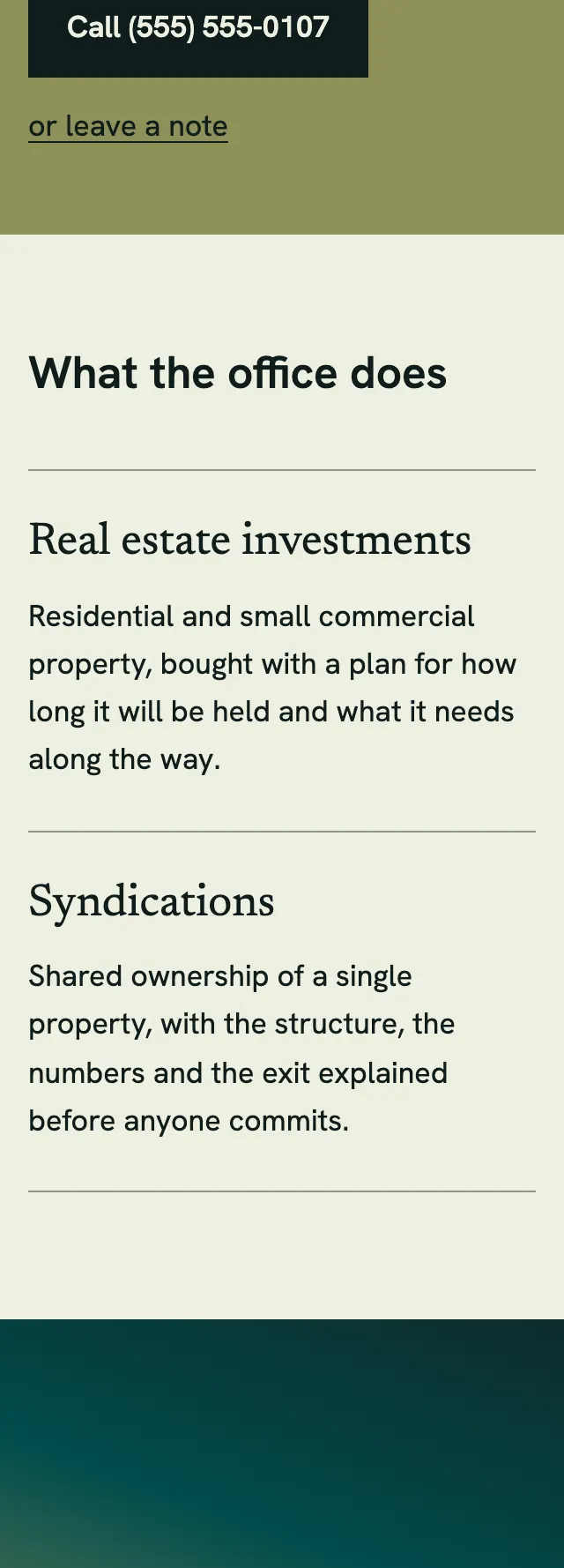
- What the office does runs as a two row ruled ledger beside a tall photo slot, followed by a centered teal band with a single italic heading and one paragraph.
Desktop and mobile