Design concepts · Real estate
Concept: Real estate development, San Diego
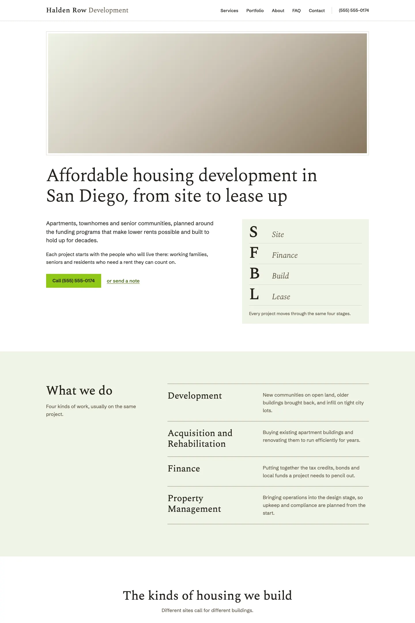
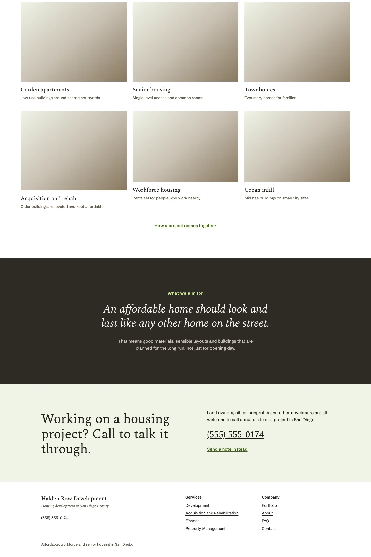
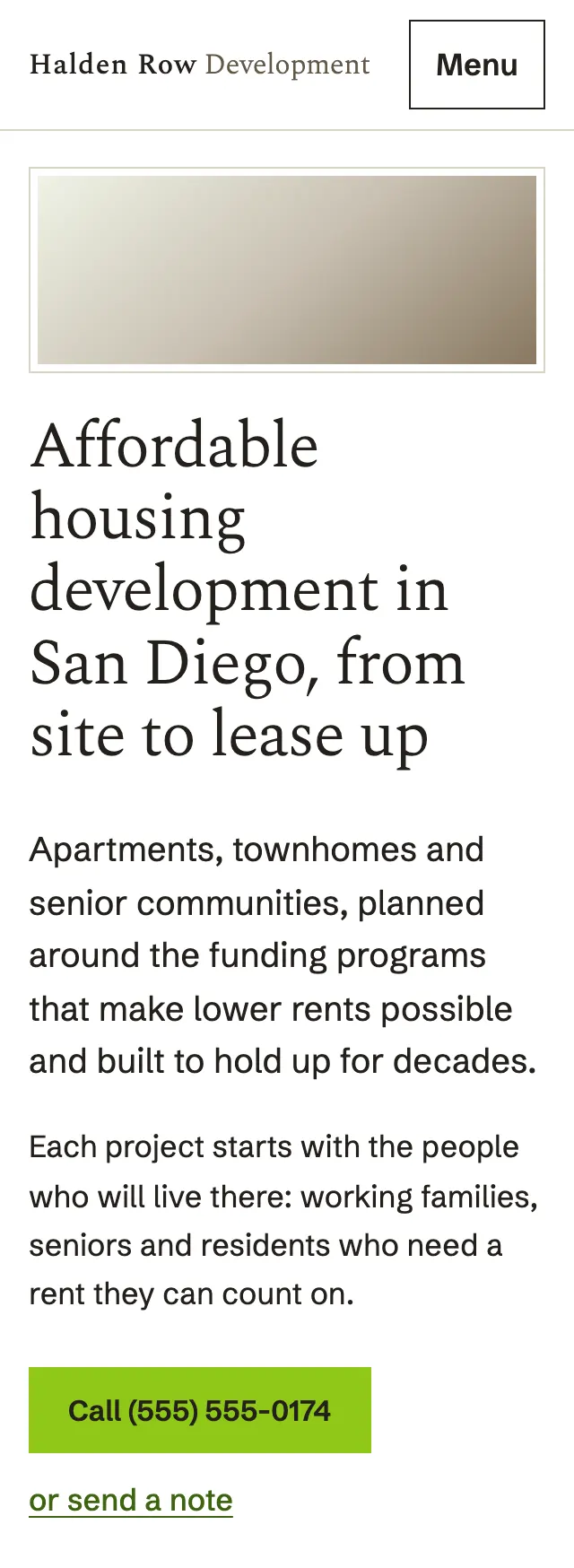
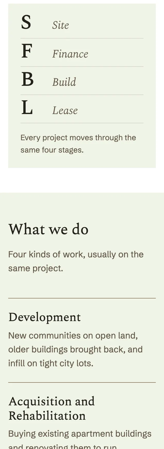
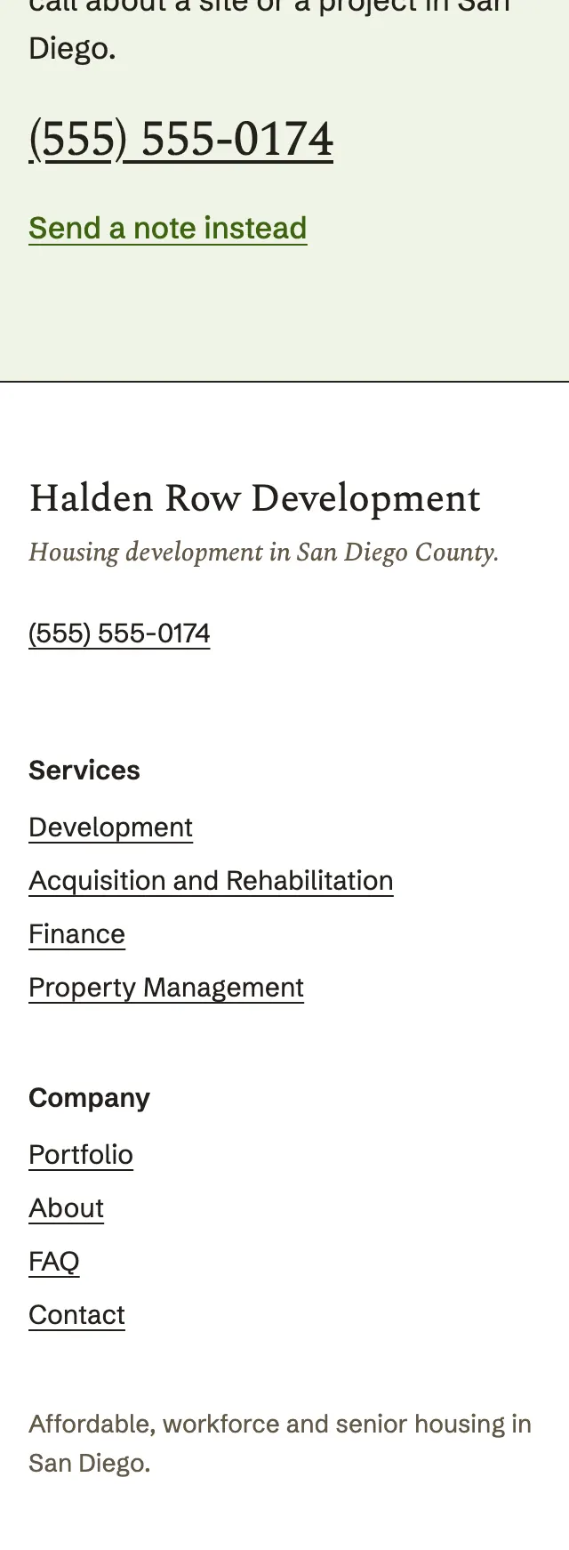
A housing developer's site in a quiet book serif on white, opening on a wide framed photo band and a tinted panel that spells out the four stages of a project, one large letter at a time.
A design concept, not a client site. The name and every detail of the business it was drawn for have been replaced.
The design decisions
- Spectral, in light and italic weights, carries the headlines, the large letters and the closing statement, with Schibsted Grotesk for body copy and navigation.
- The palette is white and a pale sage tint, warm taupe for secondary type, a bright lime for the call button and a dark brown ground for the statement band.
- The hero photo sits inside a thin double frame at its own wide ratio, and beside the opening copy a tinted panel lists the project stages as large serif initials with an italic word on each rule.
- Services run as ruled rows beside a short heading, and the housing types sit in a three column grid of photo slots, each with a serif name and one plain line.
Desktop and mobile