Design concepts · Landscaping
Concept: Landscaping, Chula Vista
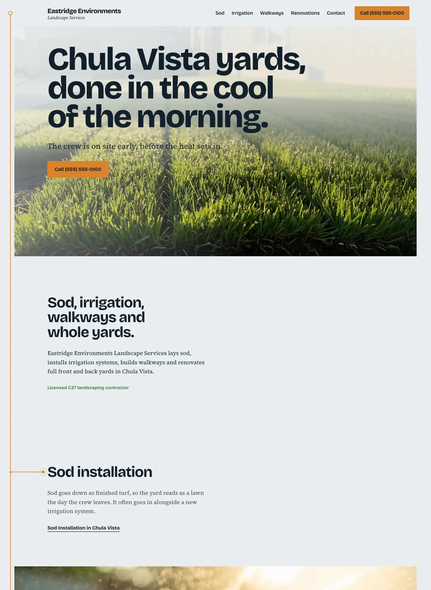
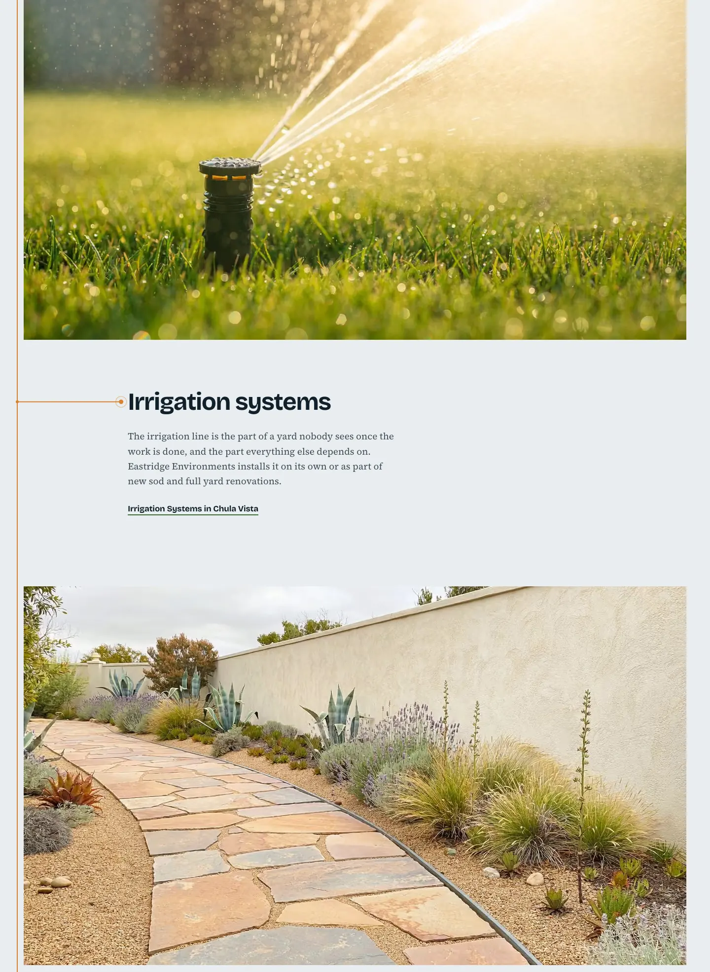
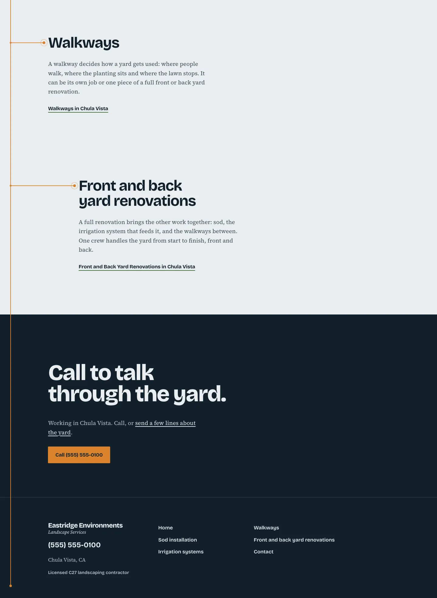
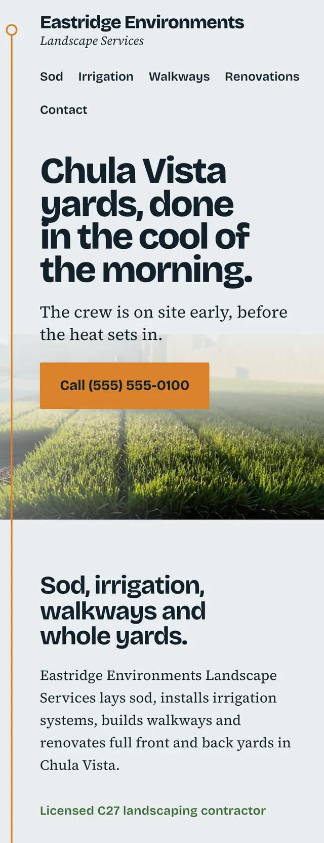
A working landscape crew's site that feels like the cool minutes before the heat of the day: pale gray blue air, deep slate, and one warm amber for first sun and running water.
A design concept, not a client site. The name and every detail of the business it was drawn for have been replaced.
The design decisions
- Bricolage Grotesque set large and tight carries headlines, service names and the wordmark, with Source Serif 4 for body text, a plain heavy voice instead of a luxury serif.
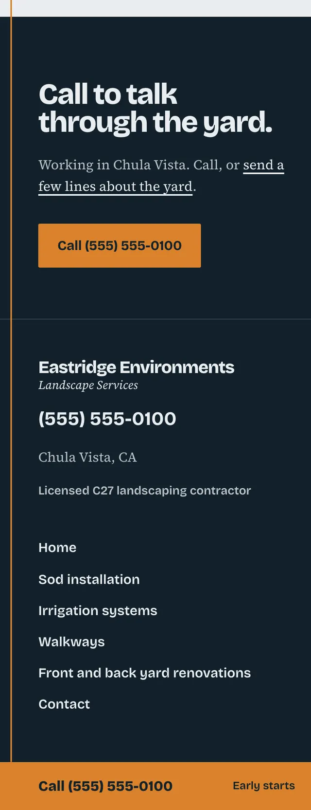
- The palette is a pale morning gray blue ground and deep slate ink, with amber reserved for the call button and the irrigation line and a grass green kept to small accents.
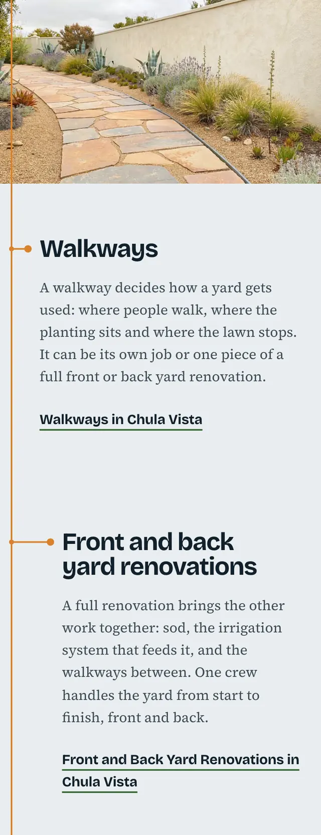
- A thin amber irrigation line runs down the left margin of the page from a valve dot at the wordmark, and branches out to a small emitter beside each service heading.
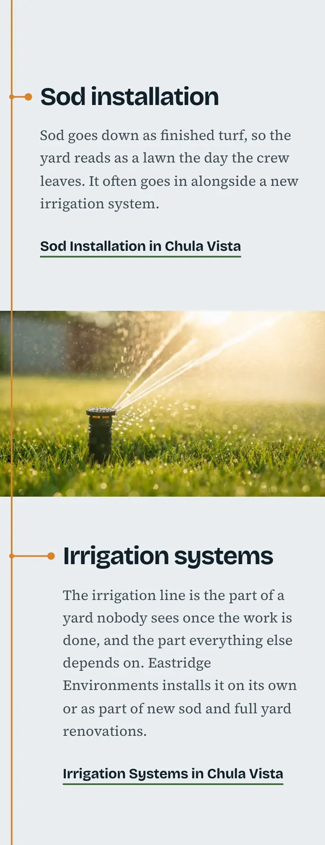
- Photos run full bleed at their own ratio between narrow off center text columns, one service per band, and the hero headline sits on a hazed sky at the top of the photo, with a call bar pinned on phones.
Desktop and mobile