Design concepts · HVAC
Concept: HVAC, Newark
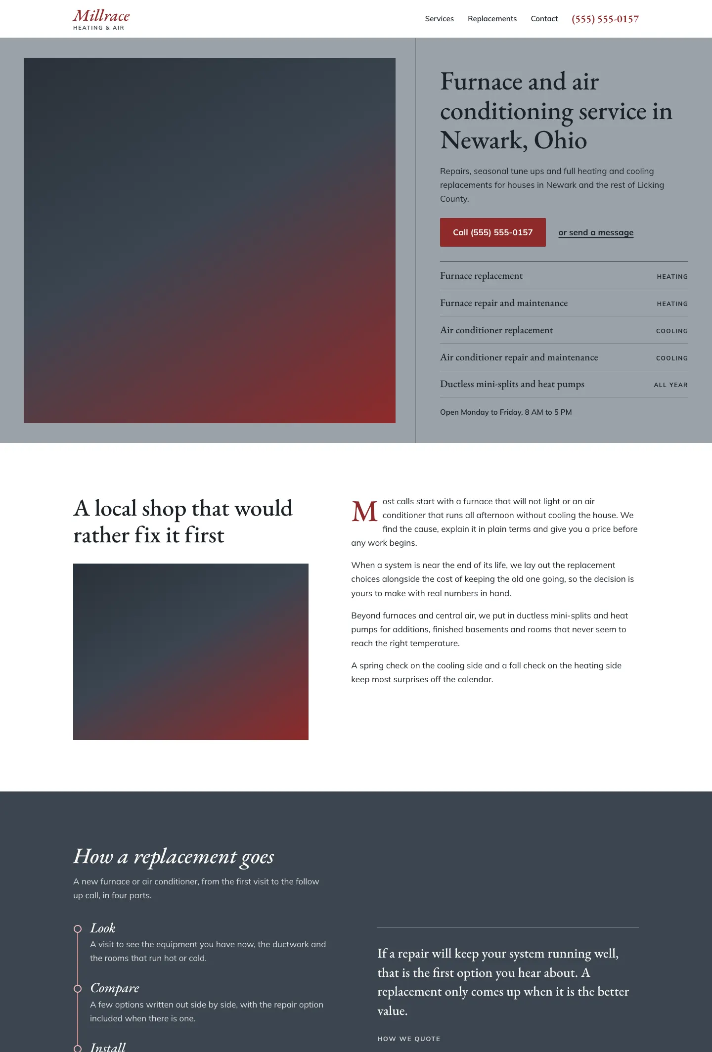
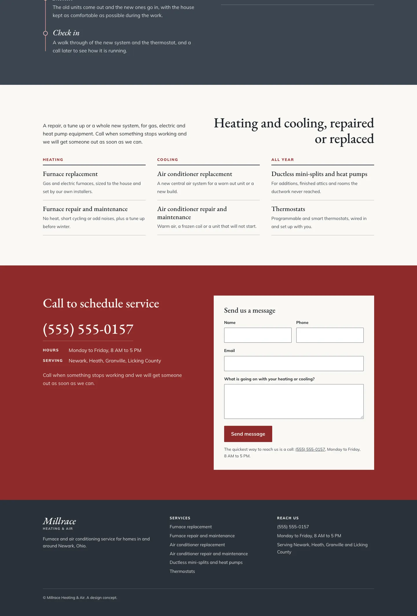
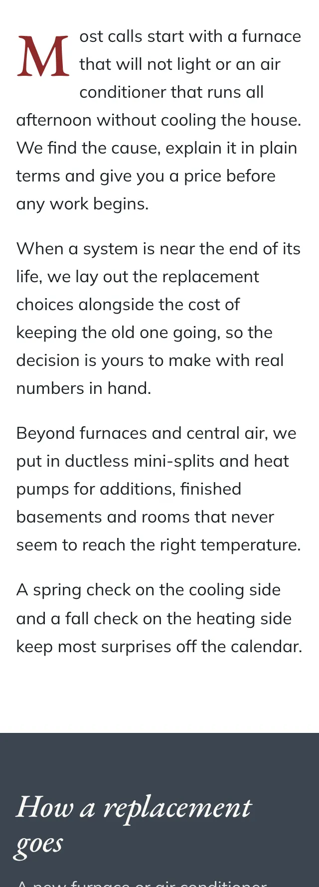
An HVAC site set like a small town shop's printed card, with a wide photo beside a ruled column of services on a cool grey ground and one deep red doing all the calling.
A design concept, not a client site. The name and every detail of the business it was drawn for have been replaced.
The design decisions
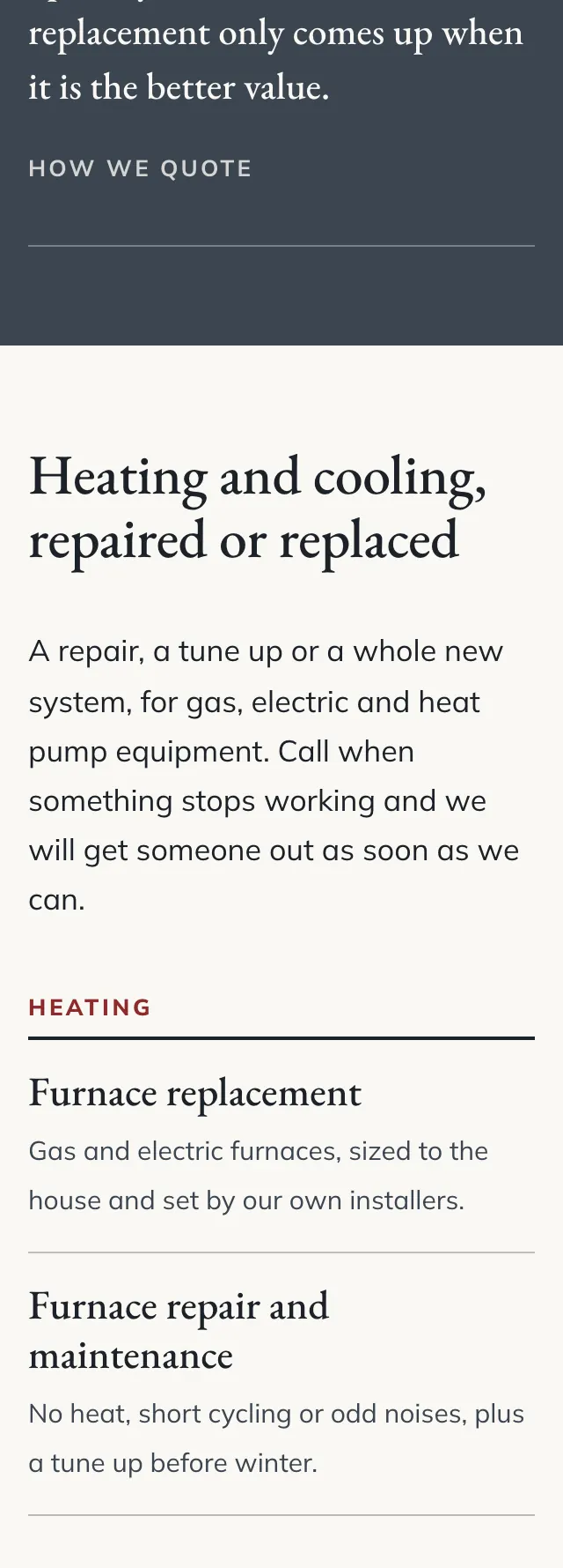
- EB Garamond carries the wordmark, the headings and the service names, with Mulish for the body copy, labels and buttons, so the page reads like a well set local paper.
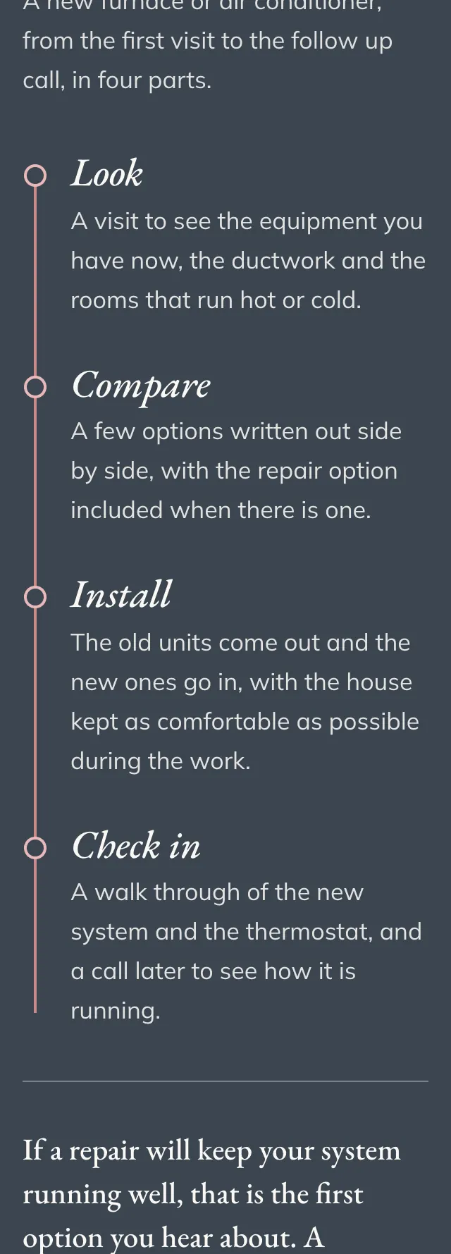
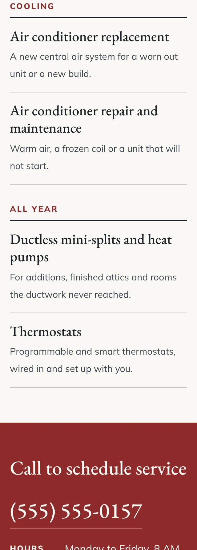
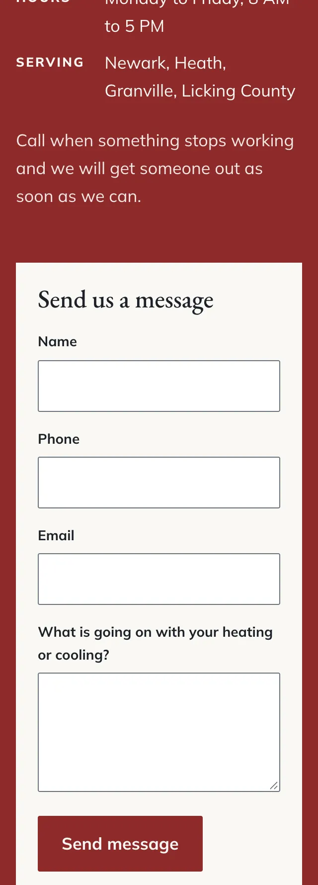
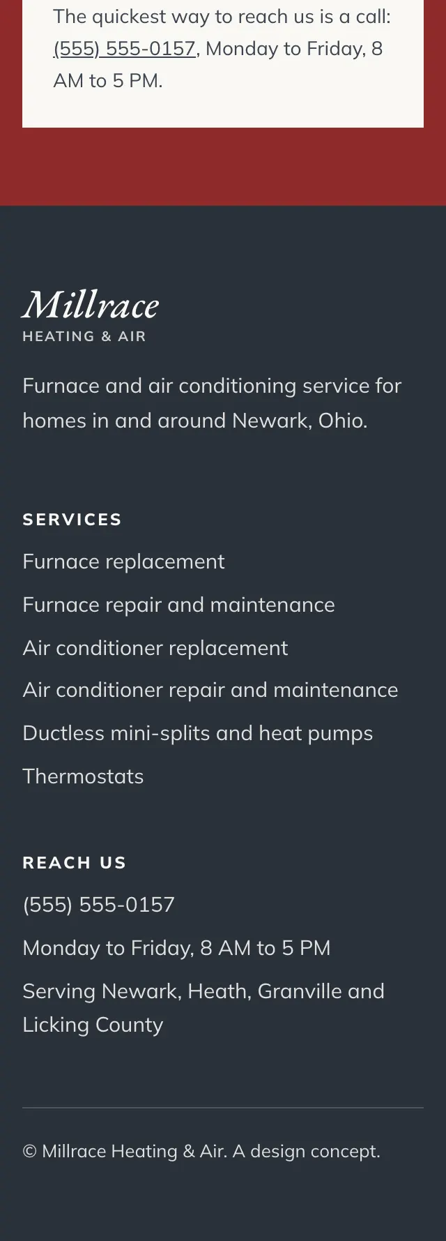
- The palette is a mid grey hero, slate for the replacement band, warm white behind the services and a deep red for the call button, the drop cap and the closing contact section.
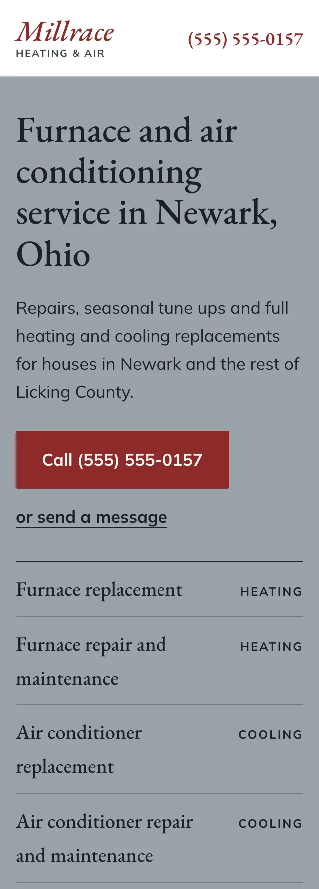
- The hero splits on a full height hairline: a wide photo on the left, then the headline, one call button and a running list of services in ruled rows on the right.
- How a replacement goes runs down a thin red line with open ring markers and four italic stage names, set beside a large pull quote on the slate band.
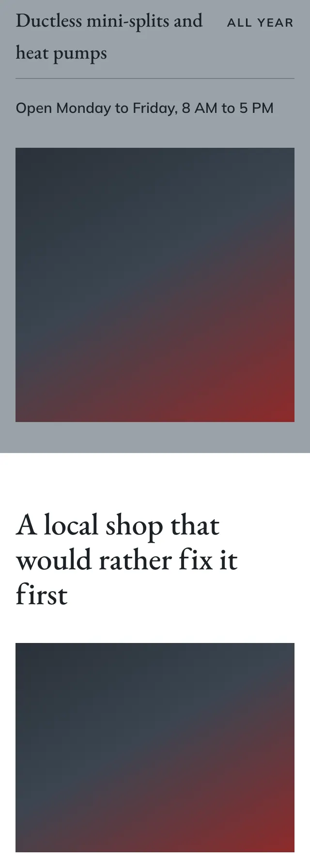
Desktop and mobile