Design concepts · Painting
Concept: House painting, Chula Vista
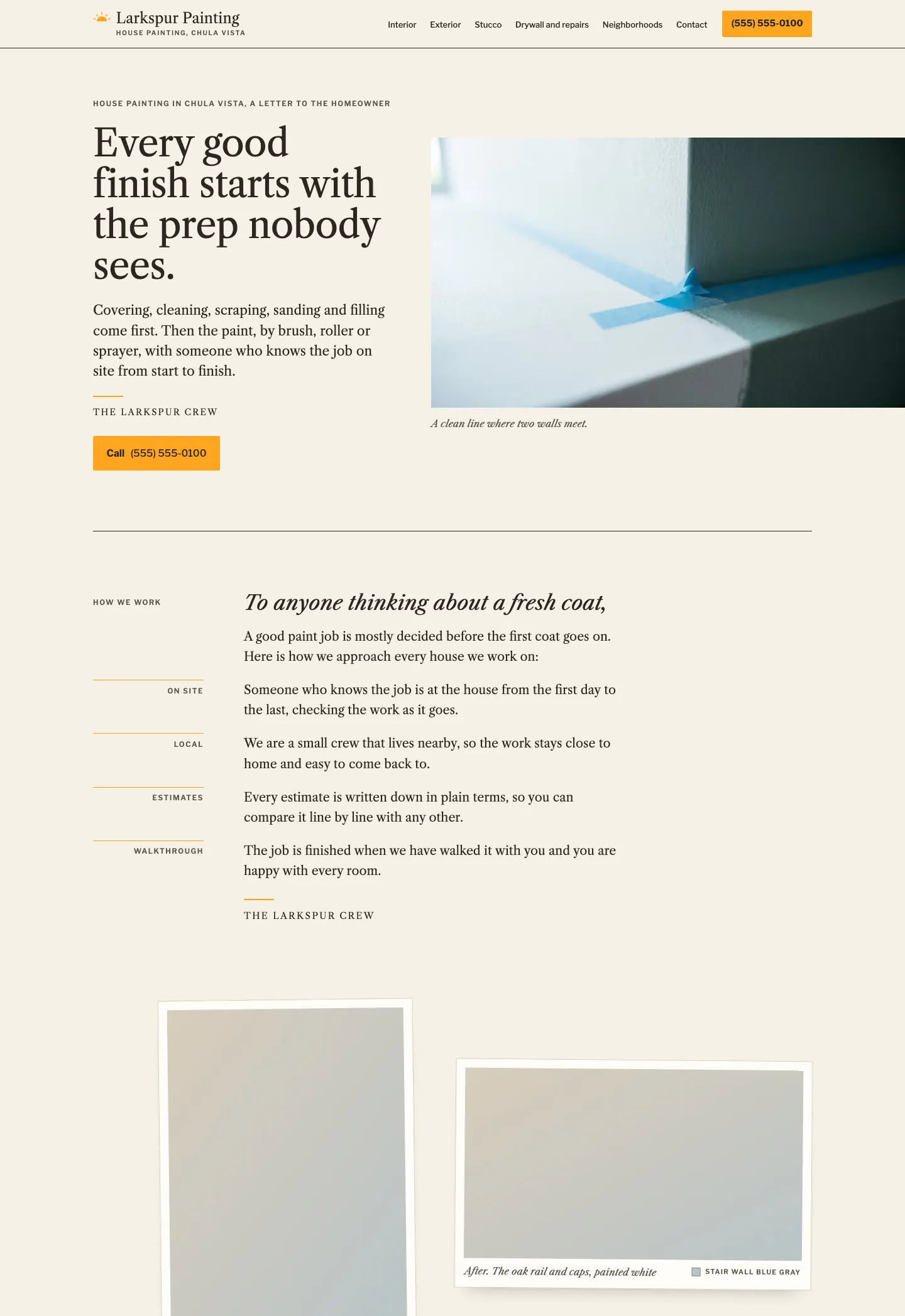
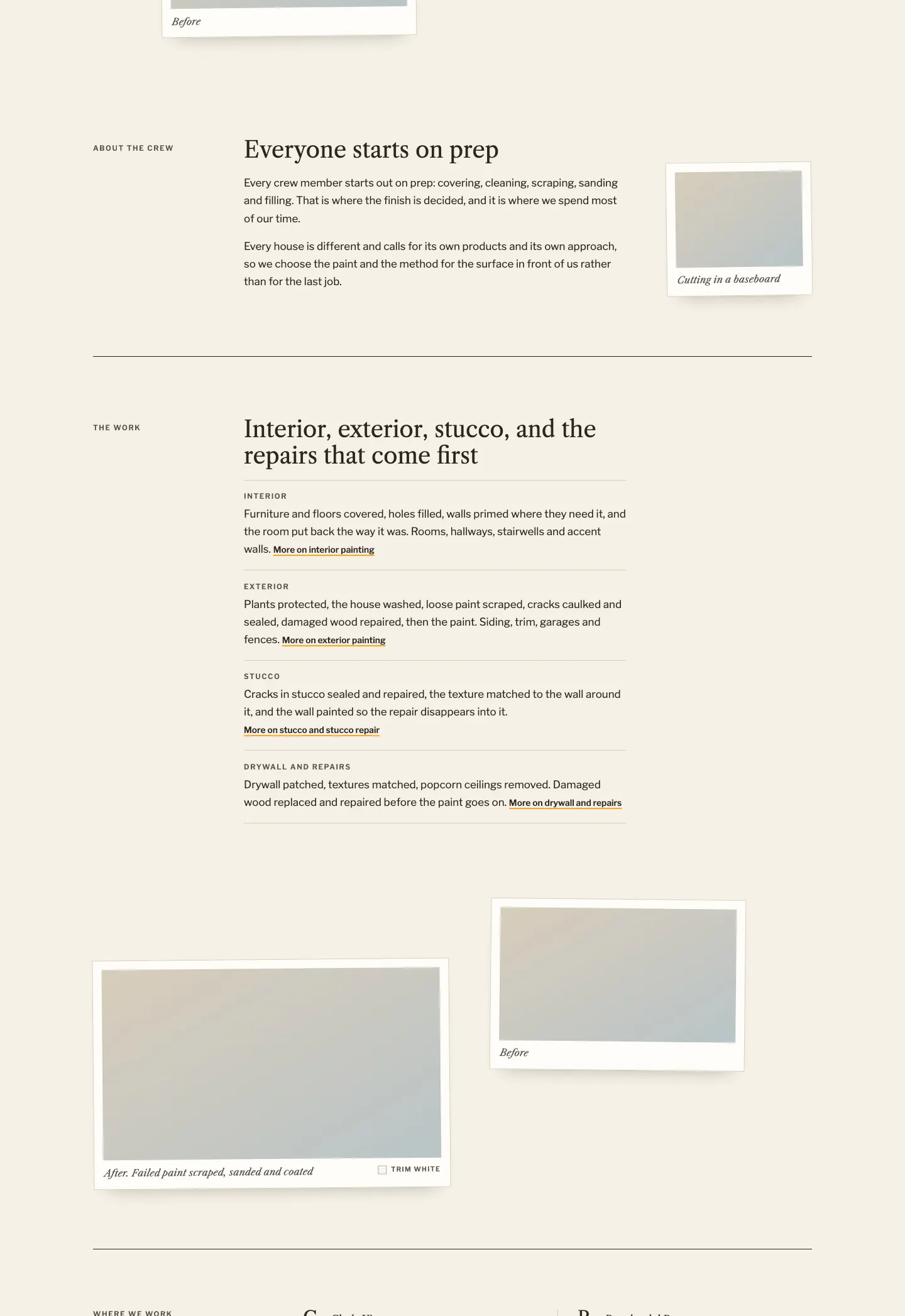
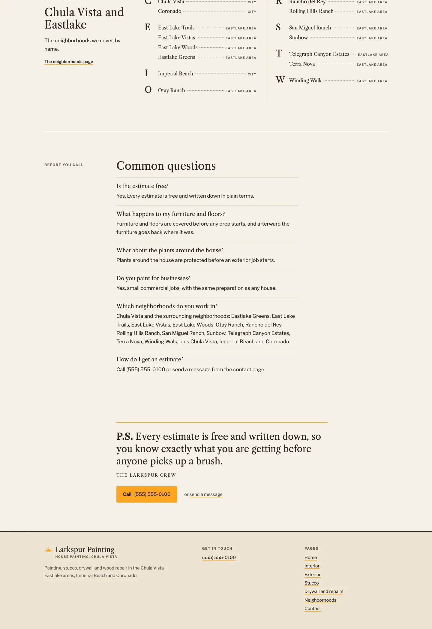
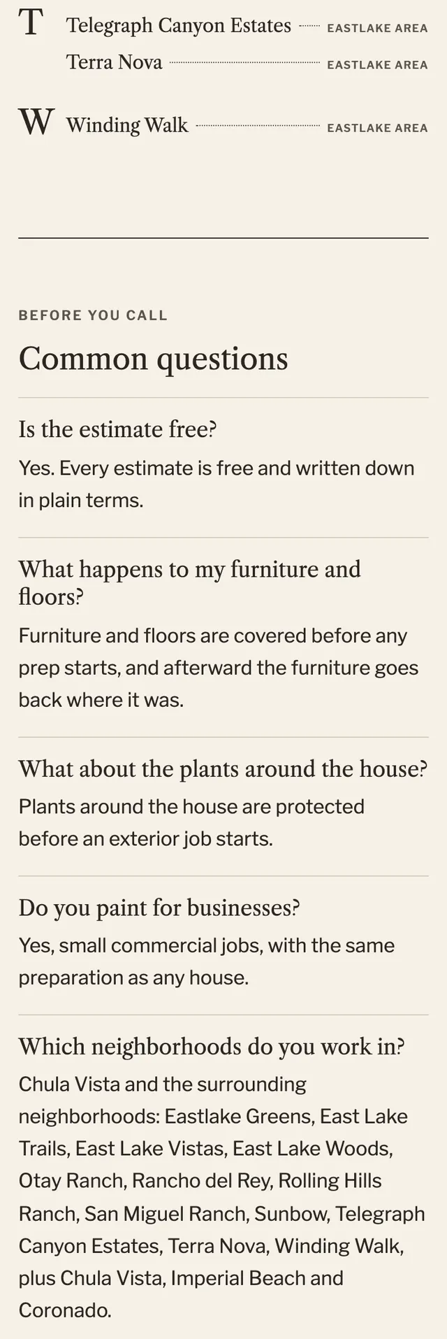
The site reads like a letter to the homeowner printed on cream letter paper, with job photos laid on the page as white bordered prints and painter's tape cut lines marking each section break.
A design concept, not a client site. The name and every detail of the business it was drawn for have been replaced.
The design decisions
- Libre Caslon Text carries the display type, the letter and the directory so the page reads as printed correspondence, while Libre Franklin in small tracked capitals handles navigation, labels and buttons like a letterhead.
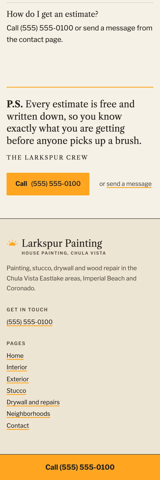
- The palette is warm paper and dark ink with a single sunburst orange reserved for the call button and rules, never used as text on the paper ground.
- Photos sit in white framed prints with a deep captioned bottom margin, offset and turned a fraction of a degree, with before and after pairs arranged differently each time.
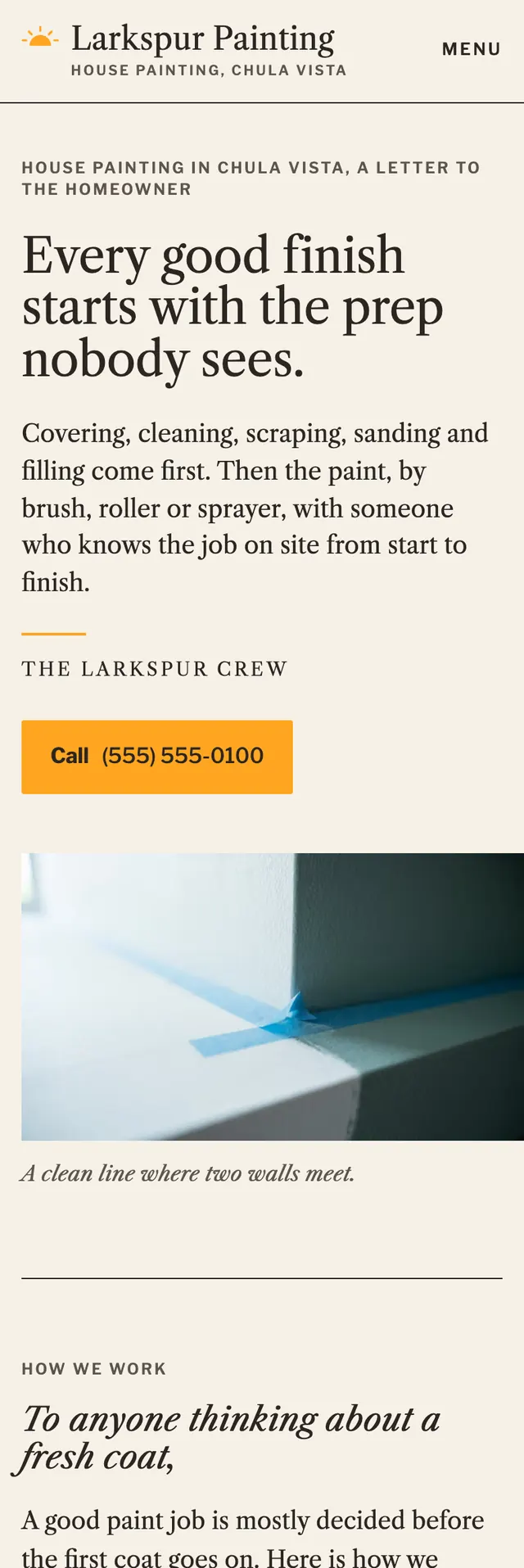
- The hero is an asymmetric split with the letter opening in large serif on the left and the photo bleeding off the right edge, and every page closes on a P.S. with the call button; on mobile a call bar pins to the bottom of the screen.
Desktop and mobile