Design concepts · Fitness
Concept: Fitness studio, San Diego
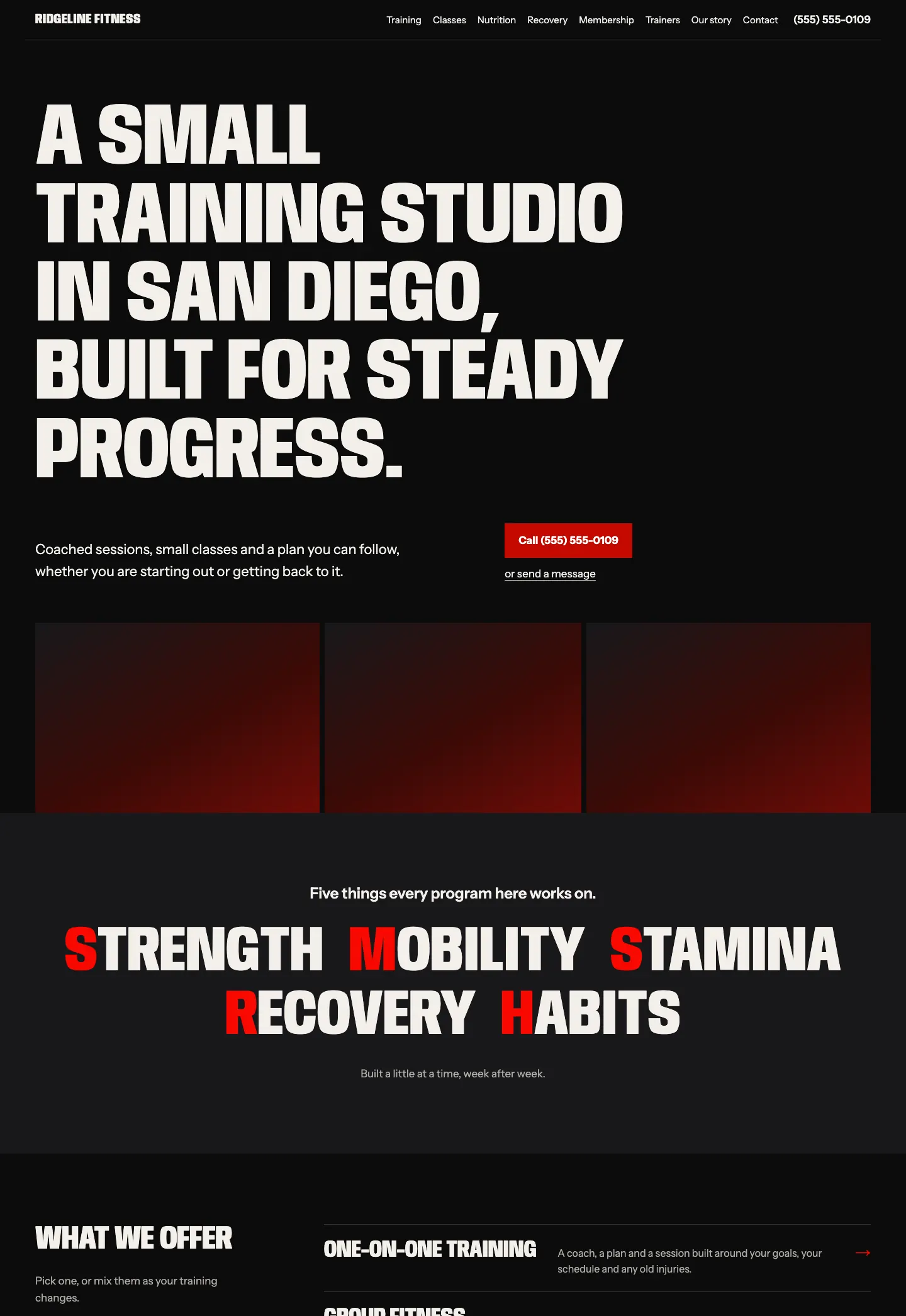
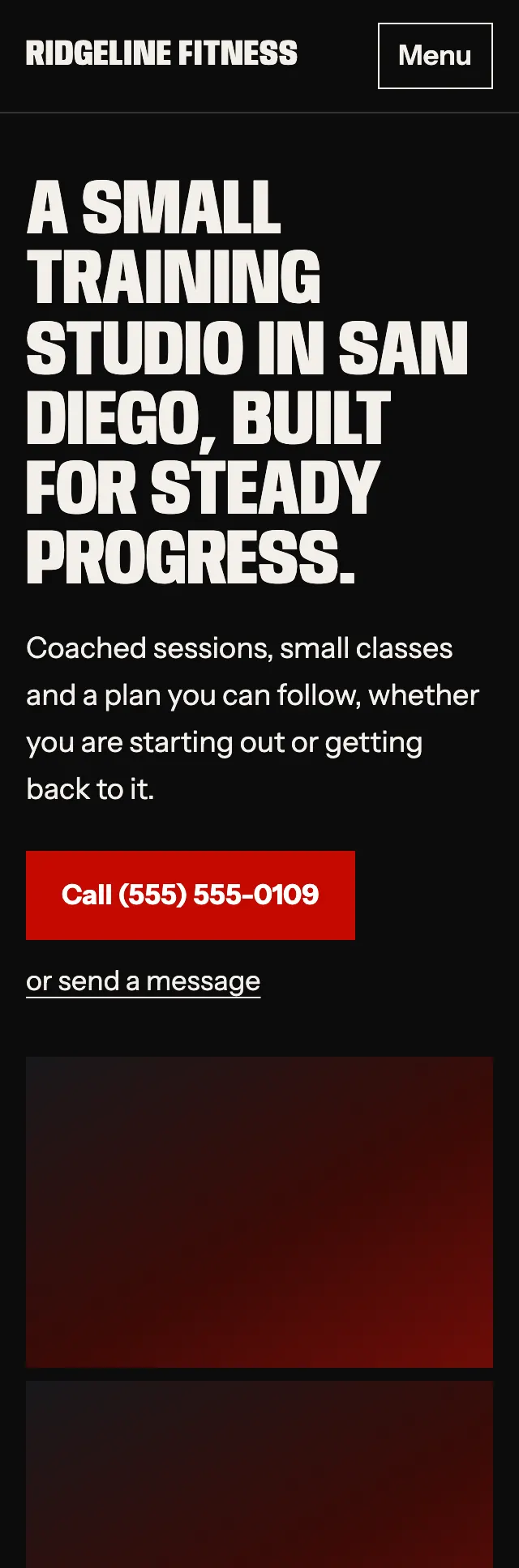
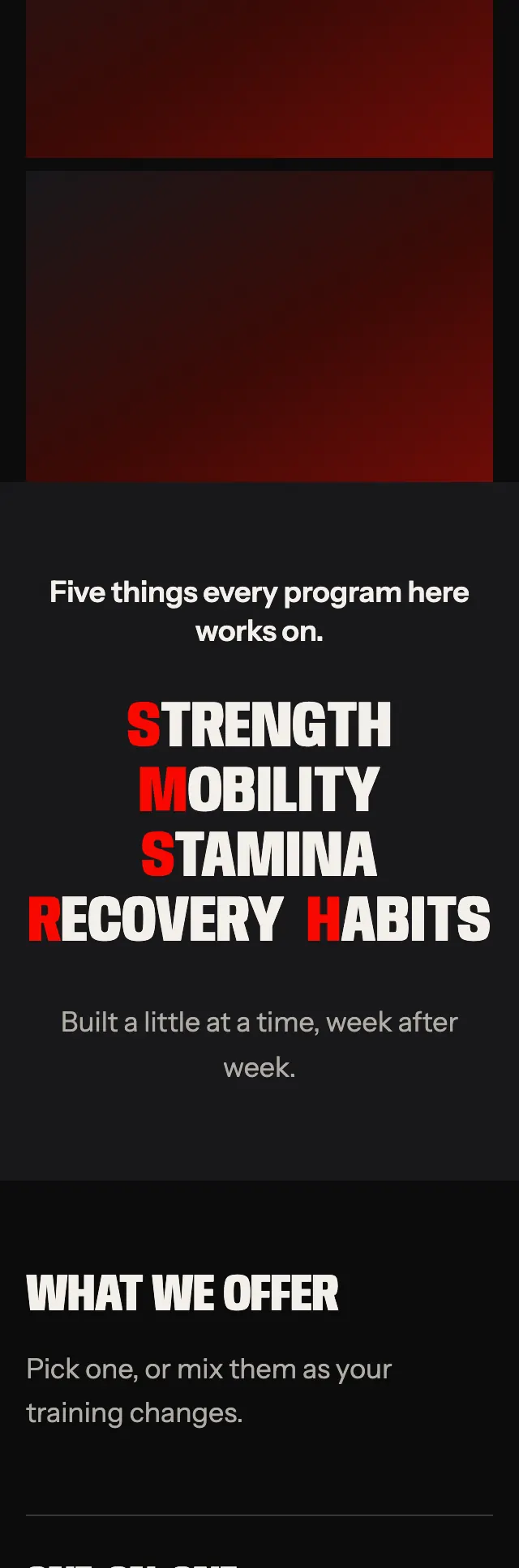
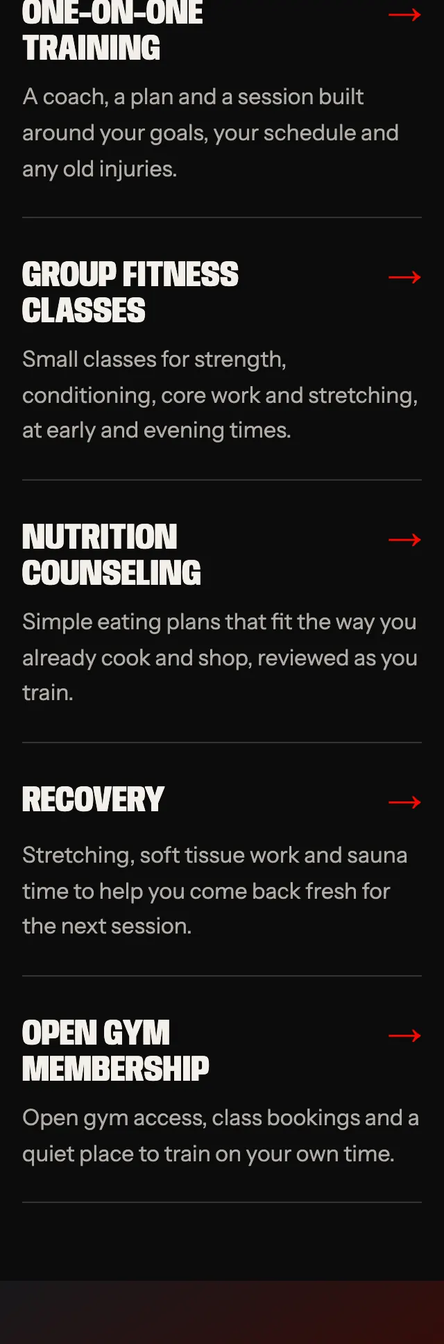
A fitness studio site that lets the type do the lifting, with an oversized condensed headline on near black, a single hot red and a row of five training words that each start in red.
A design concept, not a client site. The name and every detail of the business it was drawn for have been replaced.
The design decisions
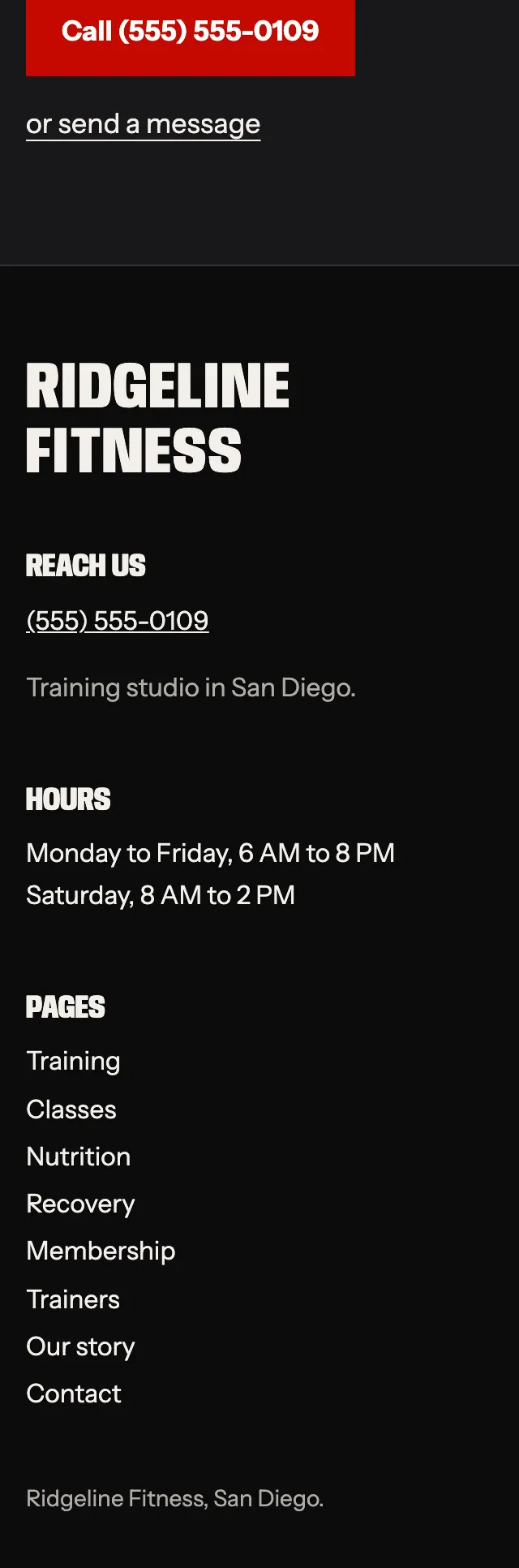
- Anybody, squeezed to a narrow width at a heavy weight and set in capitals, carries the headlines like a stencil on a gym wall, with Instrument Sans for body copy.
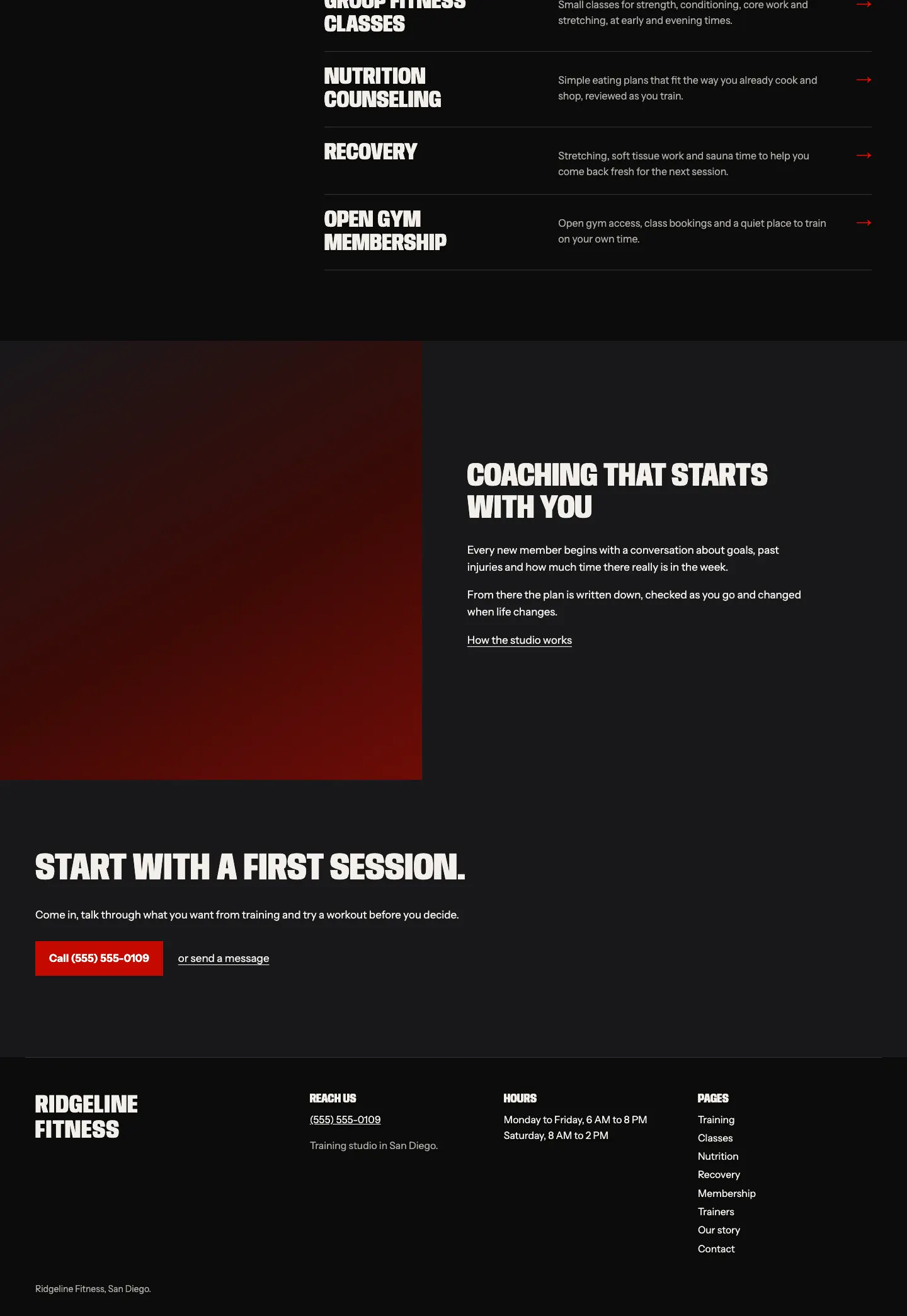
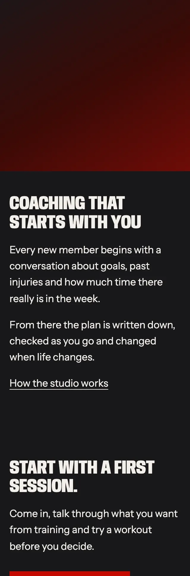
- The palette is near black and a slightly lighter coal for alternating bands, a hot red for buttons, arrows and the first letter of each training word, and a deep ember behind the photo panels.
- The hero is type led: the headline sits on solid ground, then a strip of three photo slots set at their own proportions so the heights line up without cropping.
- Services run as a ruled menu, name in heavy caps, one line of copy and a red arrow, beside a short heading column, then a full bleed photo and text split.
Desktop and mobile