Design concepts · Coffee and cafes
Concept: Drive-thru coffee, Alpine
A drive-thru coffee stop styled like the highway signage you pass on the road into the hills: green guide plates, white borders and a yellow lane line.
A design concept, not a client site. The name and every detail of the business it was drawn for have been replaced.
The design decisions
- Headings, nav, buttons and the address sign are set in Overpass, a face drawn from US highway sign lettering, with Lato for reading text.
- The palette is highway sign green, a sun yellow and white, with the yellow used for the dashed lane line, buttons and the second wordmark word.
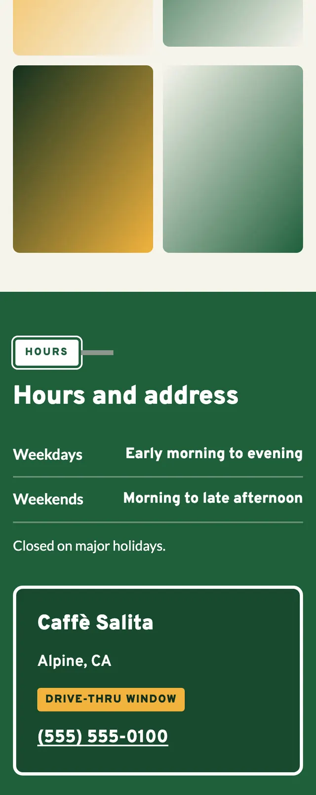
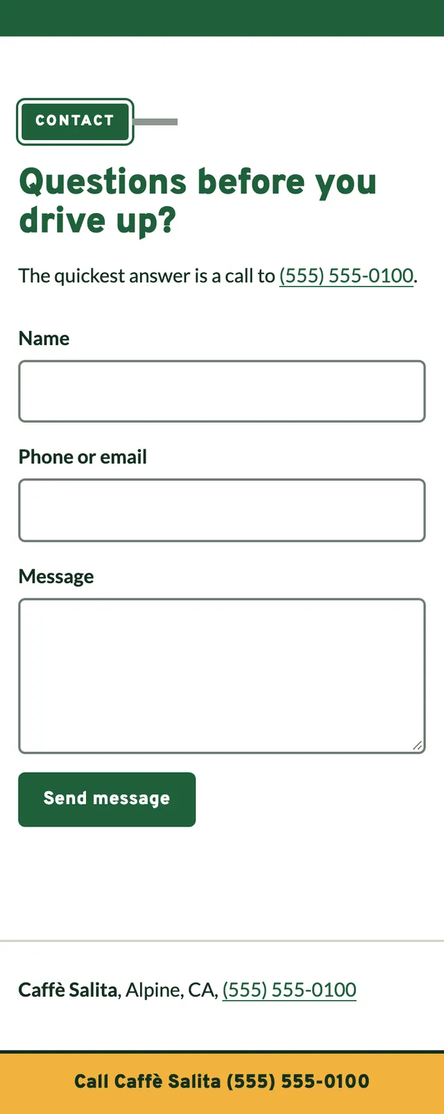
- Each section is marked by a mile marker post, a narrow green plate on a grey post lettered vertically with a word, which sits in the left gutter on desktop and lies flat above the heading on mobile.
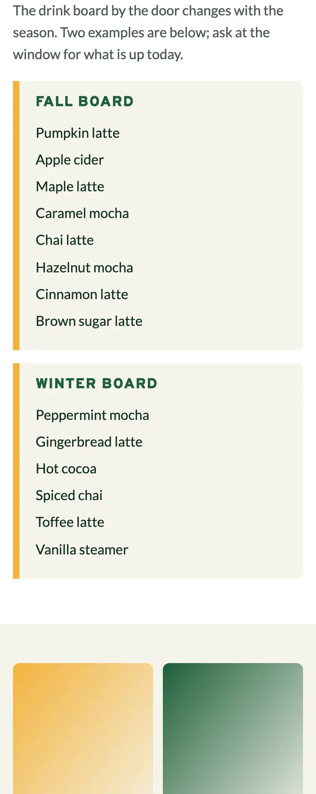
- The page alternates a full bleed green hero, a white menu with seasonal board lists, a paper band of four photos at staggered heights, a green hours band with an address guide sign, and a two column contact form, with a yellow call bar pinned on phones.
Desktop and mobile