Design concepts · Construction
Concept: Commercial contractor, San Diego
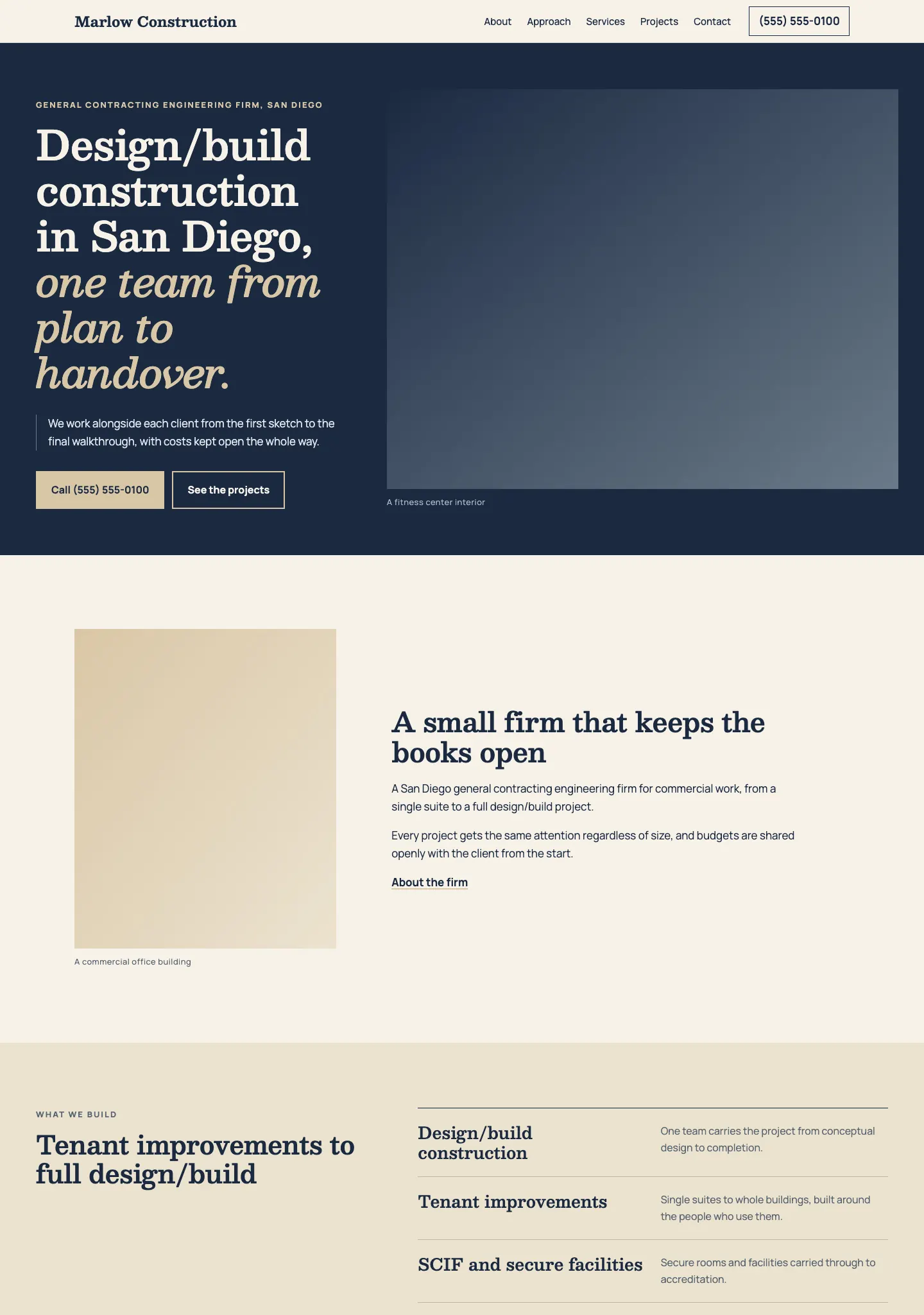
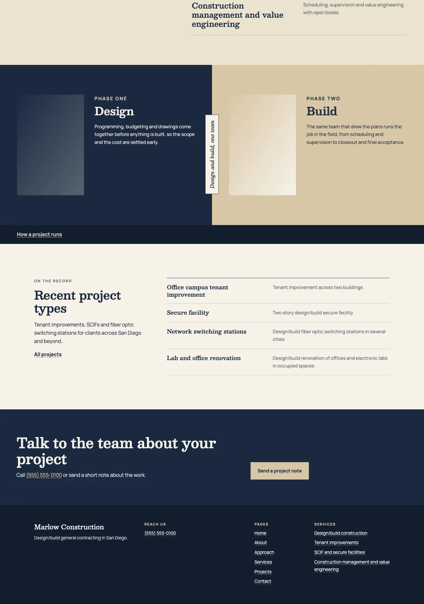
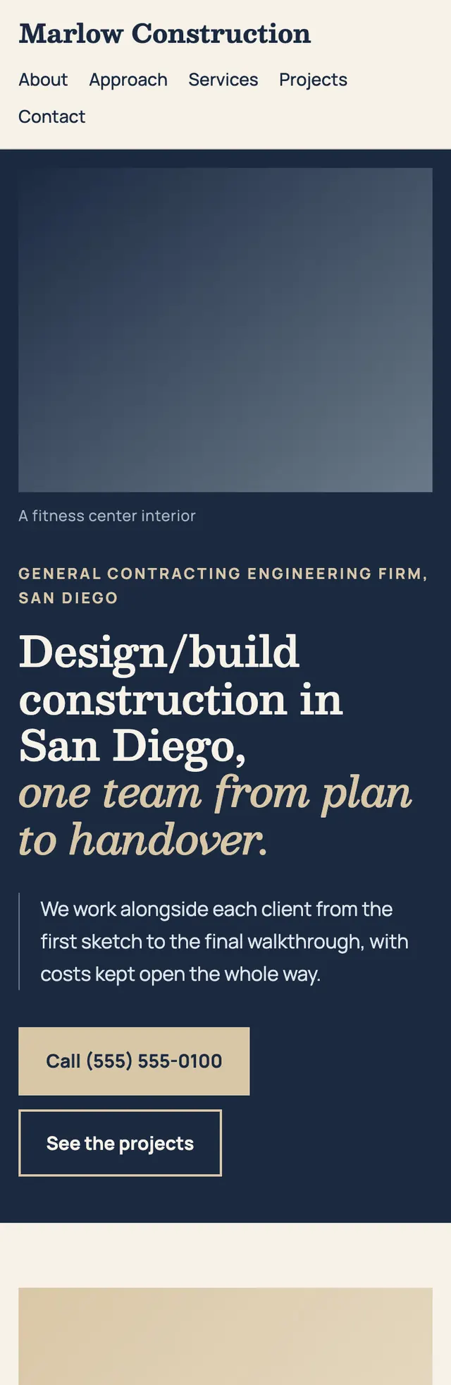
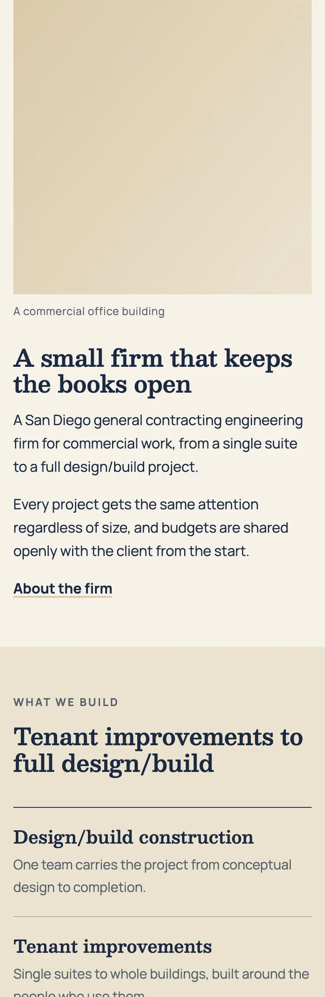
Every structural choice is a pairing of two halves, two typefaces and two tones, so the page reads as a partnership between the builder and the client.
A design concept, not a client site. The name and every detail of the business it was drawn for have been replaced.
The design decisions
- Besley carries the headings and the italic second half of the hero line for an established, engineered voice, while Manrope handles body text and small labels.
- The palette is a deep navy for the firm against a warm sandstone for the partner, with paper and soft sand tints between them and a steel gray reserved for rules and labels.
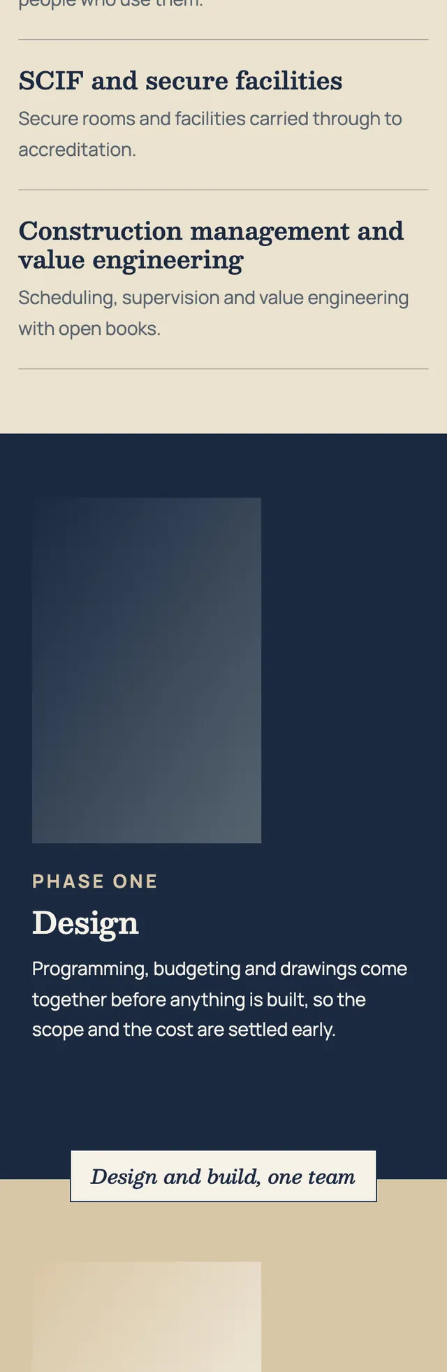
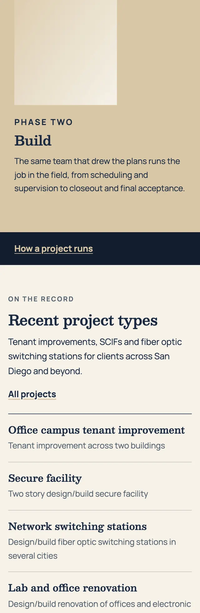
- The signature block is a full bleed split, navy on one side and sandstone on the other, with a label set vertically across the seam on desktop that drops onto a horizontal seam between the stacked halves on mobile.
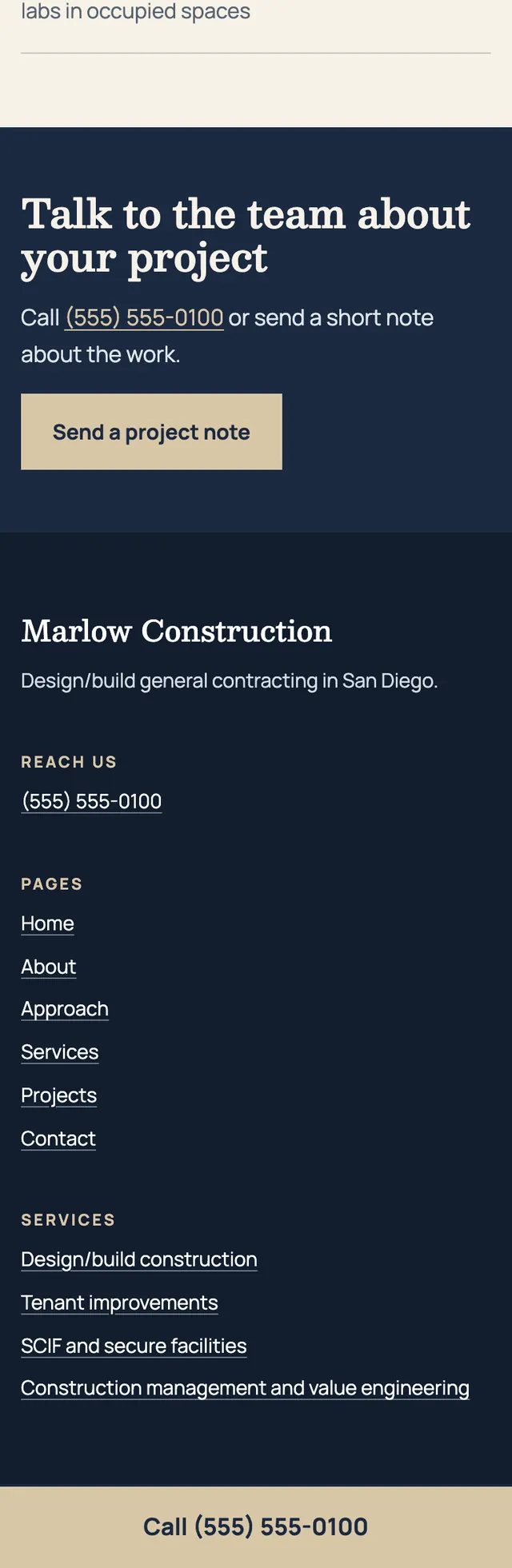
- Sections change width and alignment as the page descends: an offset photo and text intro, a sticky heading beside a ruled service list, a ledger of project types with a narrow head column, then a left aligned call band with the button on the right.
Desktop and mobile