Design concepts · Coffee and cafes
Concept: Coffee shop, Santee
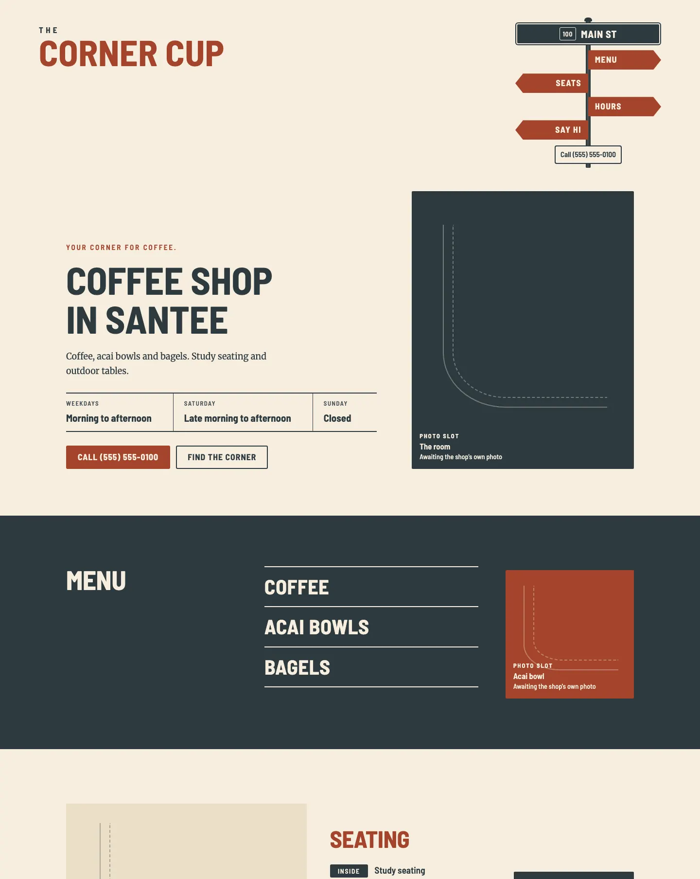
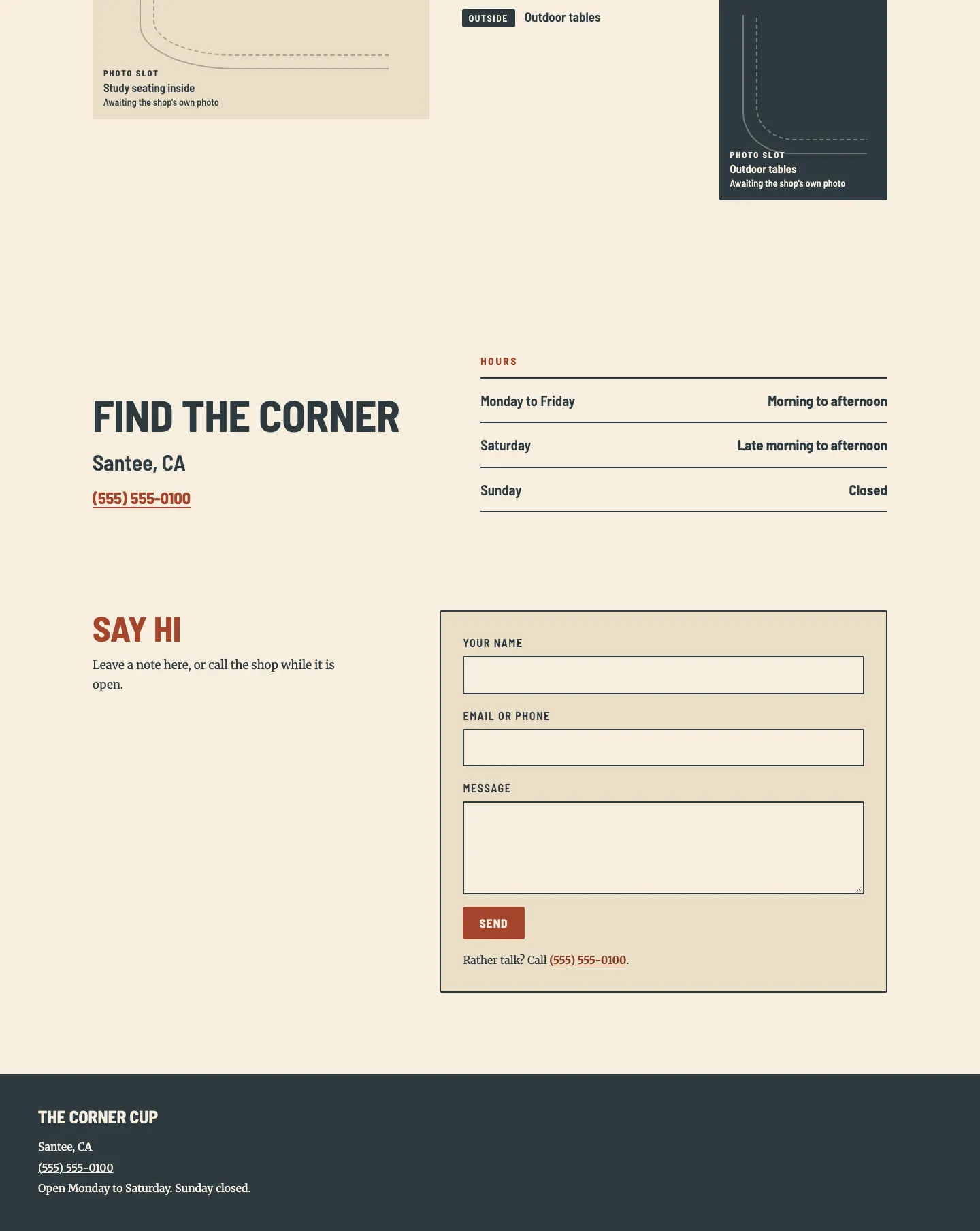
A shop named for a corner, built like one: a street sign, curb lines and sign lettering hold the things a regular looks for, such as the hours and the phone.
A design concept, not a client site. The name and every detail of the business it was drawn for have been replaced.
The design decisions
- Barlow Semi Condensed, mostly uppercase, plays the street sign lettering for the wordmark, headings, hours and labels, set against Merriweather as the warm body serif.
- The palette is brick for sign blades and buttons, a cream sidewalk ground, and a slate street color for text, the sign post, the menu band and the footer.
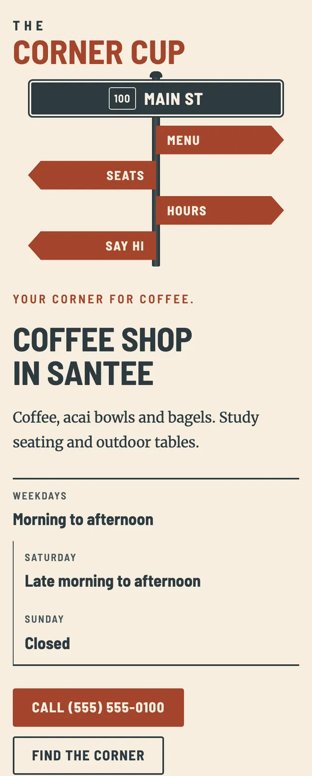
- The navigation is a street corner sign: a slate post with a street blade on top and brick fingerpost blades for each section pointing alternately left and right, which stays centered under the wordmark on phones.
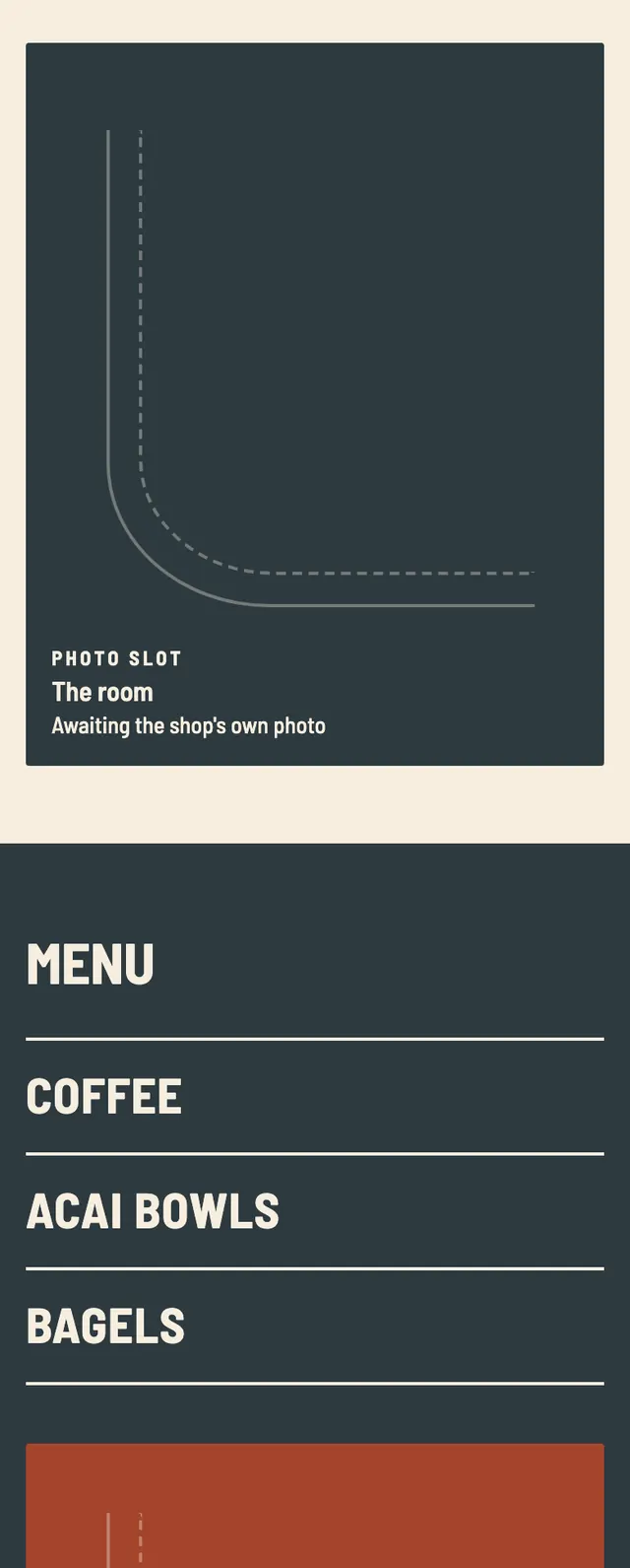
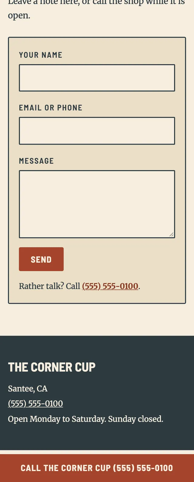
- Every photo position is a palette colored frame with two curb lines meeting at a corner, and the page moves from a split cream hero to a full bleed slate menu band, offset seating frames, a visit block and a form, with a brick call bar pinned on phones.
Desktop and mobile