Design concepts · Coffee and cafes
Concept: Coffee and dessert shop, San Diego
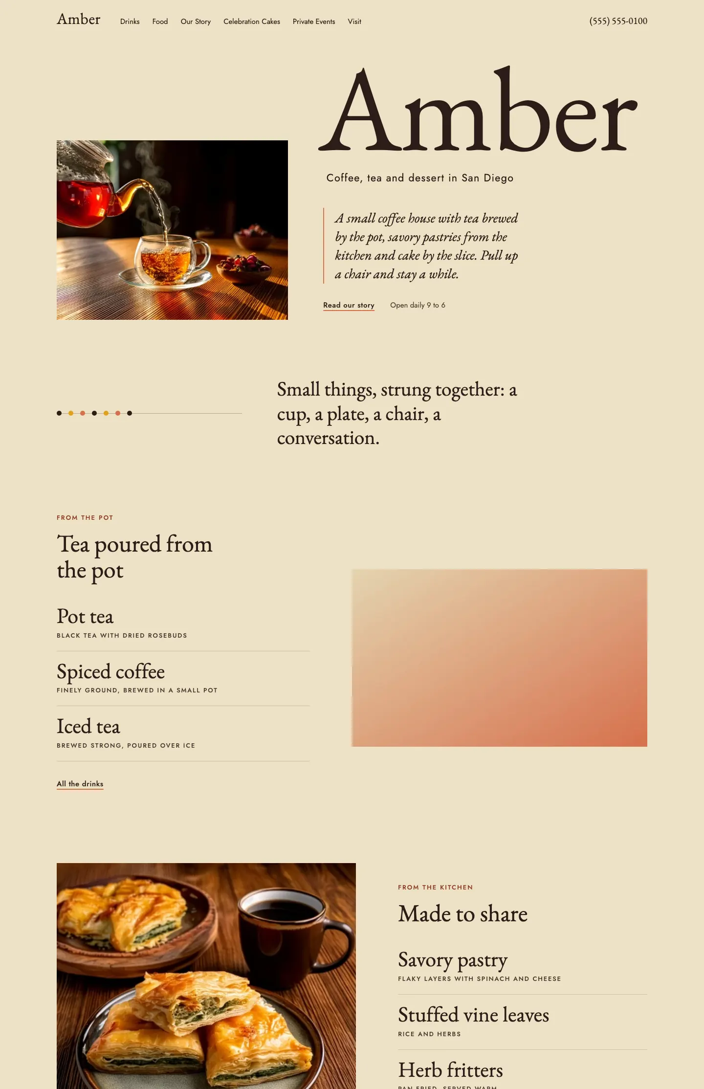
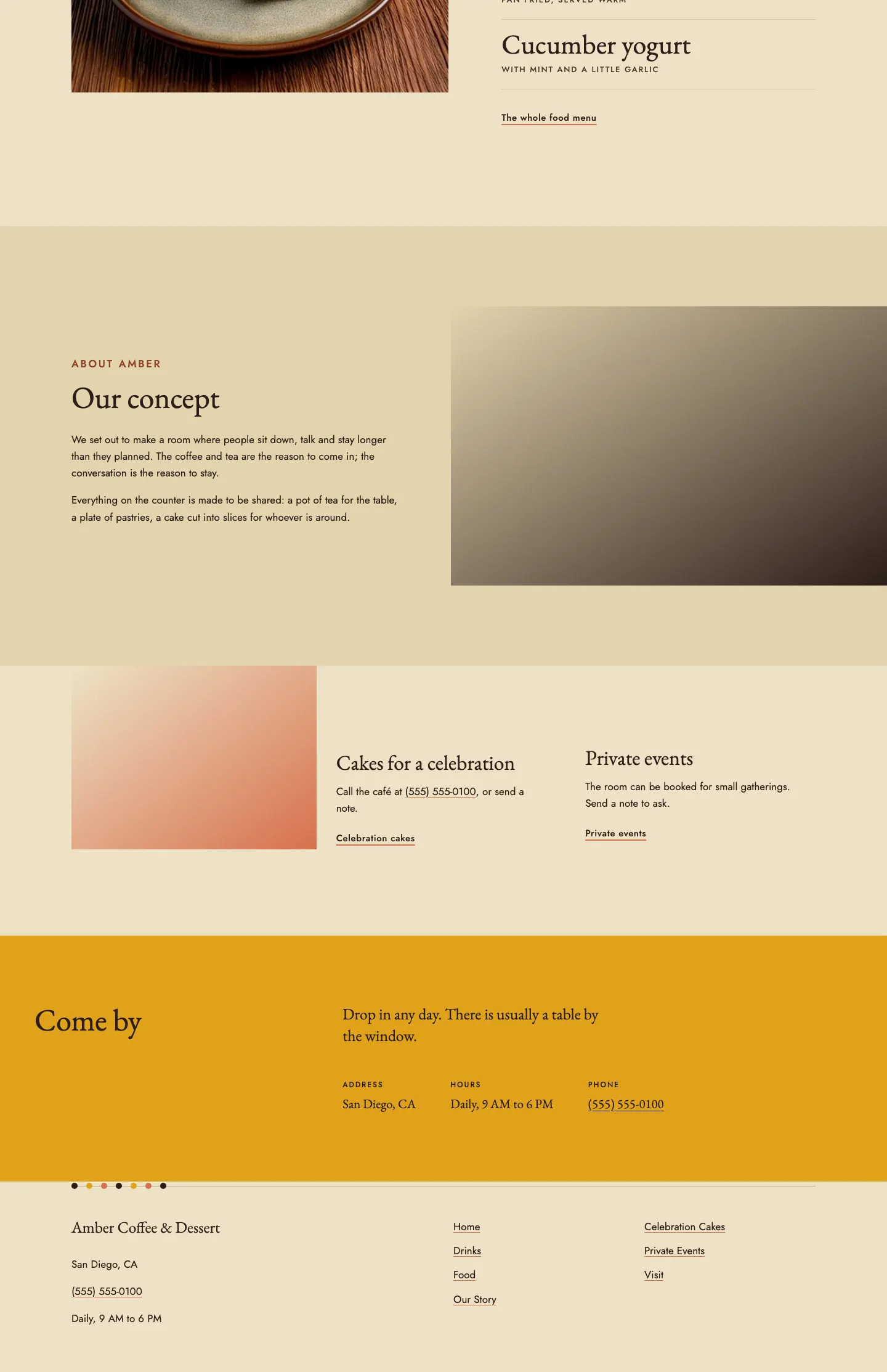
An essay paced cafe site that reads like a printed menu card, where each item's name is set large in a classical serif with a small capital descriptor beneath and sections are divided by a string of colored beads.
A design concept, not a client site. The name and every detail of the business it was drawn for have been replaced.
The design decisions
- EB Garamond carries the giant wordmark, item names and headings in regular and italic, paired with Jost for descriptors, navigation and body copy.
- The palette is a warm parchment ground with a deeper parchment for frames, near black ink, a saffron band for the visit section and a terracotta accent for underlines and beads.
- Sections alternate measure and offset, from a narrow pull line beside the bead rule to wide splits that flip the photo side, and no heading is centered.
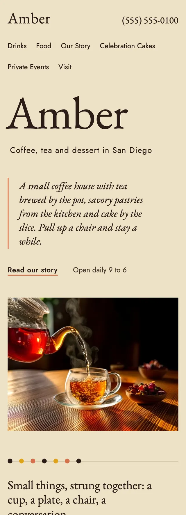
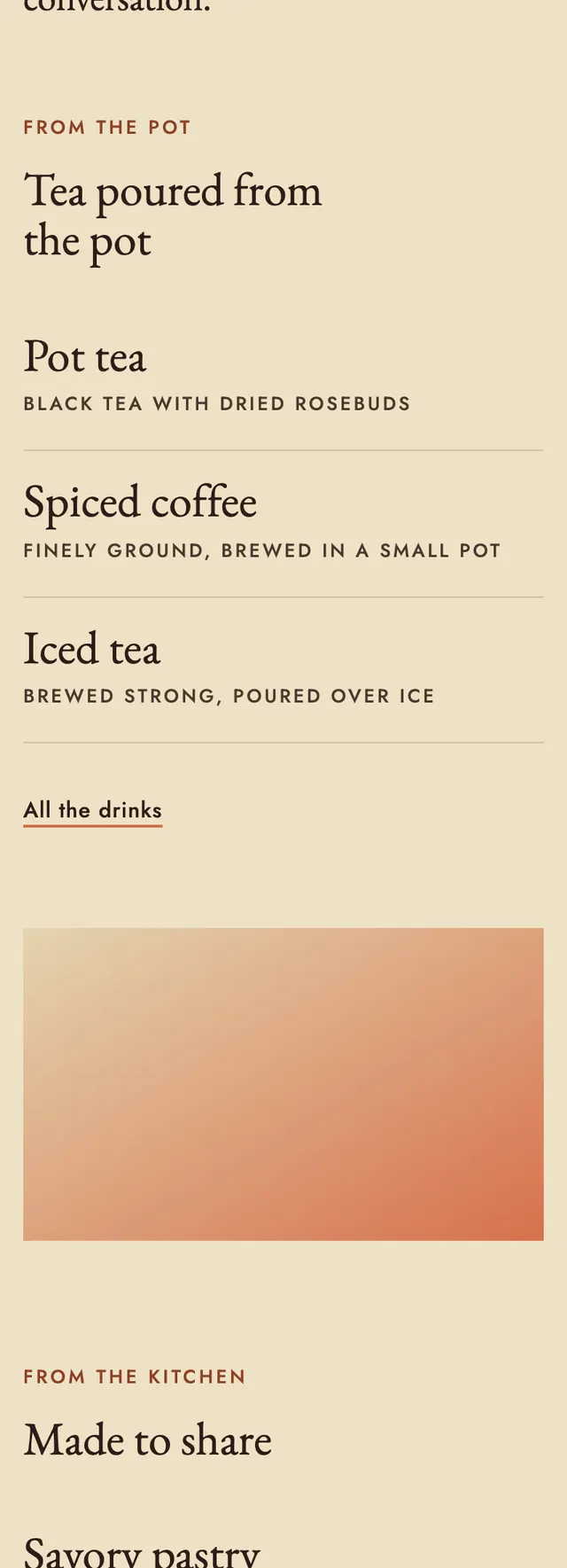
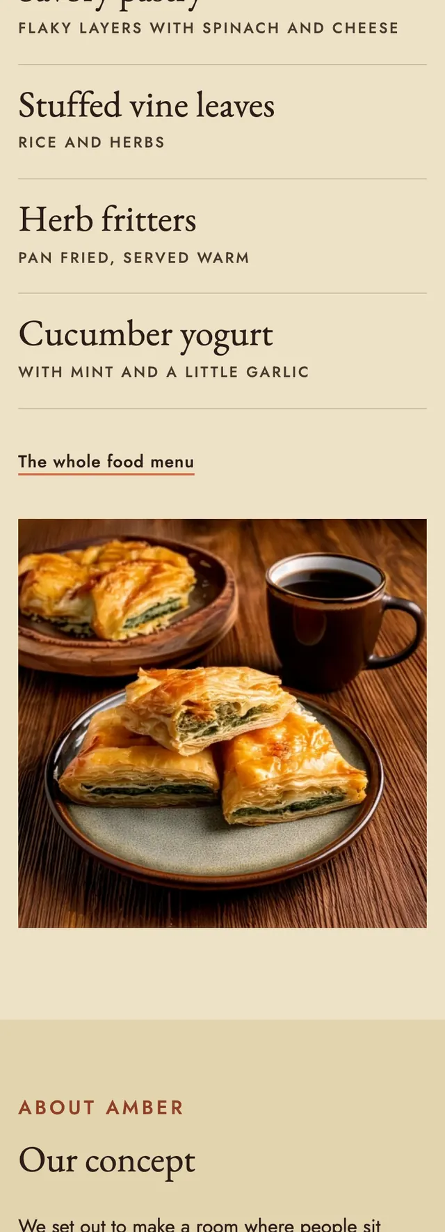
- Photos sit at their native ratio in frames that reserve exactly that ratio with no text over them, and on phones the wordmark leads, the photo follows and a fixed call bar sits at the bottom.
Desktop and mobile