Design concepts · Coffee and cafes
Concept: Coffee shop, San Diego
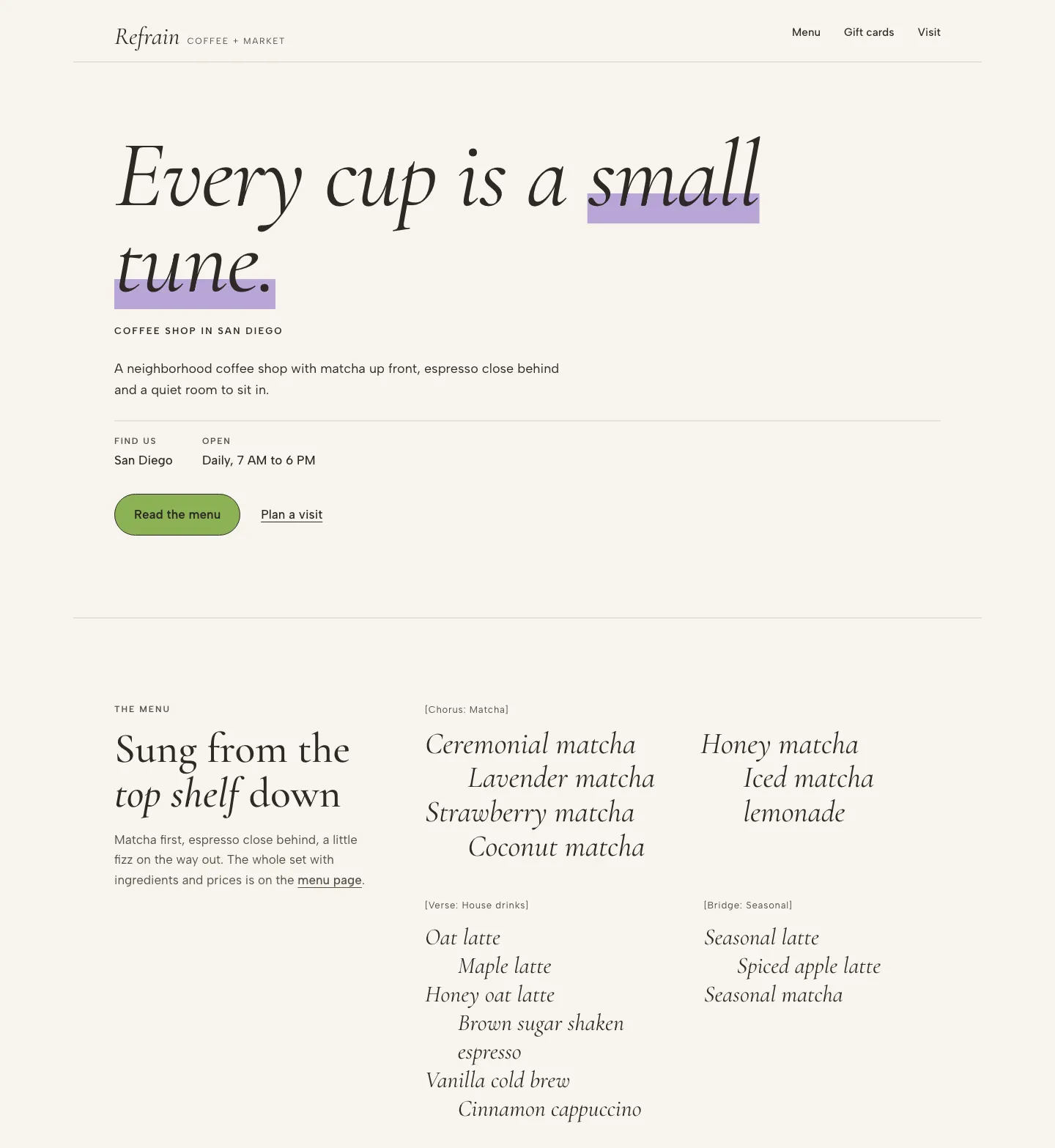
A matcha forward coffee shop site that treats the menu as a song, setting drink names as indented lyric lines under bracketed verse and chorus tags.
A design concept, not a client site. The name and every detail of the business it was drawn for have been replaced.
The design decisions
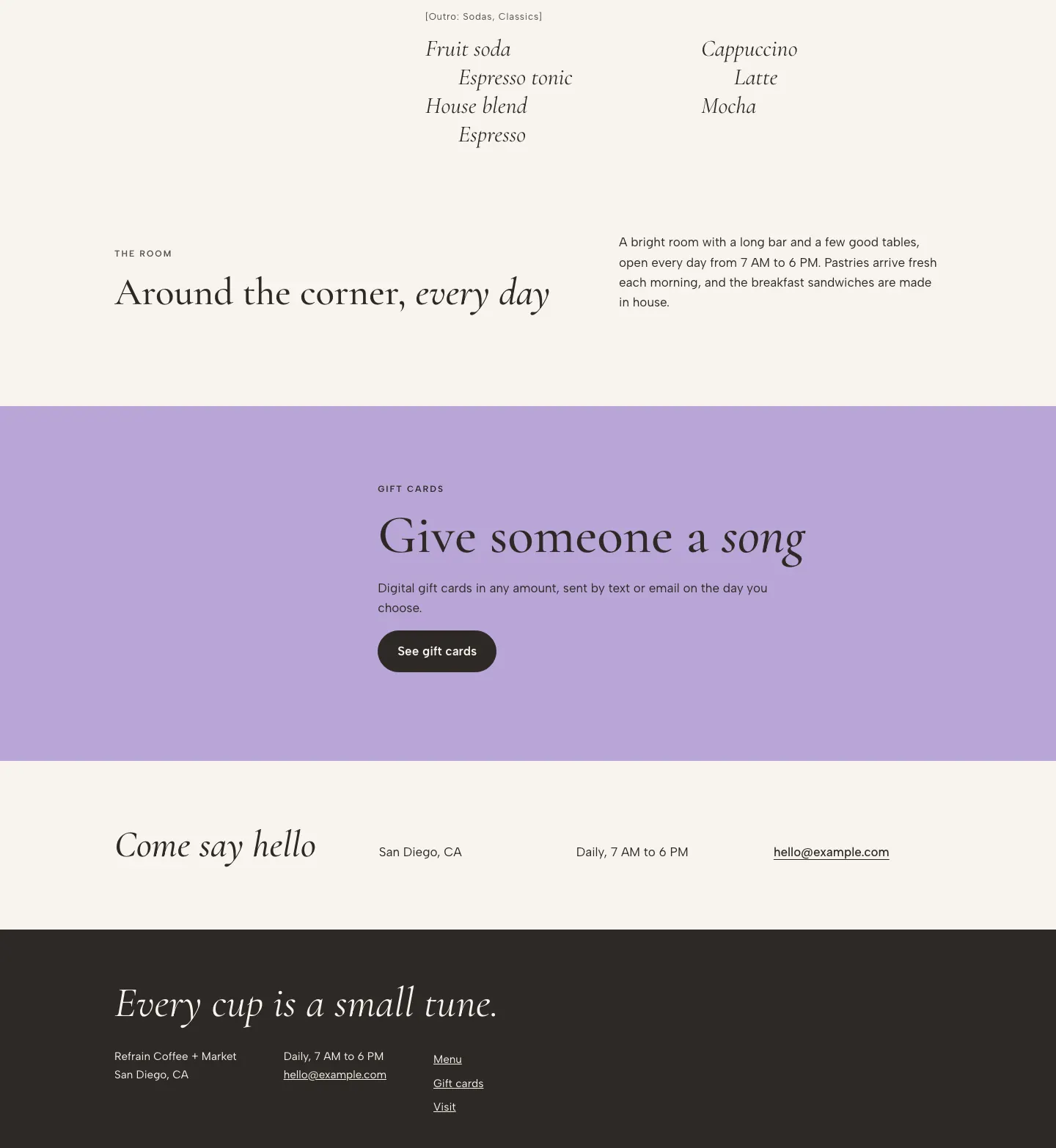
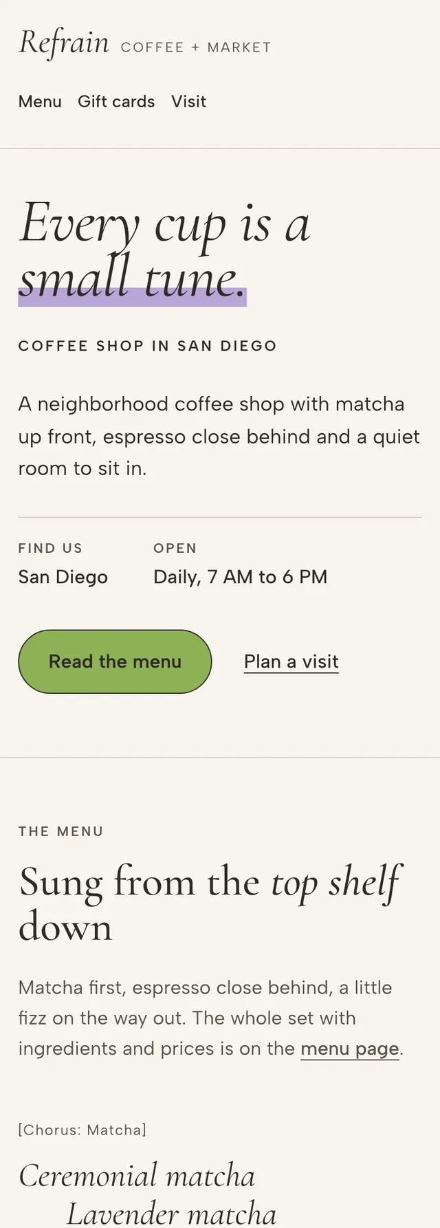
- Cormorant Garamond italic carries the hero line, drink names and section heads, paired with Albert Sans for body copy, labels and buttons.
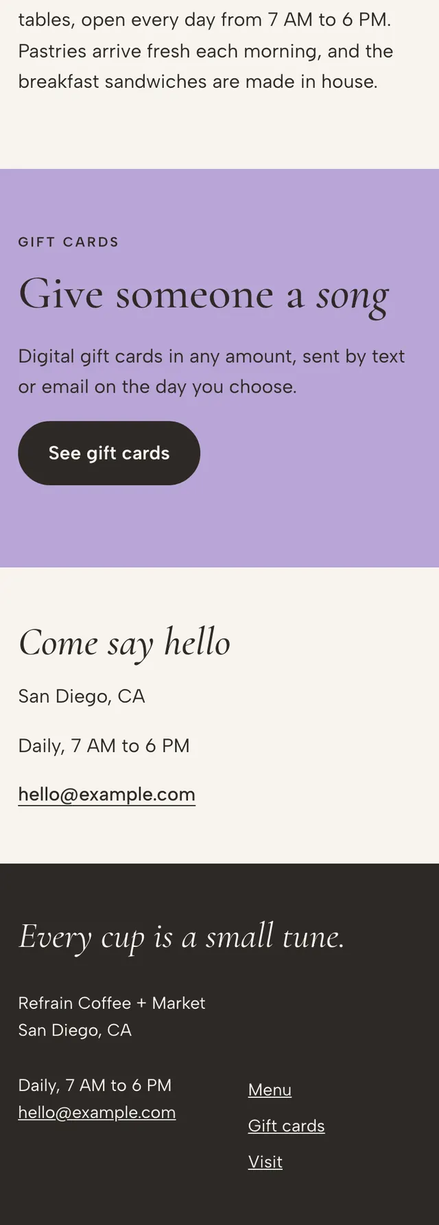
- The palette is cream paper with a matcha green for buttons and a flat lavender used only as a hard edged highlight bar under the key hero words and as a full bleed gift card band.
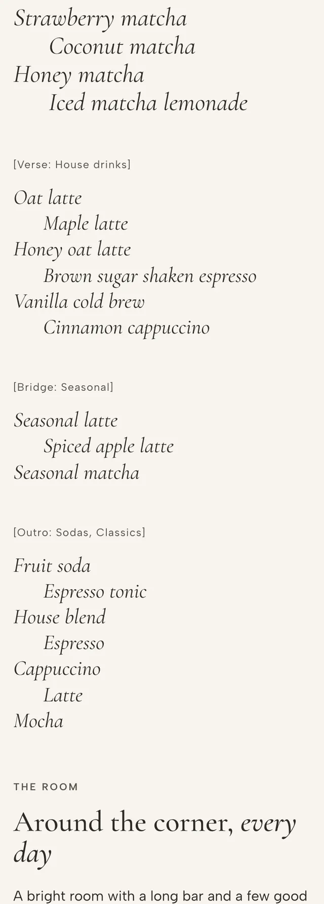
- The home menu is a lyric sheet: a narrow intro on the left and a wide sheet on the right where the chorus spans two columns and the verse and bridge sit side by side.
- Section widths and alignments shift as you scroll, headings stay left aligned, and on smaller screens everything collapses to one column with the lyric lines keeping their alternating indent.
Desktop and mobile