Design concepts · Coffee and cafes
Concept: Coffee shop, San Diego
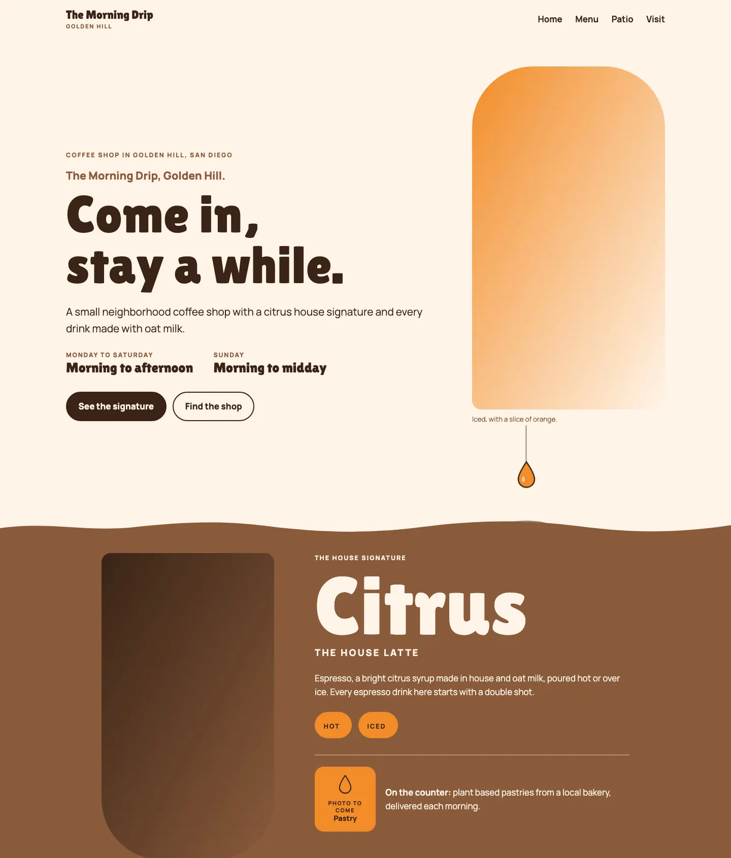
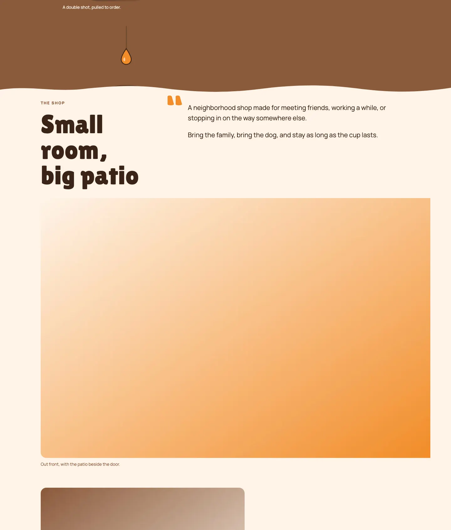
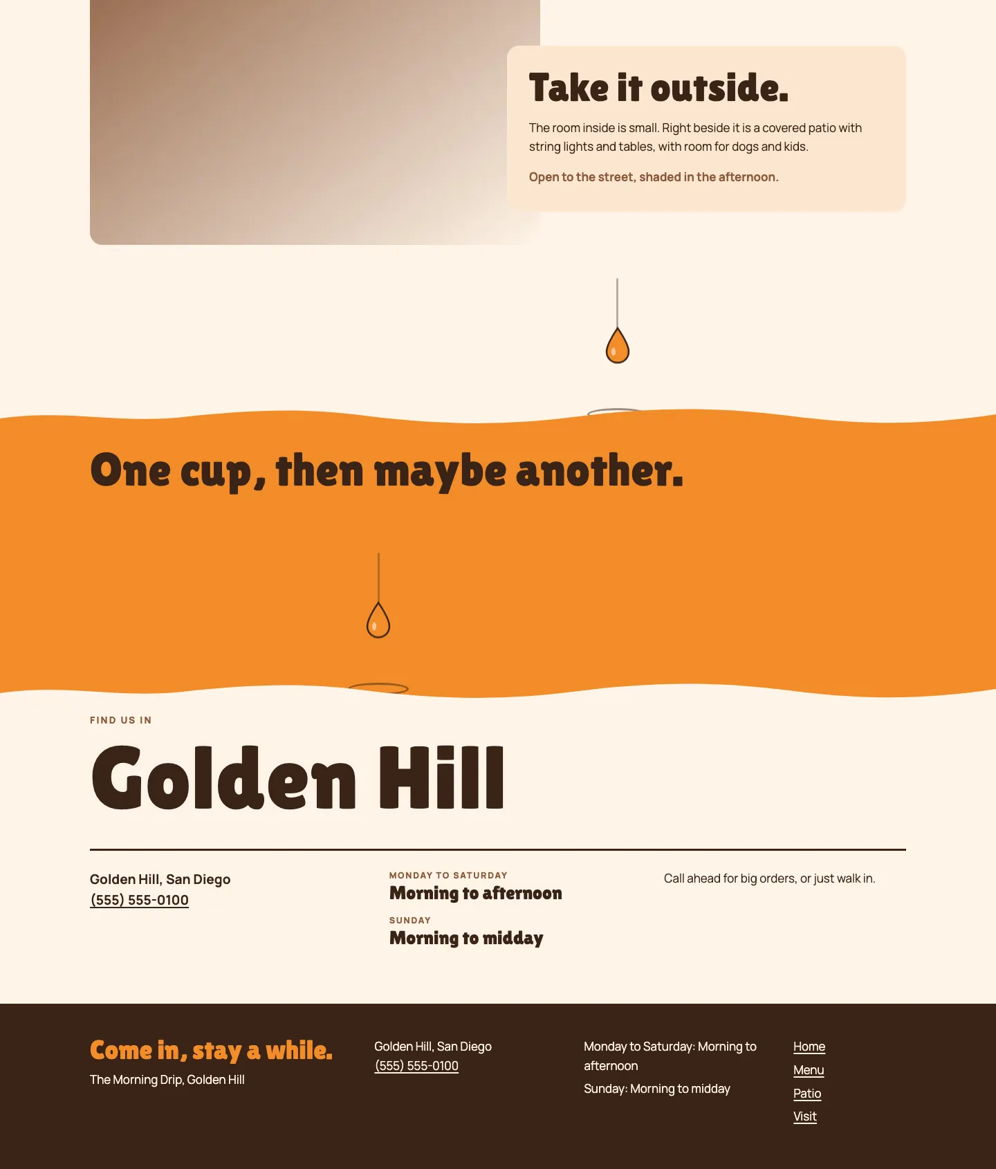
A single orange drop falls down the page between sections and lands on a wavy edge, so the whole site reads as one drip of coffee finding the cup.
A design concept, not a client site. The name and every detail of the business it was drawn for have been replaced.
The design decisions
- Lilita One, round and heavy like hand painted sign lettering, sets the display type against Manrope for body text and labels.
- The palette is a bright orange, a brown sugar for section grounds, an oat milk cream for the page and a deep brown ink so every text pair passes contrast.
- Between sections an orange drop falls along a thin stream on scroll and lands on a wavy section edge with a small splash ring, and it hangs still mid fall under reduced motion.
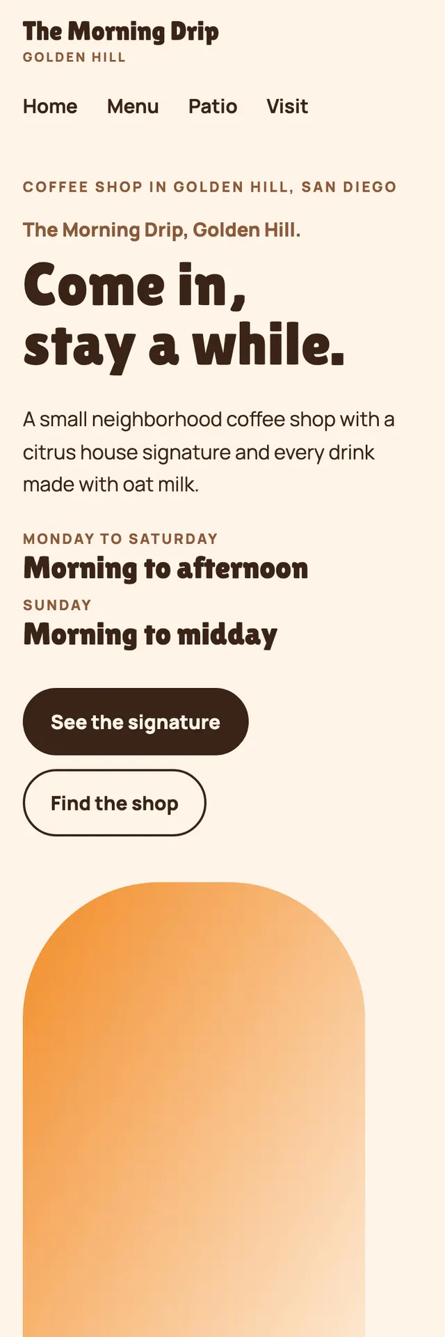
- Grounds alternate cream, brown sugar, cream, orange and cream while widths change, from a split hero with a dome topped photo frame to a centered signature pair, a photo that runs to the right edge, a patio photo with an overlapping card and a visit block with the neighborhood set huge.
Desktop and mobile