Design concepts · Coffee and cafes
Concept: Coffee shop, San Diego
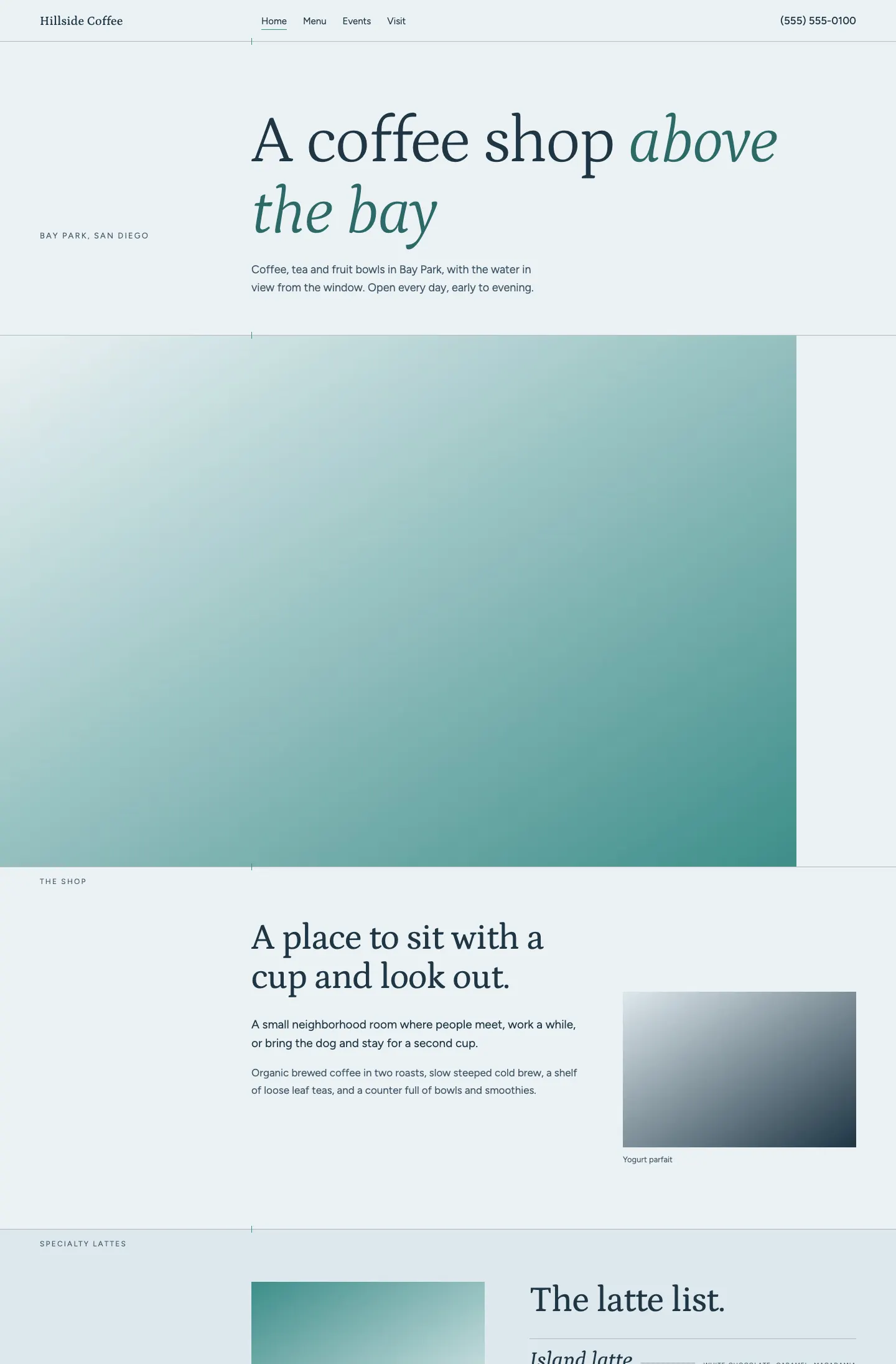
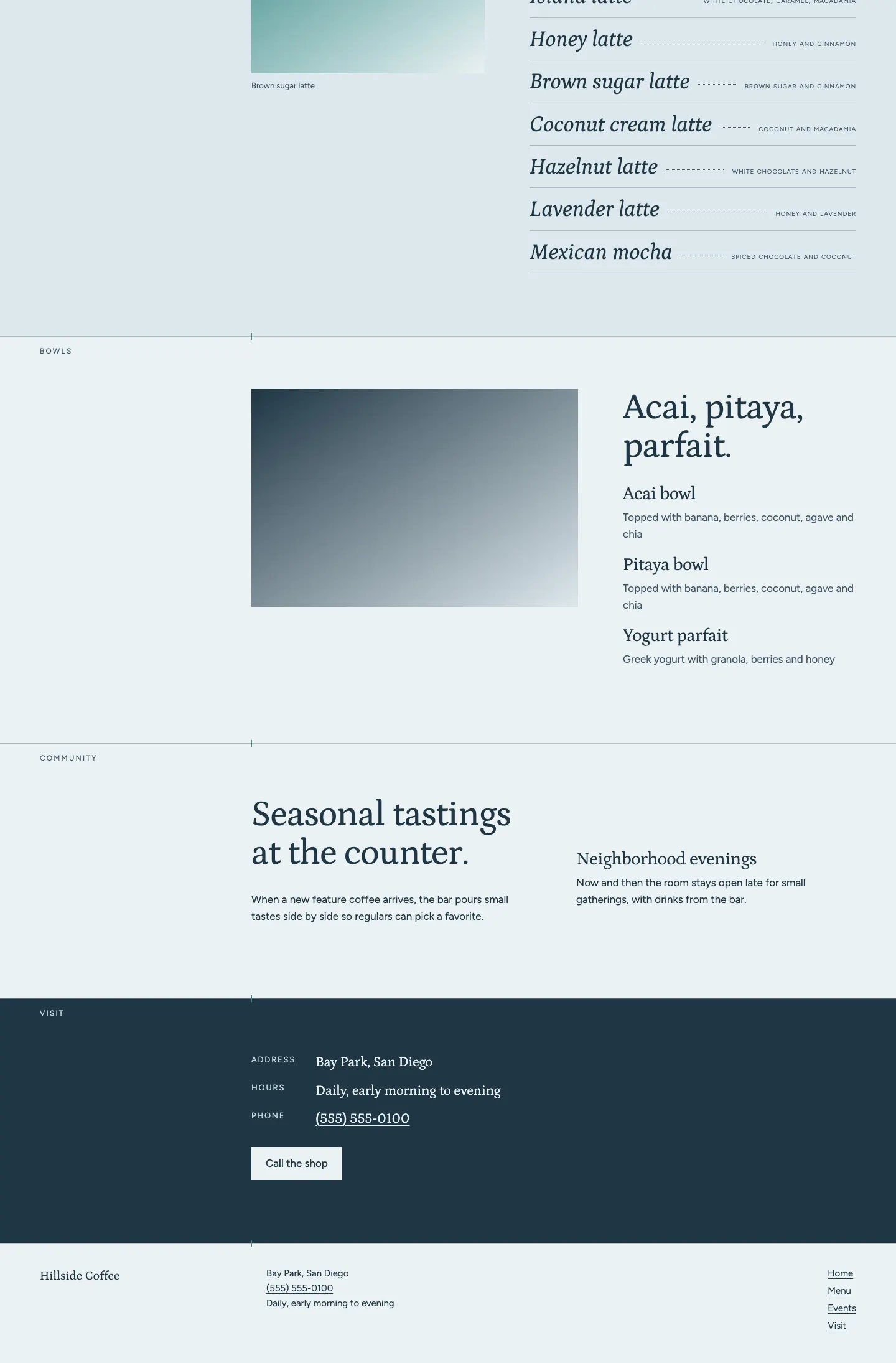
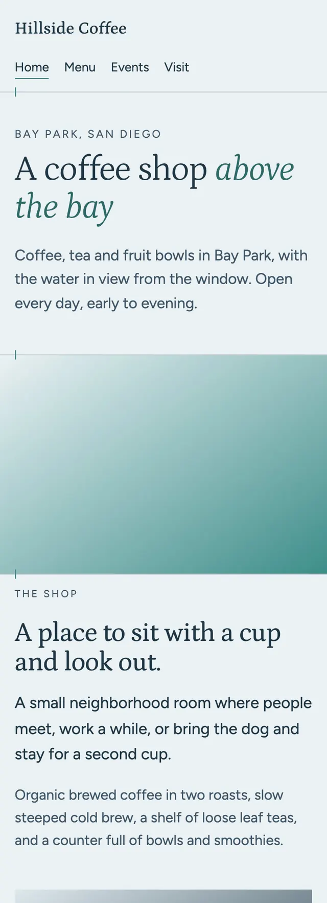
A neighborhood shop with a view of the water, laid out like the view from its window: a pale hazy sky, one long horizon line, and the deep bay below.
A design concept, not a client site. The name and every detail of the business it was drawn for have been replaced.
The design decisions
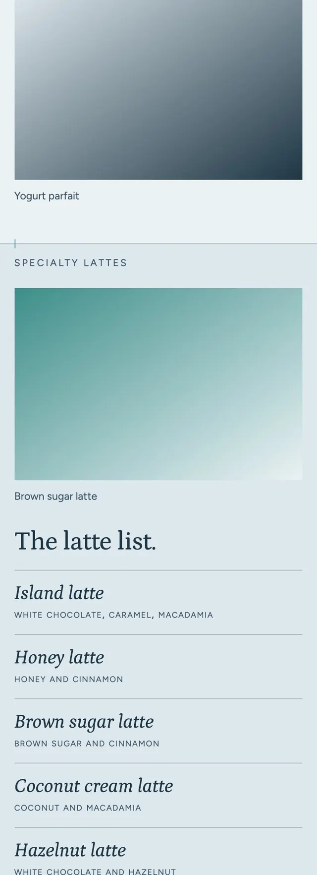
- Petrona carries the display type, light for headlines and italic for drink names, paired with Figtree for body text.
- The palette is a bay haze ground with a deeper mist for alternating bands, a bay navy for ink and dark bands, and a teal accent darkened where it carries text.
- A thin horizon line runs under the nav with a short tick marking a shared axis, and every band opens on its own hairline horizon with its small caps label sitting on the line and its content starting on that axis.
- The latte list is set as a parlor menu of italic names with thin leaders to their flavor notes, and bands change weight from a long text story to the list, a bowls split, staggered community notes and a navy visit band, with a call bar pinned on phones.
Desktop and mobile