Design concepts · Coffee and cafes
Concept: Coffee and surf shop, San Diego
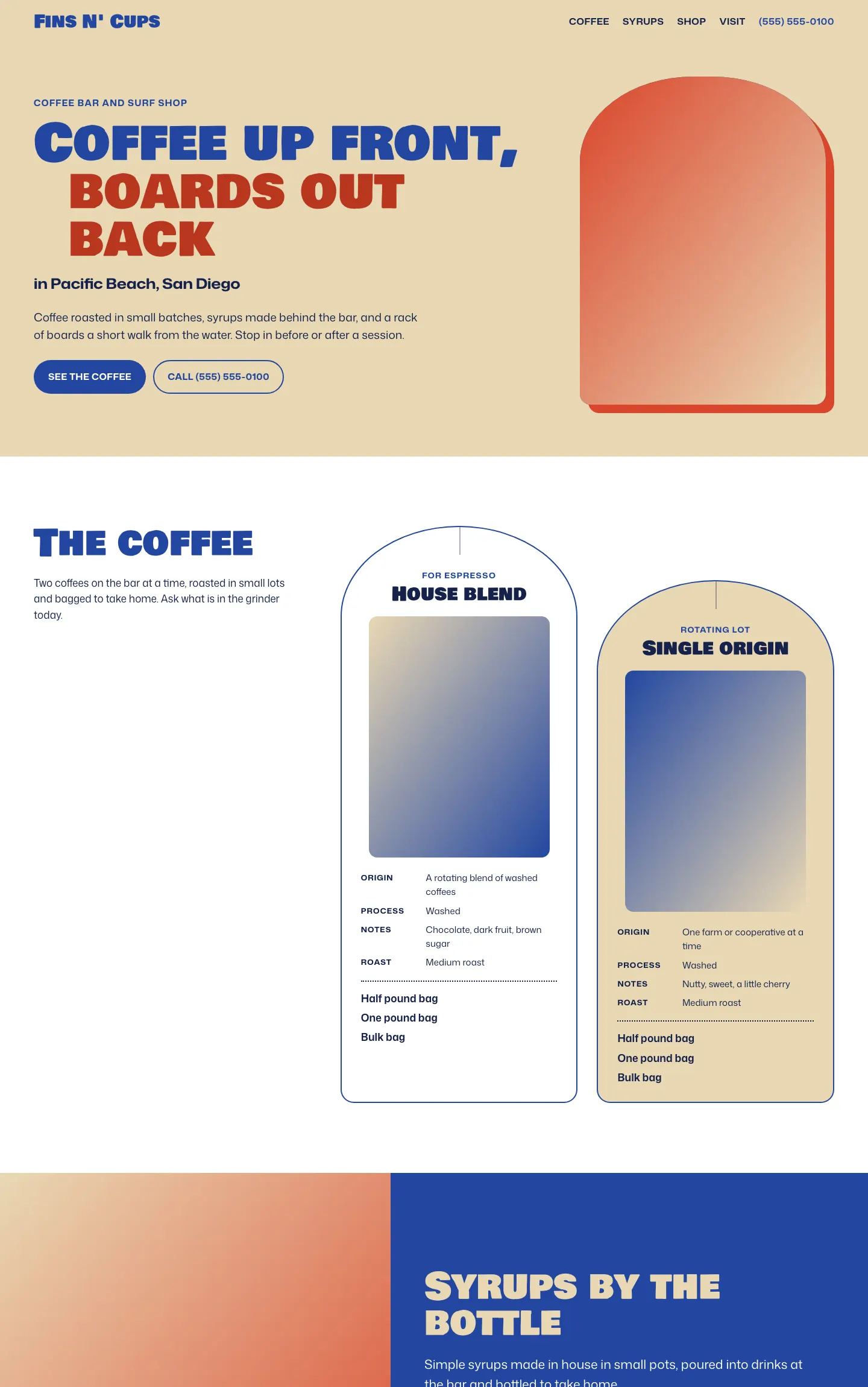
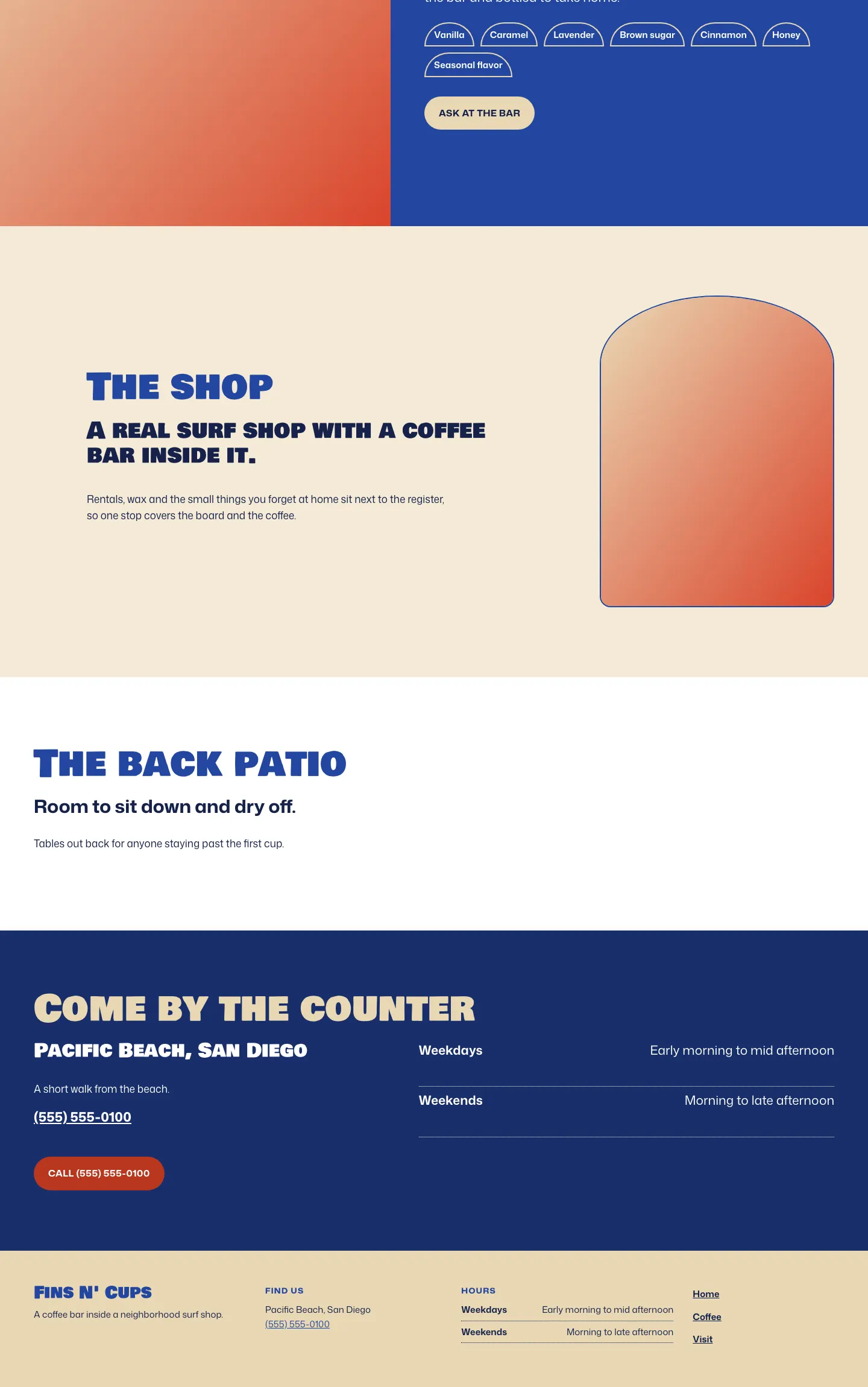
A surf shop that happens to pour coffee, so the cards, tags and frames all borrow the rounded nose and center stringer of a surfboard.
A design concept, not a client site. The name and every detail of the business it was drawn for have been replaced.
The design decisions
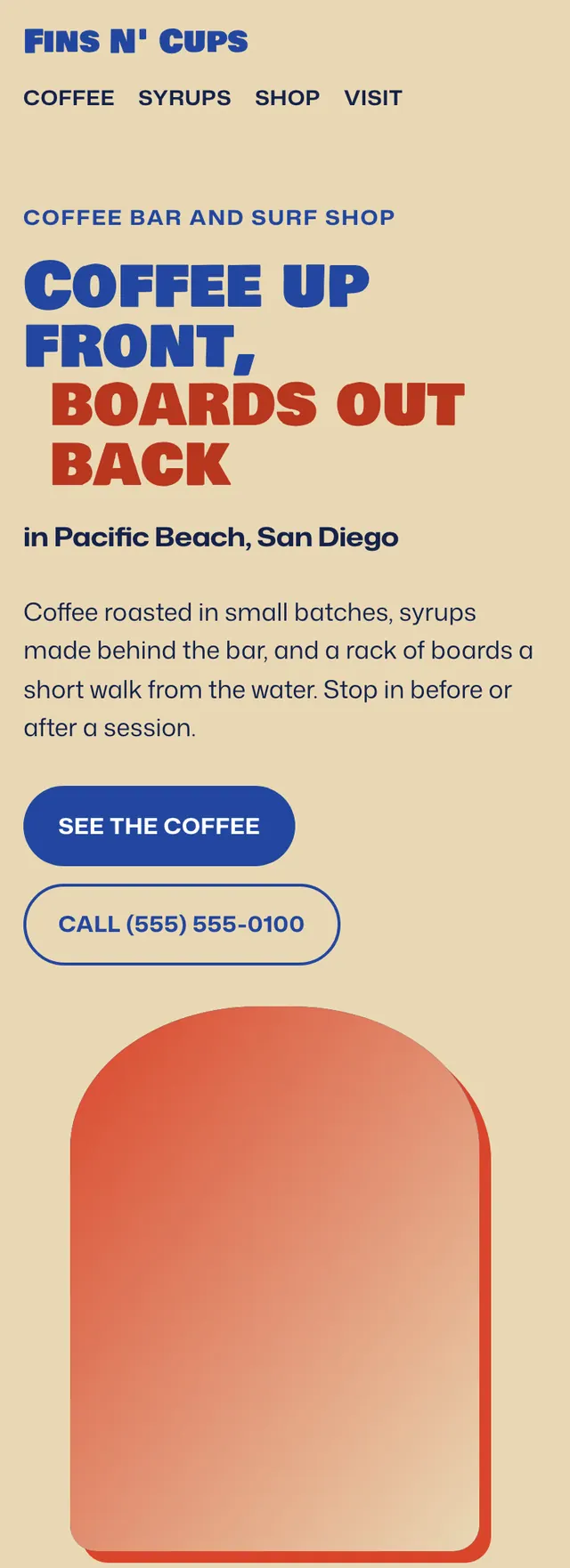
- Display type is Bowlby One SC in stacked heavy lines, paired with Mona Sans using its width axis for running text.
- The palette is an ultramarine, a fin red and a board deck tan on white, with deeper versions of the blue and red where text needs contrast.
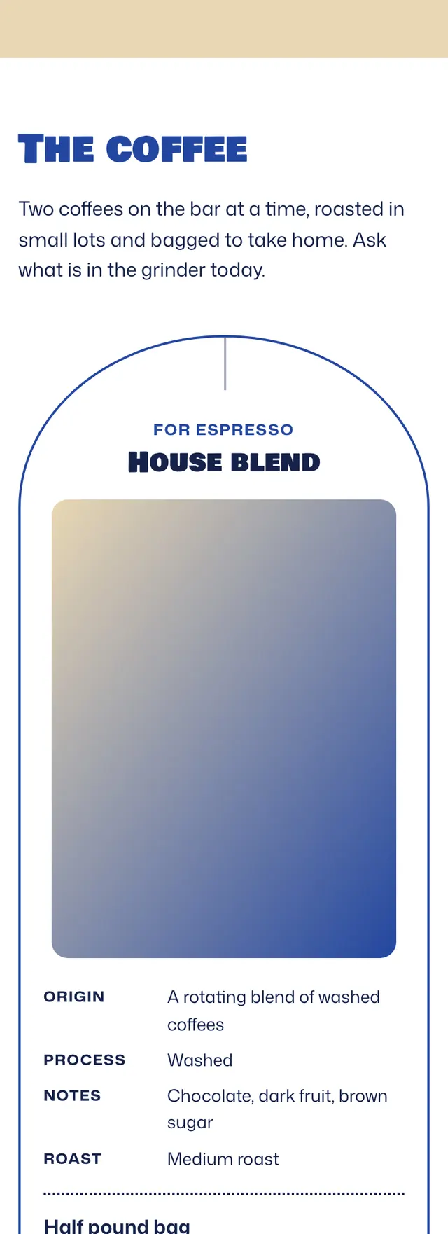
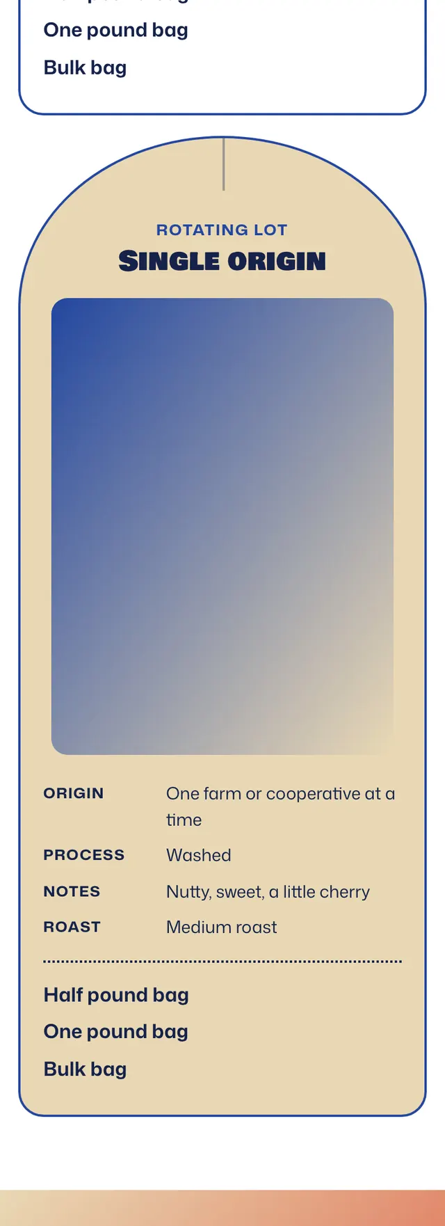
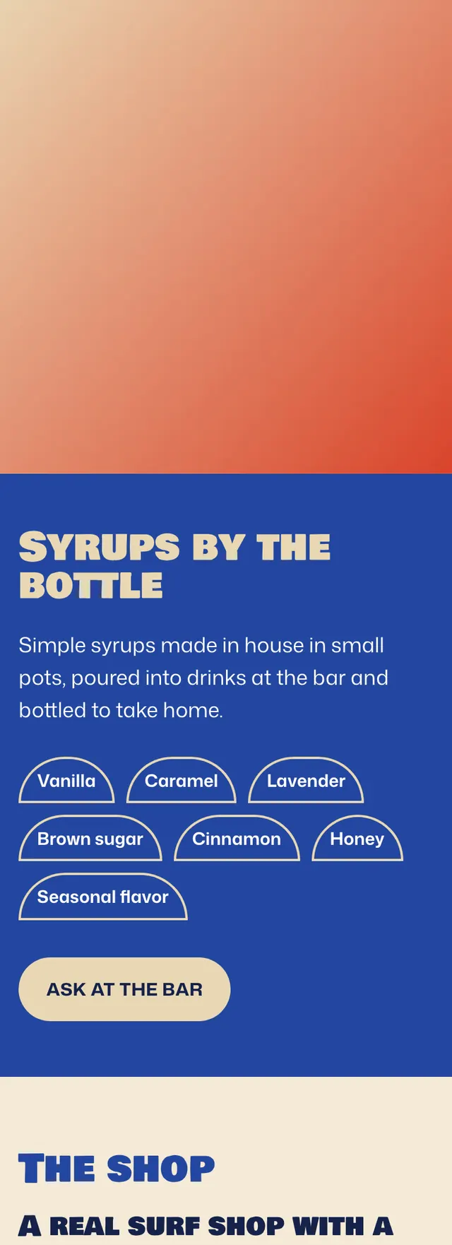
- Coffee cards are drawn as surfboard noses with an elliptical top, a square tail and a thin stringer line, hung at staggered heights like boards on a rack, and syrup flavors sit in small nose shaped tags.
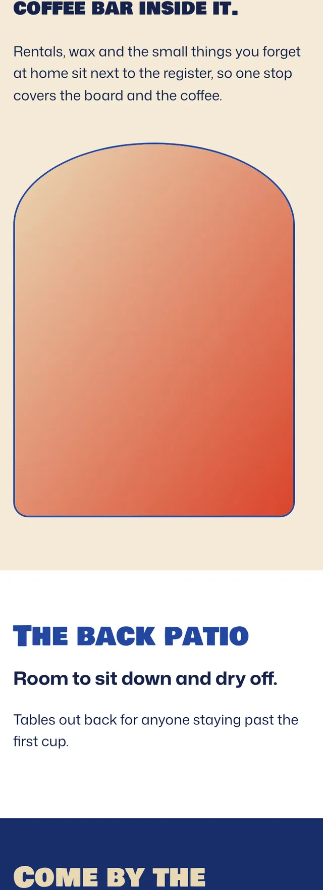
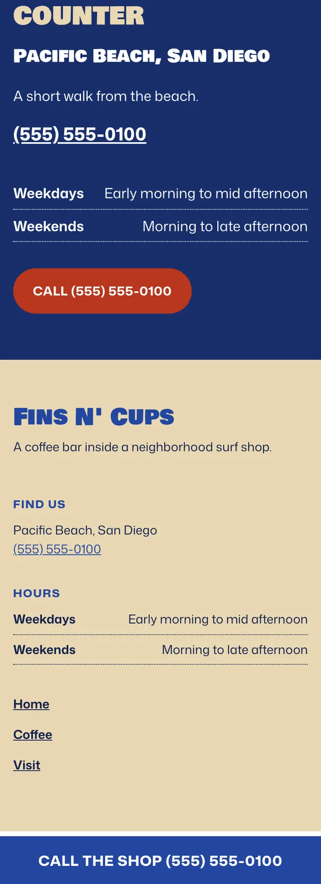
- Each band changes ground and column split, moving from tan to white to a full ultramarine syrup band to soft tan, white and deep blue, and on phones the sections stack under a call bar pinned to the bottom.
Desktop and mobile