Design concepts · Coffee and cafes
Concept: Coffee shop, El Cajon
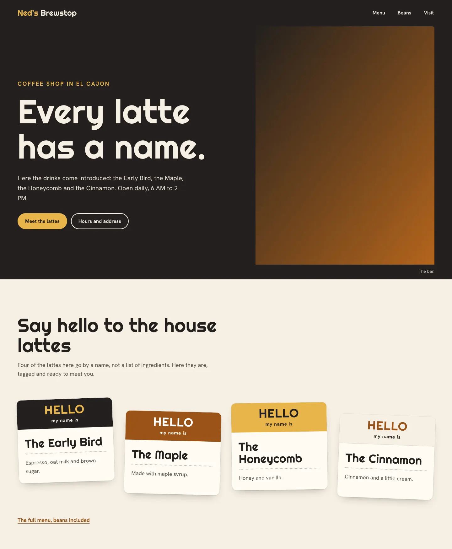
A neighborhood coffee shop site where the house lattes are introduced like guests at a mixer, each on its own stick on name tag.
A design concept, not a client site. The name and every detail of the business it was drawn for have been replaced.
The design decisions
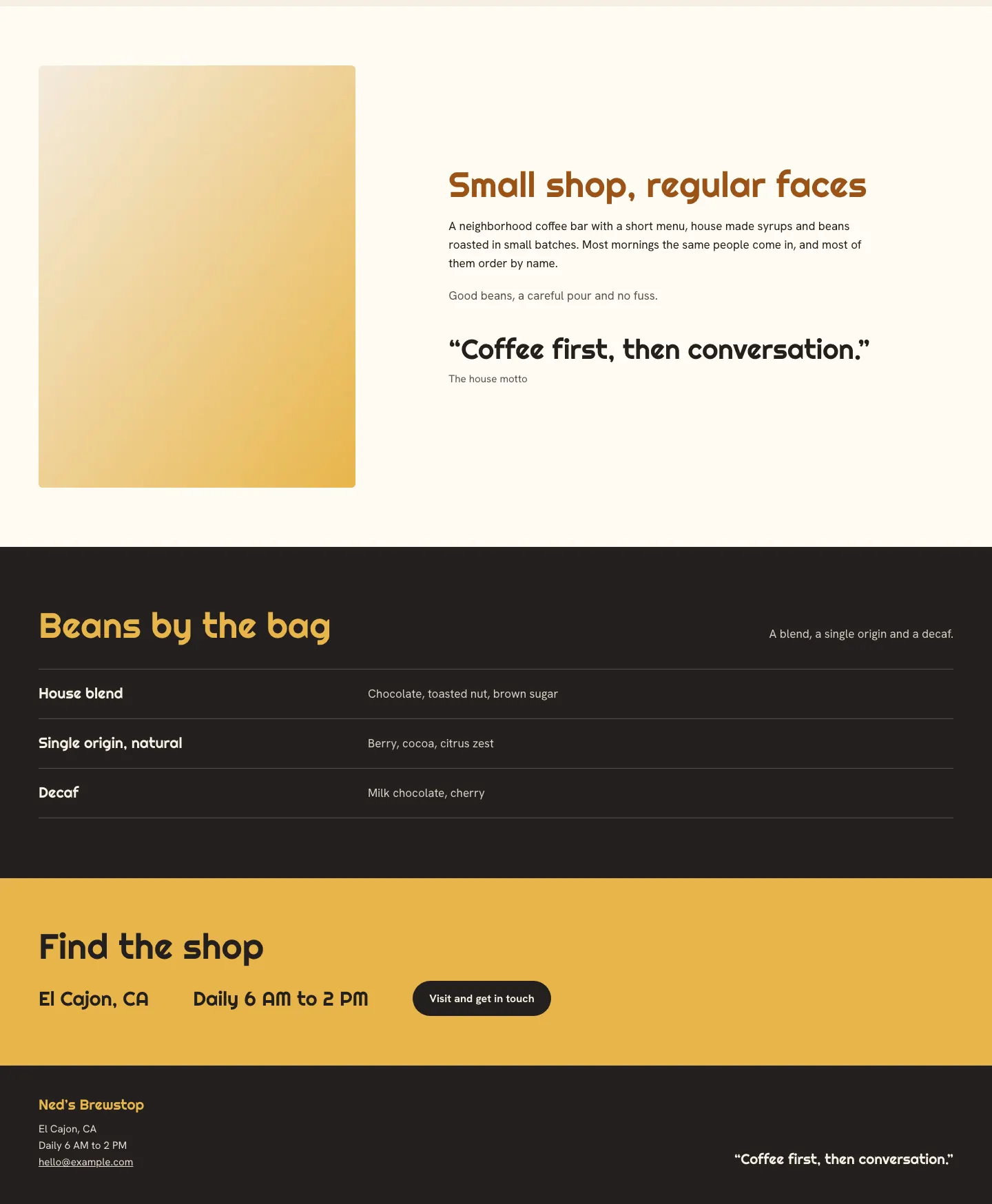
- Righteous, with its rounded sign painted feel, sets the headlines, wordmark and the names written on the tags, while Hanken Grotesk keeps the body copy and bean list easy to read.
- The palette is a maple brown, a honey yellow and a deep charcoal on warm cream, and each name tag takes one of those colors for its header band.
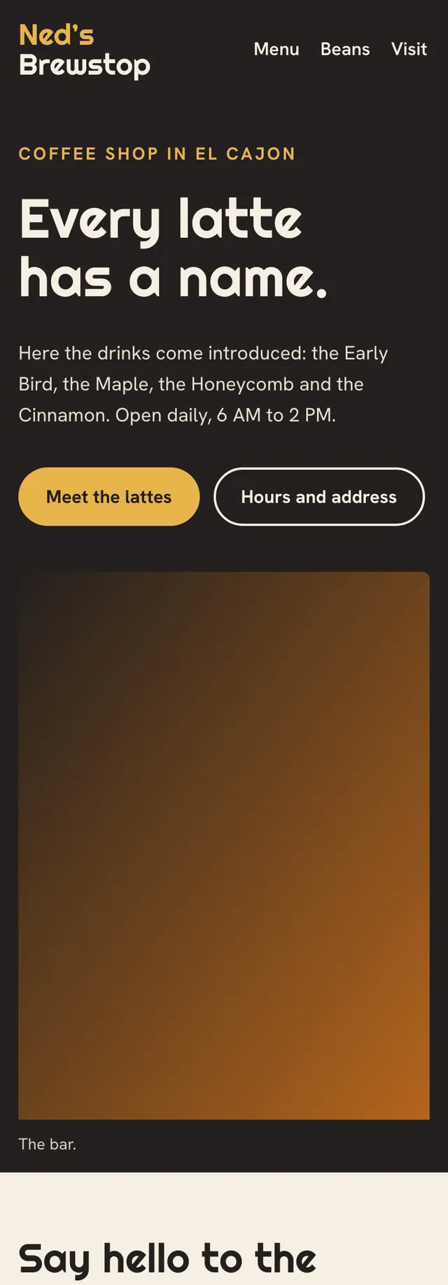
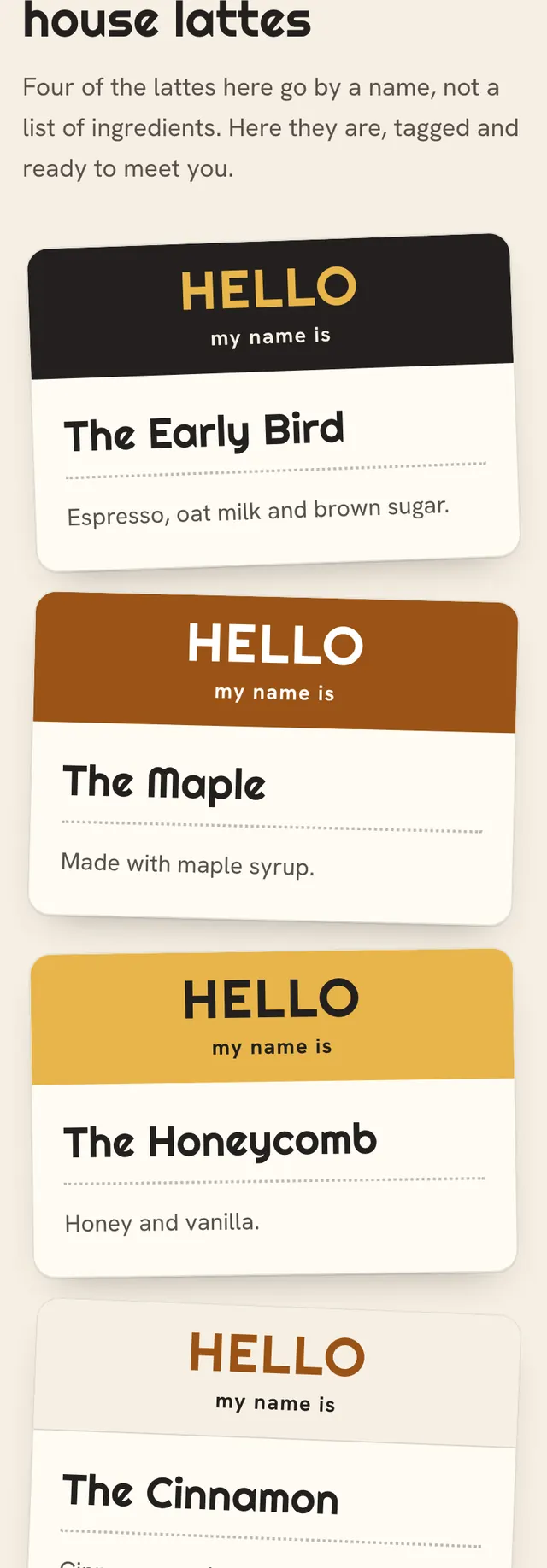
- The four tags sit at slightly different tilts and heights in a row on desktop and stack on phones, so the drinks read like name badges rather than a menu grid.
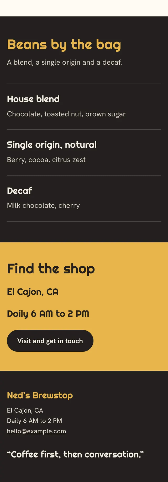
- The page alternates full bleed bands, from a charcoal split hero to a cream tag field, a paper story band with the photo on the left, a charcoal bean ledger set as a ruled list and a honey visit band.
Desktop and mobile