Design concepts · Coffee and cafes
Concept: Coffee shop, Chula Vista
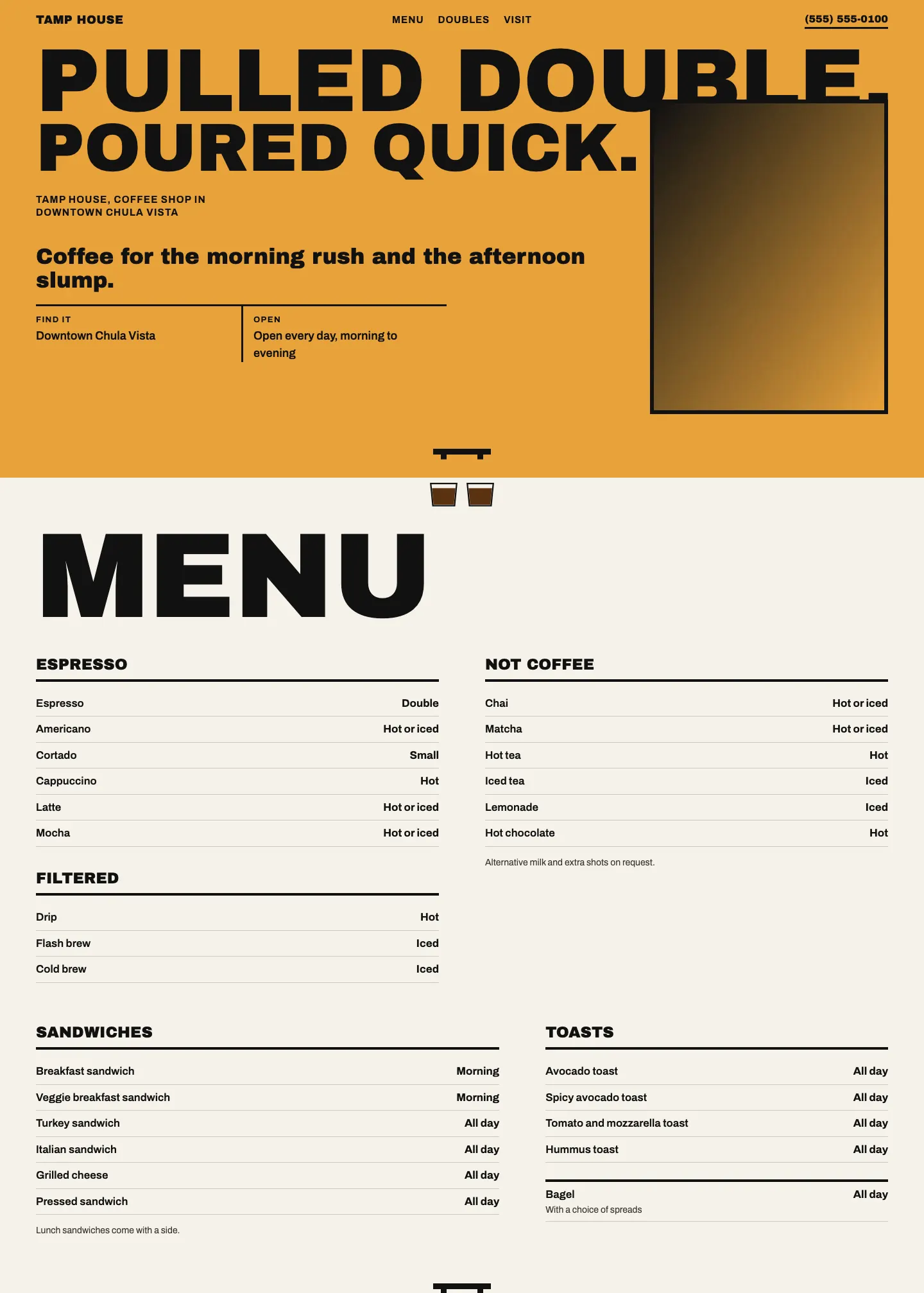
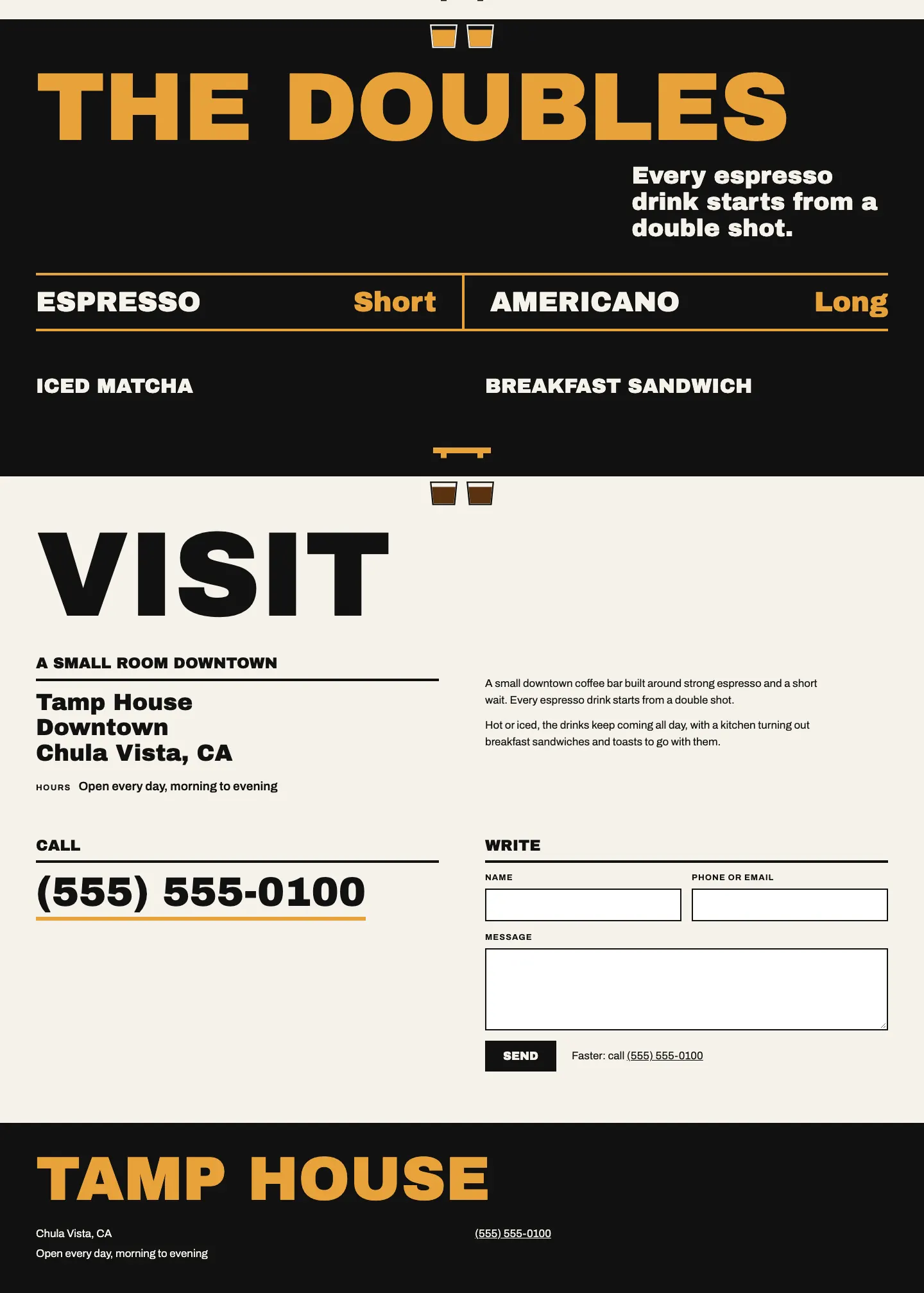
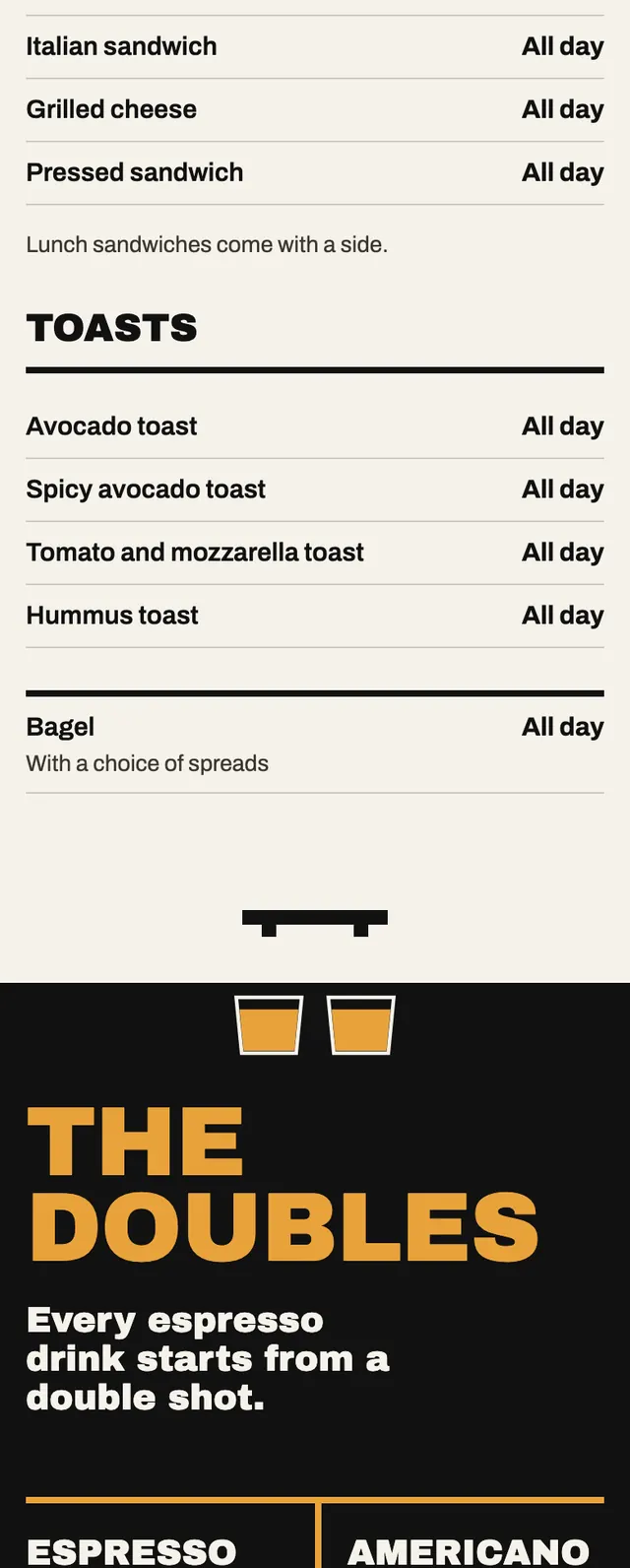
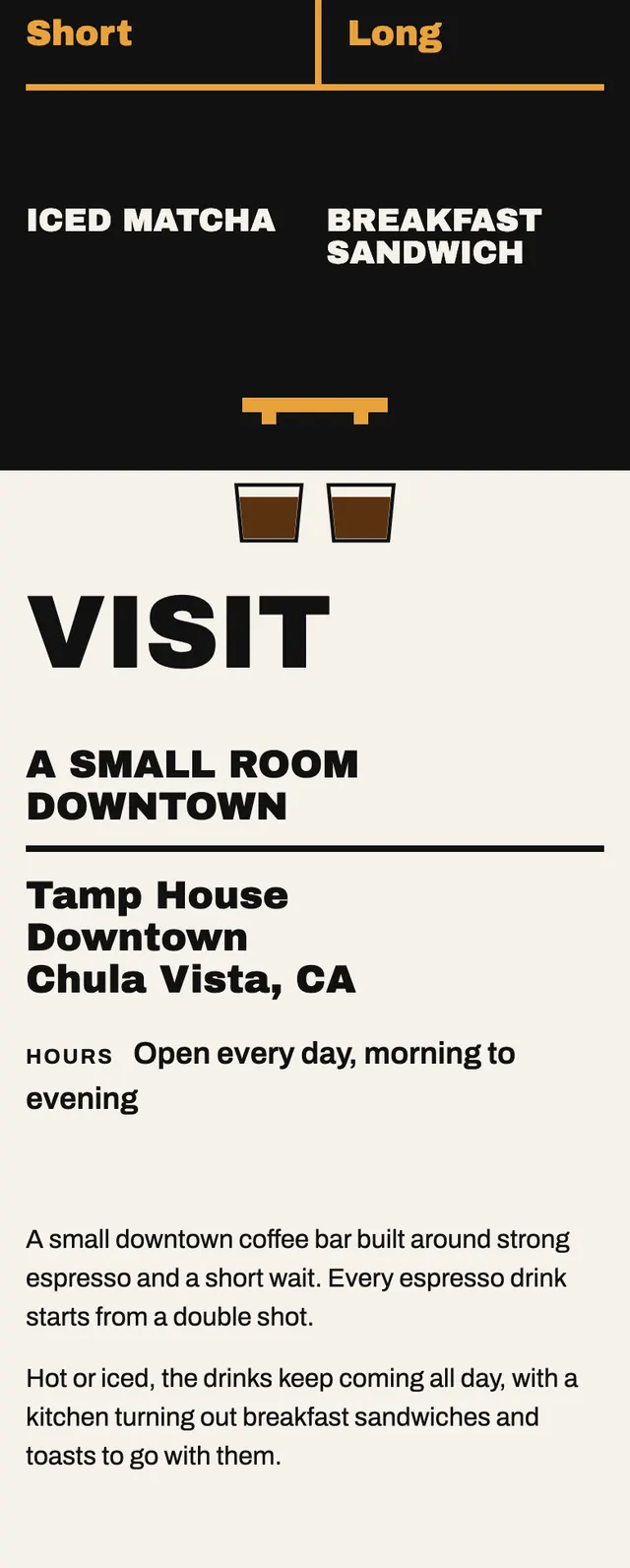
A loud, blunt coffee bar page built on pairs: a shouted two line headline, a menu in twin columns and a black section about double shots, with nothing on it trying to be gentle.
A design concept, not a client site. The name and every detail of the business it was drawn for have been replaced.
The design decisions
- Archivo Black does every shout, from the hero lines and giant flush left section names to the phone number, while plain Archivo carries the menu rows, labels and form.
- A crema gold ground, near black and an off white alternate section by section, and gold only ever appears on black or as a ground so it never sits as text on the light color.
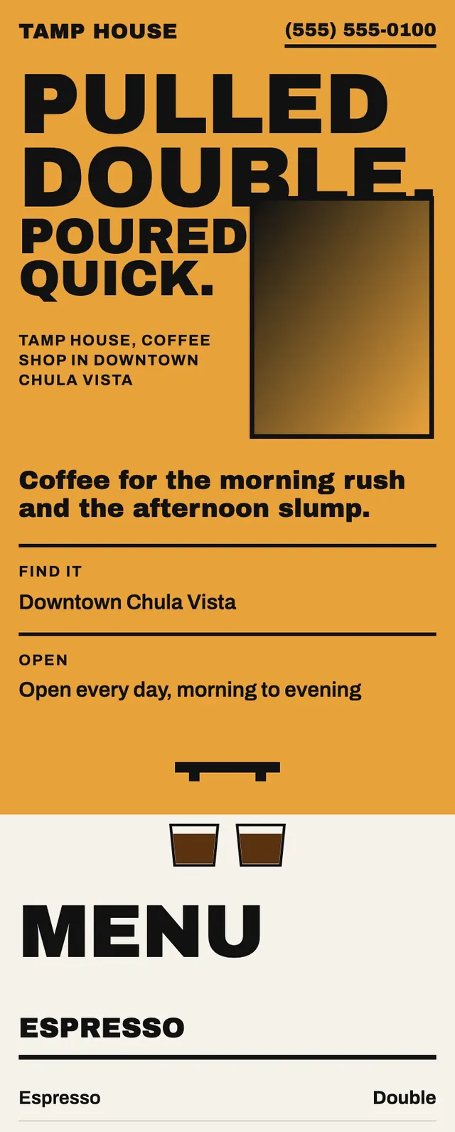
- The first hero line is sized to run gutter to gutter, and the photo frame cuts in from the right to bite the foot of that line while the second line is fitted to the room beside it; on phones the words stack and the frame bites the same way.
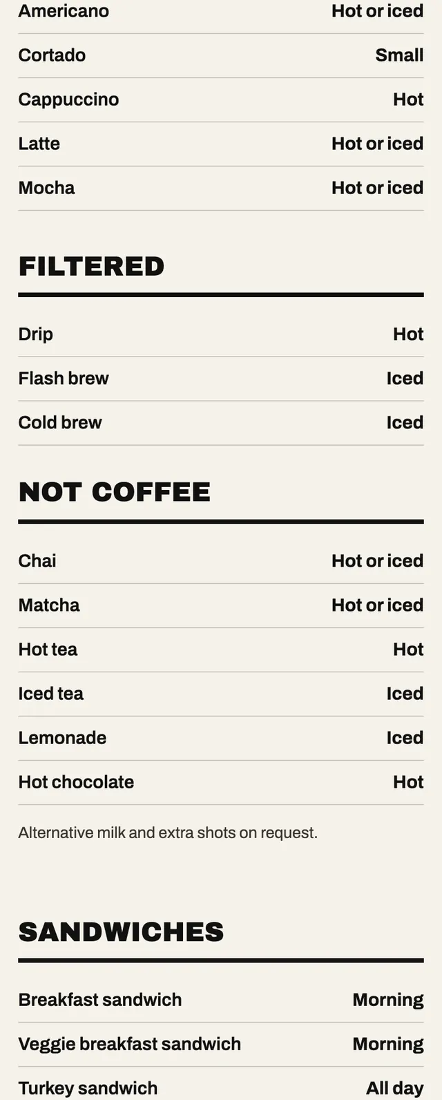
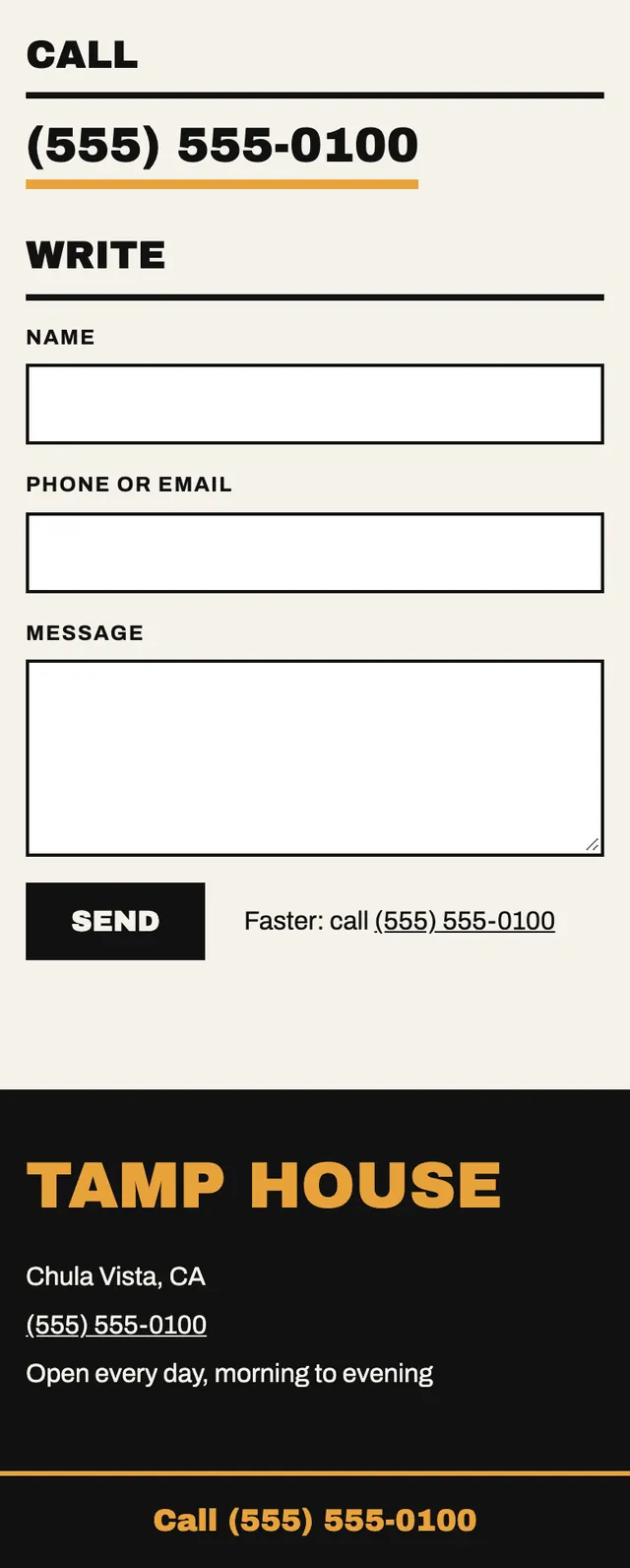
- A small drawn two cup espresso pull sits on the seam between every pair of sections, and on phones a pinned black call bar stays on screen for one tap calling.
Desktop and mobile