Design concepts · Coffee and cafes
Concept: Coffee roaster, San Diego
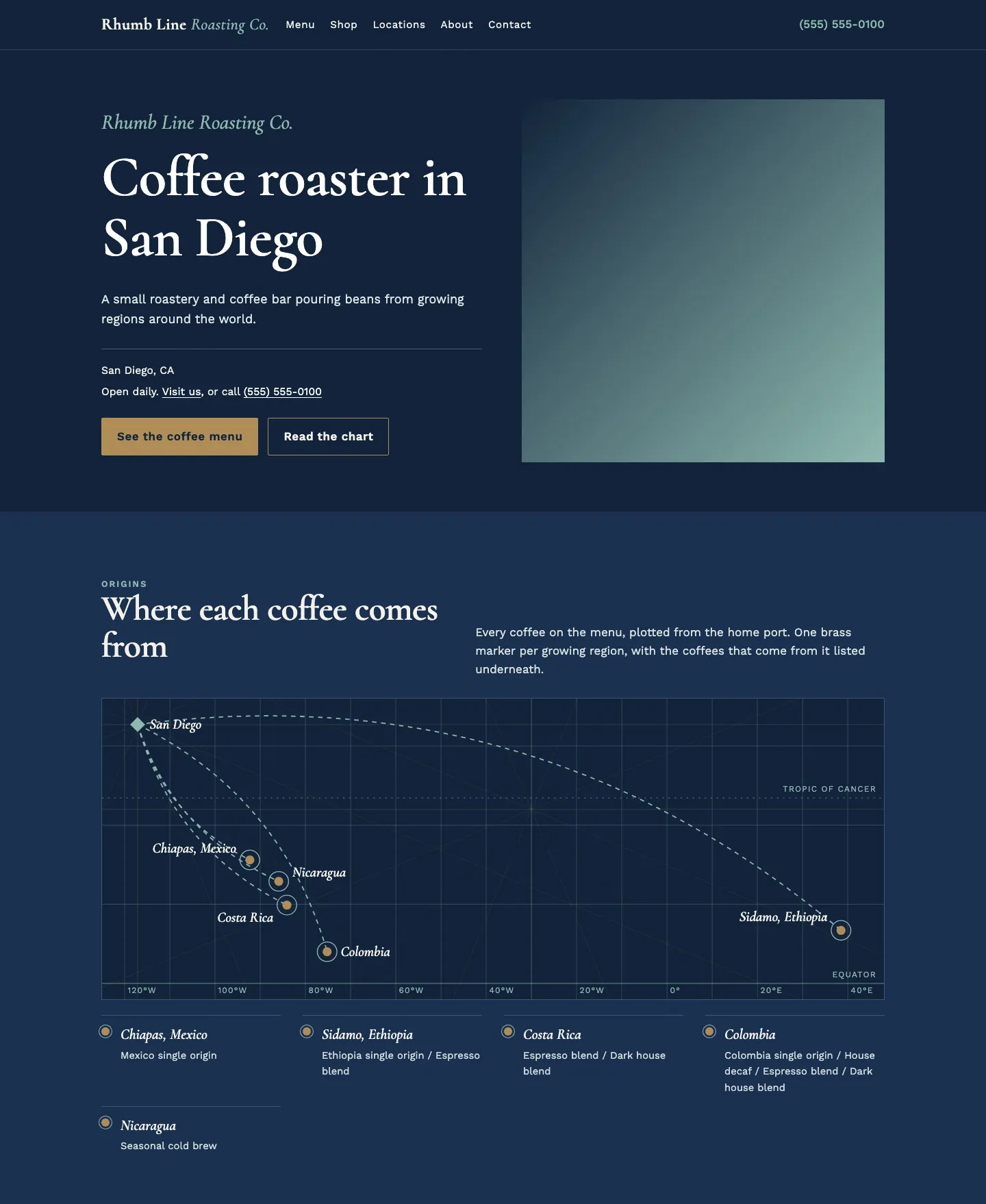
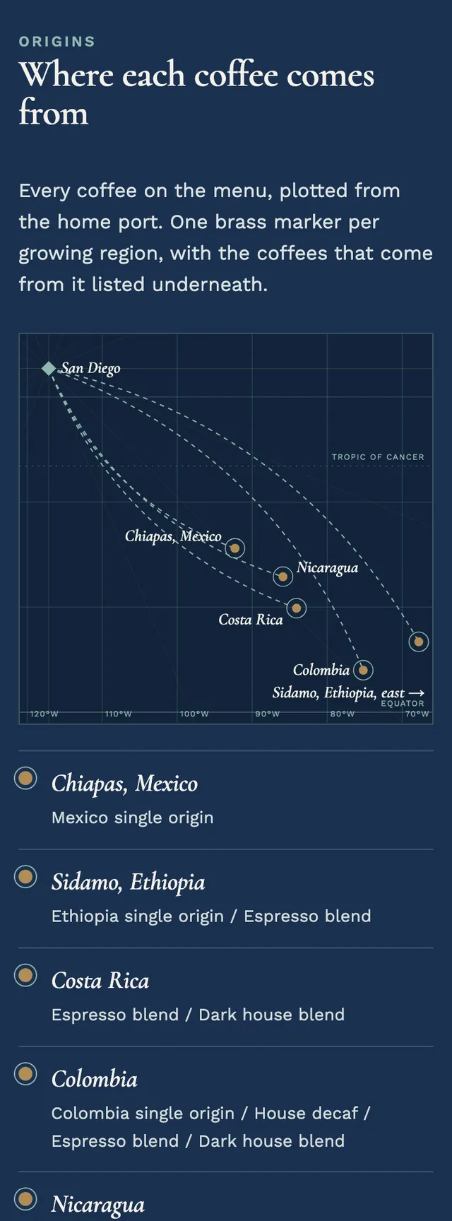
The roaster's coffee list is presented as a navigator's chart, with dashed courses running from the home port to every region the beans are grown in.
A design concept, not a client site. The name and every detail of the business it was drawn for have been replaced.
The design decisions
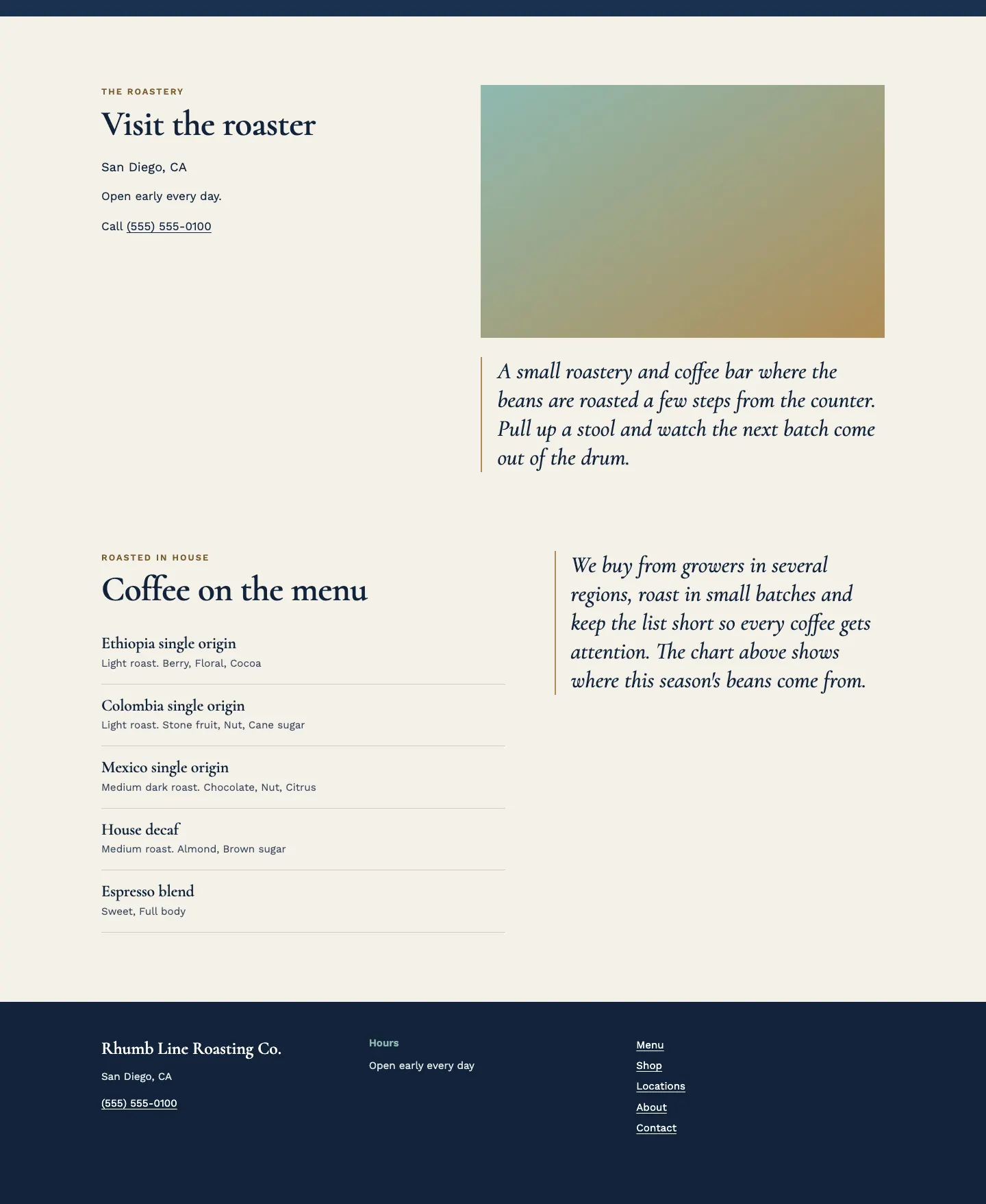
- Cormorant, with its italic used for chart labels and the tail of the wordmark, sets the engraved sea chart tone, while Work Sans keeps roast levels, tasting notes and contact lines plain.
- The palette is a deep navy sea for the hero and chart band, flat sea glass lines for the graticule and courses, brass for markers, rules and the primary button, and a warm chart paper ground for the reading sections.
- The signature is an chart with graticule lines, the Equator and Tropic of Cancer, rhumb lines from compass roses and one brass marker per origin, with a legend listing the coffees from each region and a separate narrower view for phones.
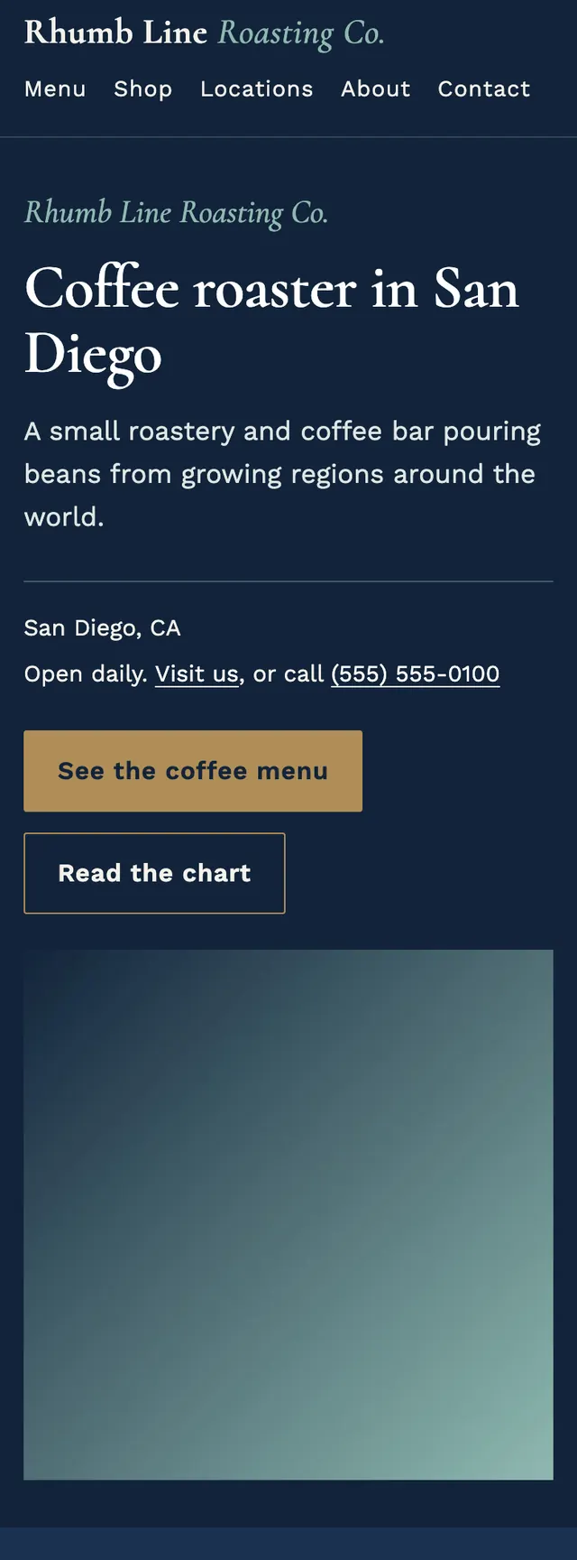
- Sections move from a split navy hero to the darker chart band to paper sections that alternate which side holds the text, and on phones a brass call bar docks to the bottom of the screen.
Desktop and mobile