Design concepts · Coffee and cafes
Concept: Coffee roaster, La Mesa
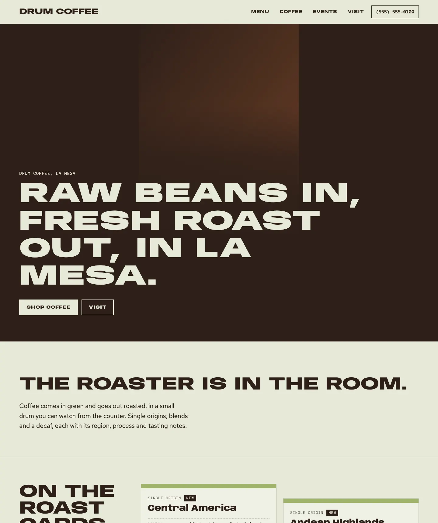
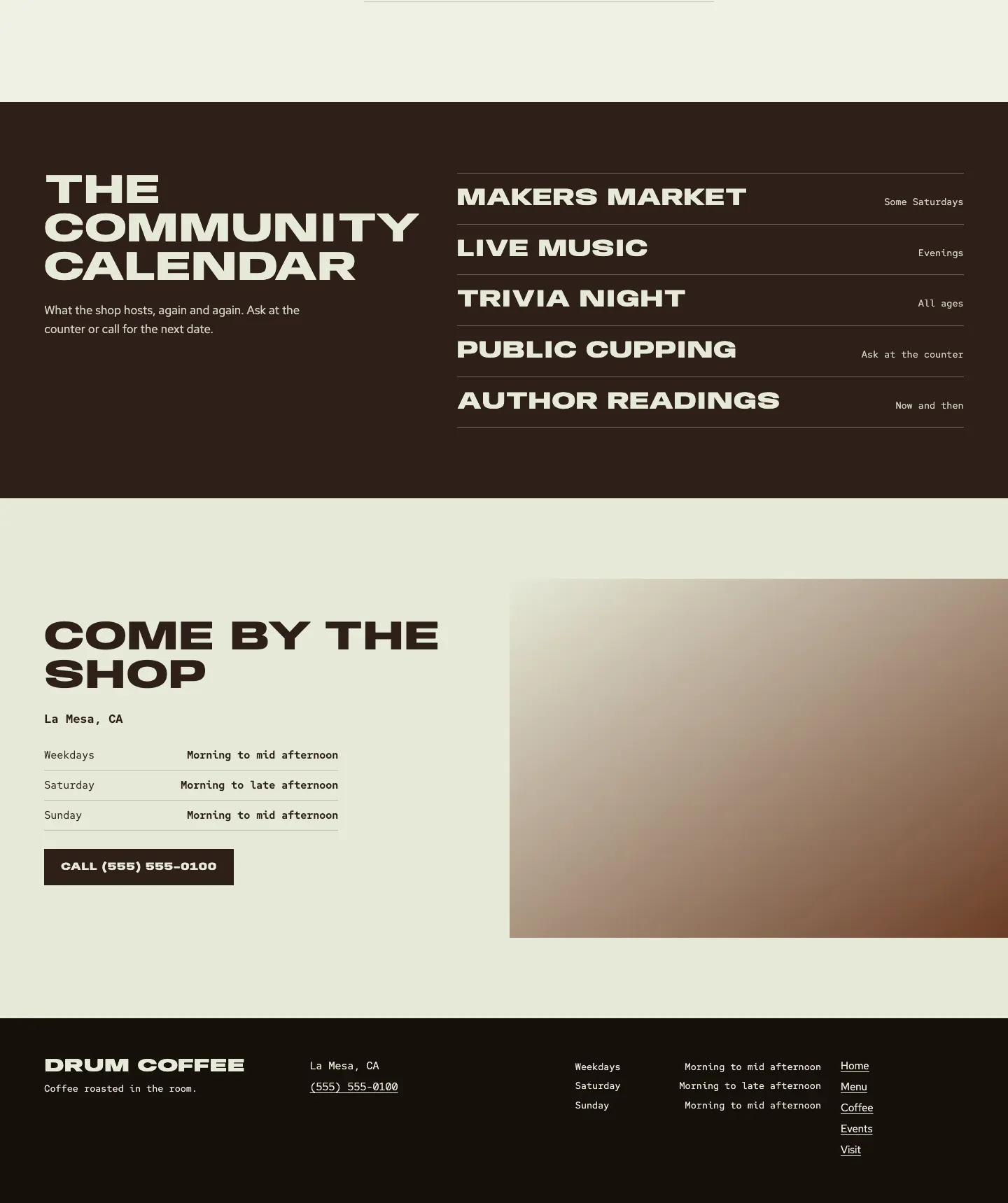
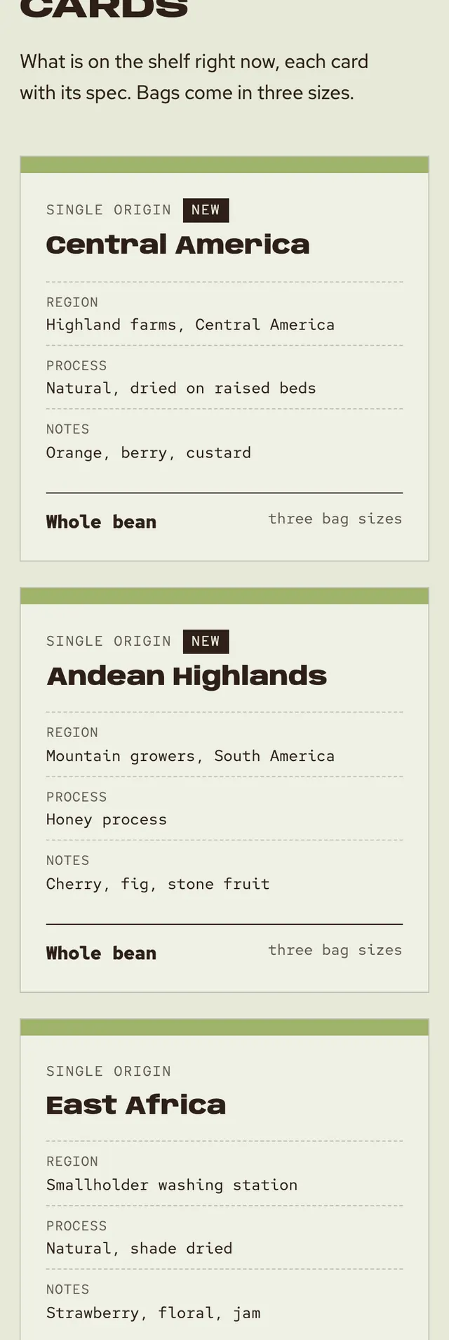
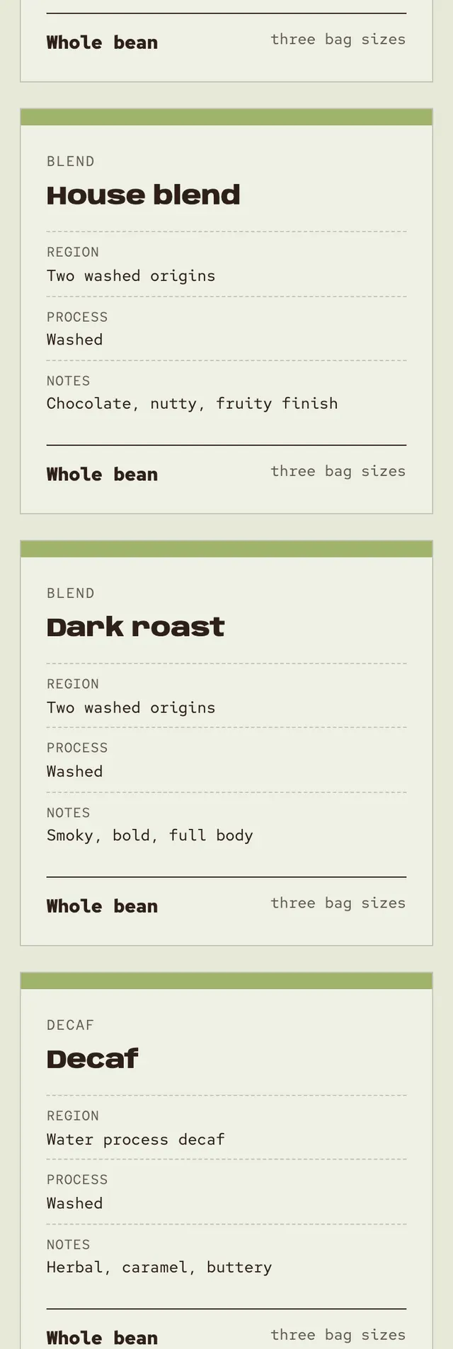
The page travels from green coffee to finished roast: the ground is the pale color of raw beans, the ink is the color of a dark roast, and only the spec cards carry the color between them.
A design concept, not a client site. The name and every detail of the business it was drawn for have been replaced.
The design decisions
- Anybody runs wide and heavy for headlines and condensed for small labels, with Red Hat Text for body copy and Red Hat Mono for specs and hours, like a roaster's log.
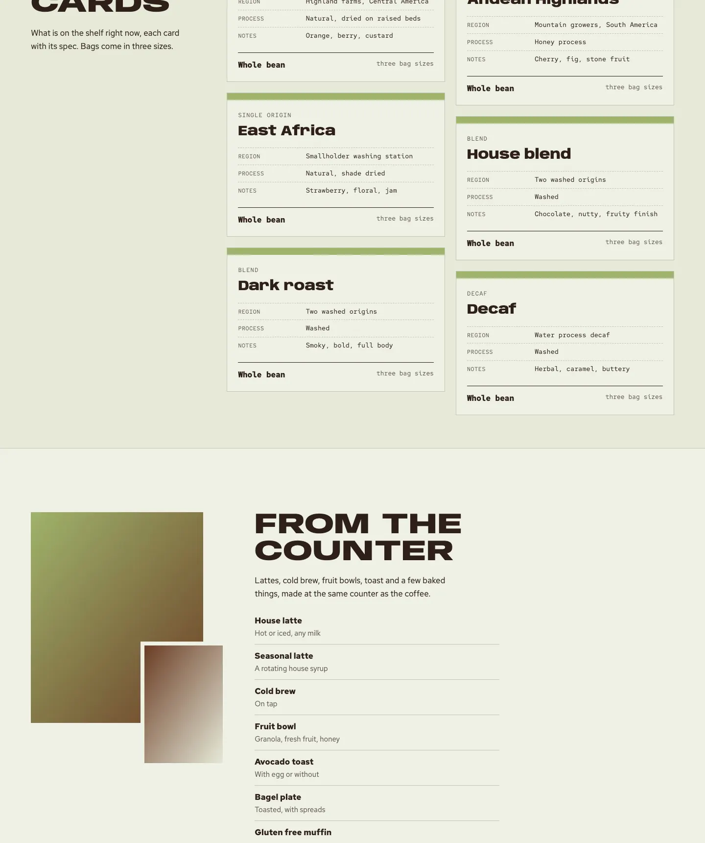
- The palette is a pale green bean ground and a deep roast brown ink, with a green to brown ramp reserved for the top edge of each roast card.
- The page maps each roast card's position in the viewport to a roast value, so the card's top edge shifts from green to brown as it scrolls up the screen.
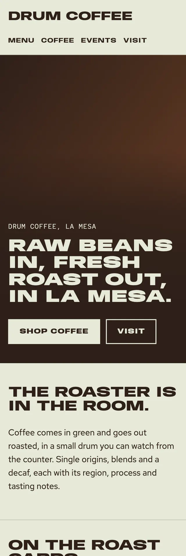
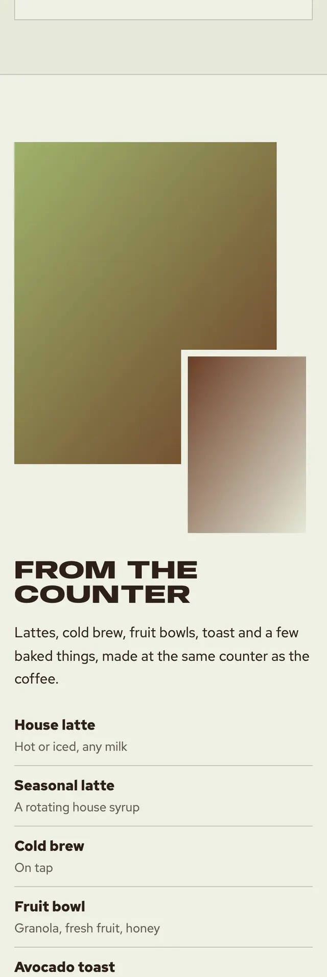
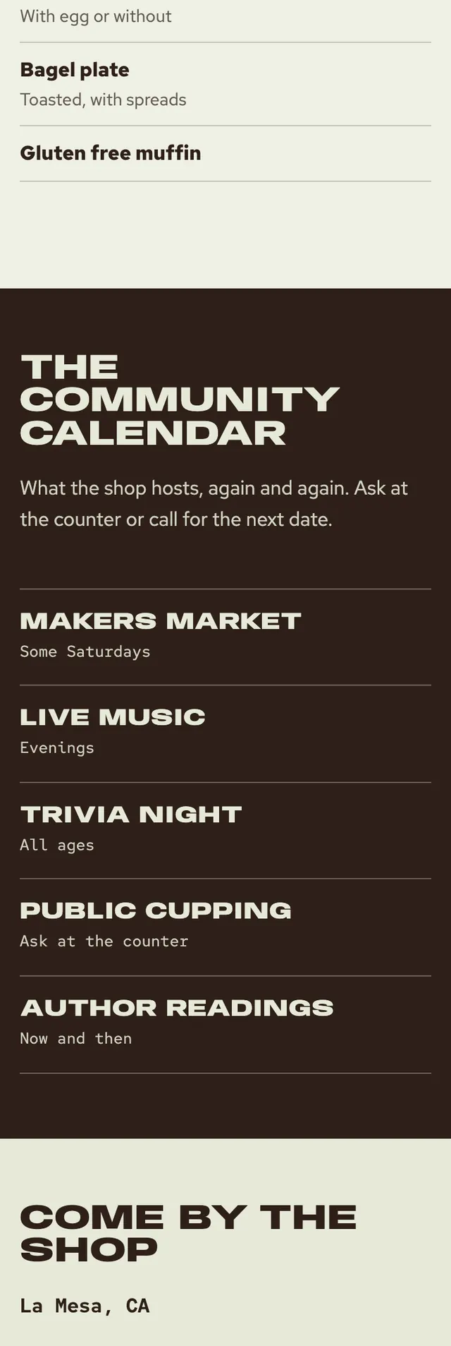
- Sections change width and alignment from a full bleed ink hero to a sticky headed card grid, an asymmetric photo and menu spread, an ink ledger of events and a visit strip, and on phones a call bar pins to the bottom.
Desktop and mobile