Design concepts · Health
Concept: Chiropractor, San Diego
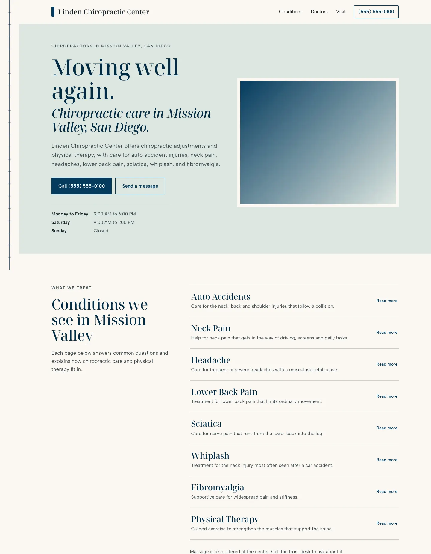
A chiropractic practice site built on one vertical alignment line in the left rail that starts as a gentle curve and straightens as the visitor scrolls, set in a calm, flat palette.
A design concept, not a client site. The name and every detail of the business it was drawn for have been replaced.
The design decisions
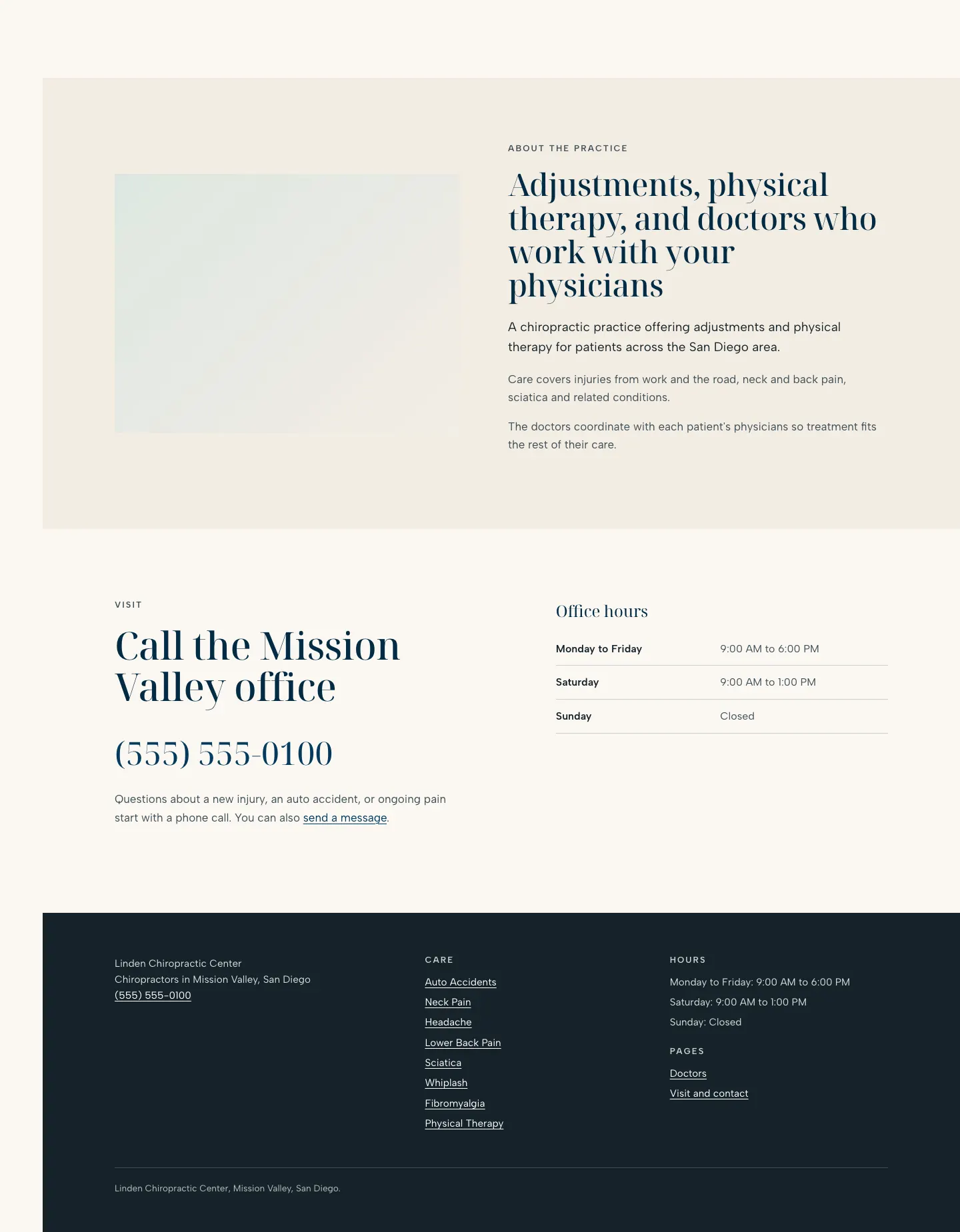
- Noto Serif Display carries the headings and the large phone number, with Albert Sans for body, navigation and labels, calm and clinical without feeling cold.
- The palette is flat sage for the hero, sand for the about band, a deep navy as the single accent for buttons, rules and the alignment line, on a warm paper page with no gradients.
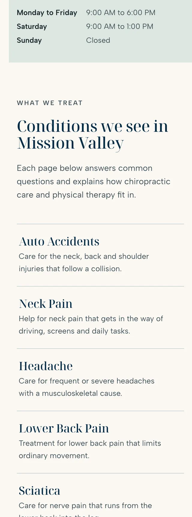
- The hero is an asymmetric split with the headline, call button and hours on the left and a framed photo on the right, and conditions run as an editorial index of ruled rows beside a sticky heading rather than cards.
- The visit section pairs a very large phone number with a ruled hours table, and on phones the call button pins to the bottom of the screen while the photo moves above the headline.
Desktop and mobile