Design concepts · Catering
Concept: Catering and logistics, San Diego
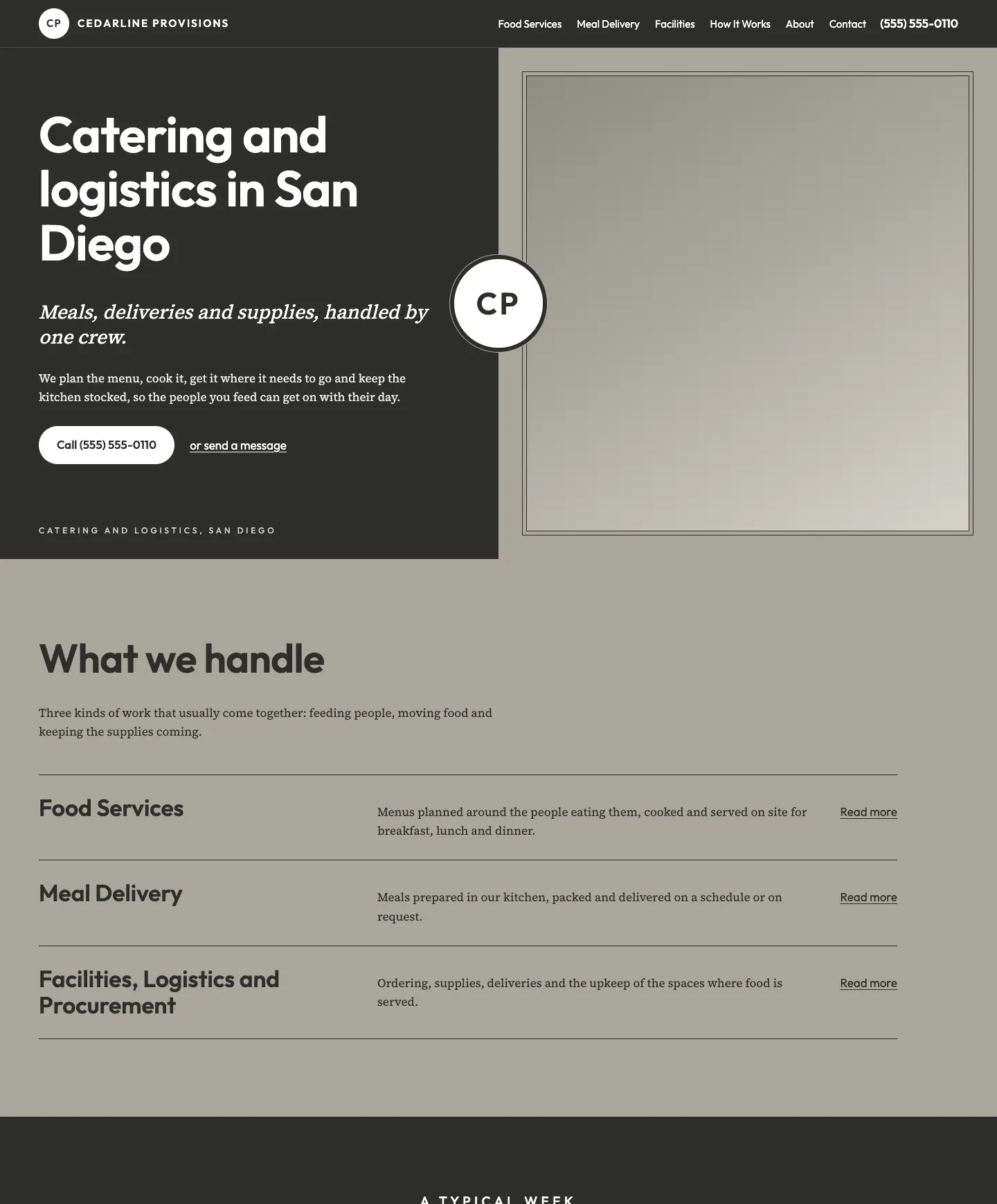
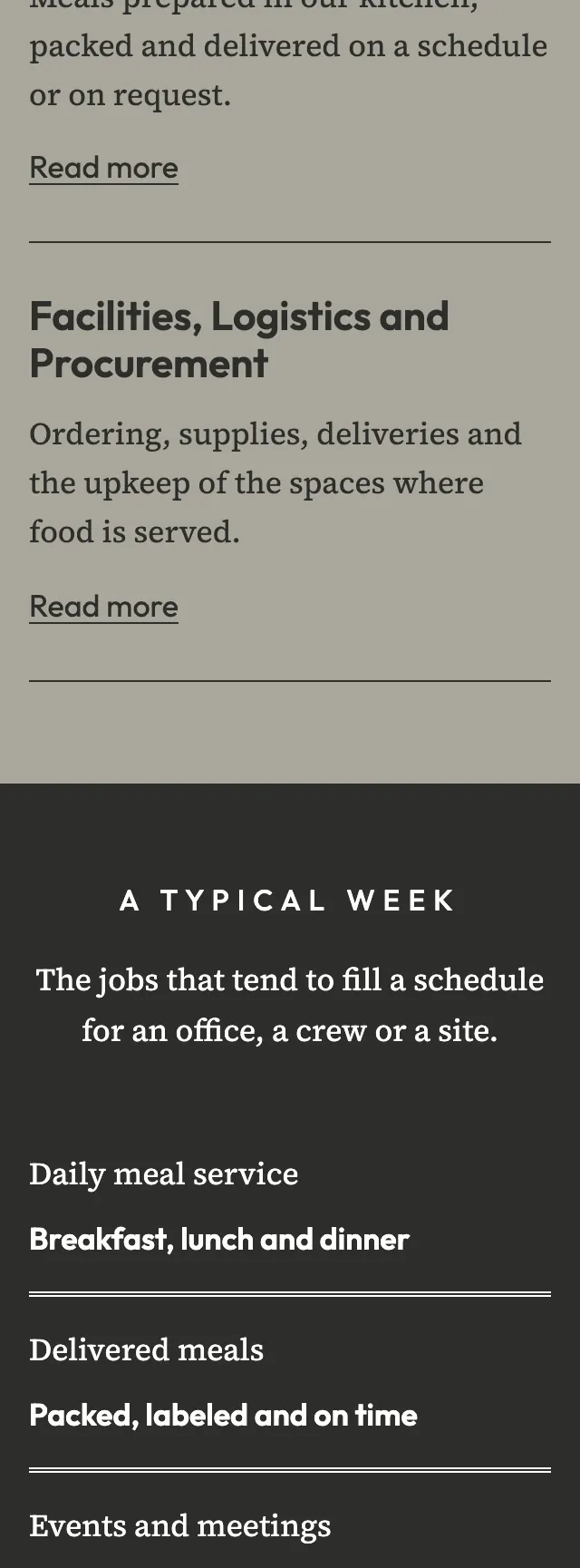
A catering and logistics site set like a clean proposal, opening on a half charcoal, half stone split with a round seal sitting on the seam between the two fields.
A design concept, not a client site. The name and every detail of the business it was drawn for have been replaced.
The design decisions
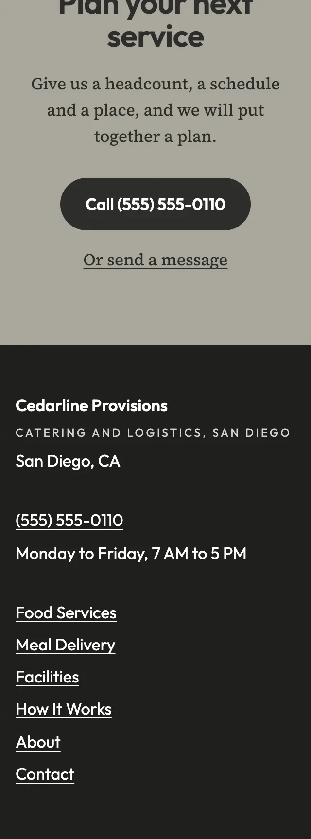
- Outfit, a geometric sans with wide tracked capitals for small labels, sets the headings, paired with Source Serif 4 for body text so the page reads like a written proposal.
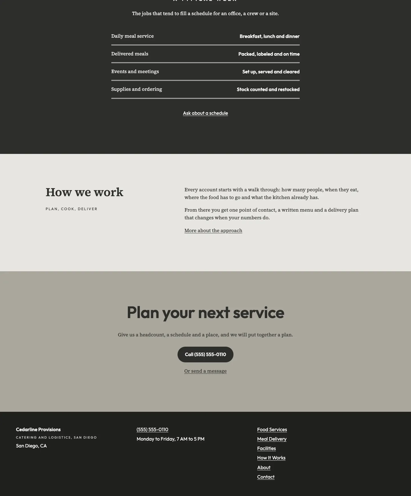
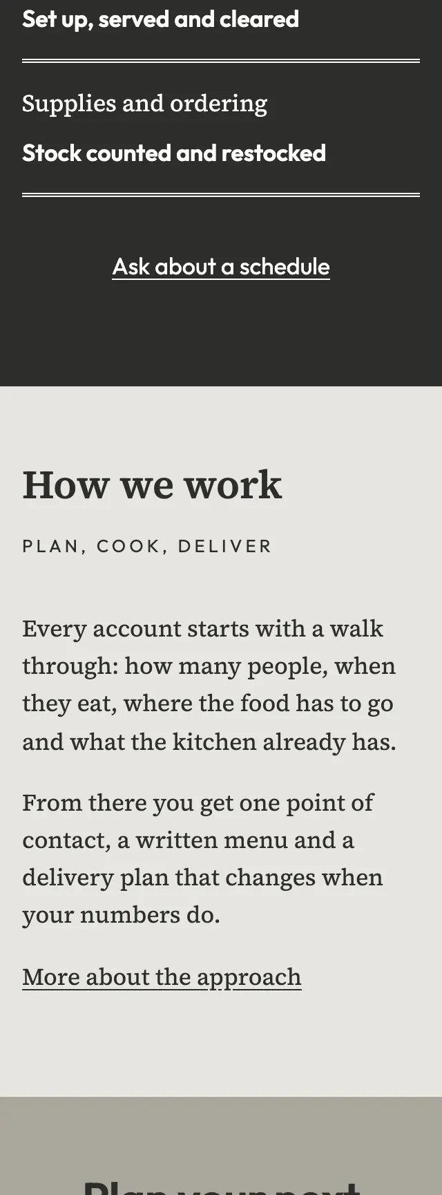
- The palette is charcoal for the hero field and the ledger band, a warm stone gray as the main ground, a pale chalk for one quiet section and white for the seal and text on charcoal.
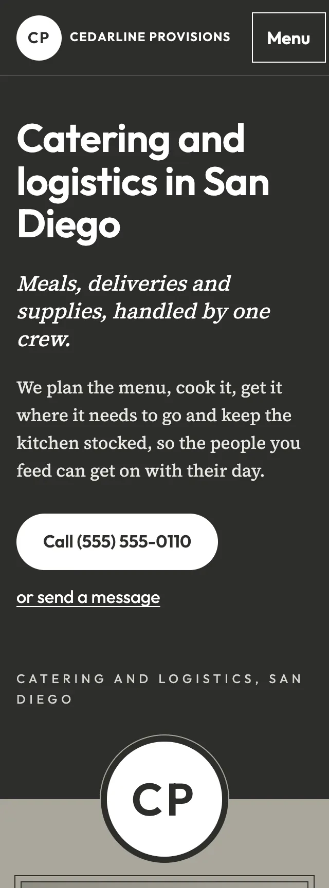
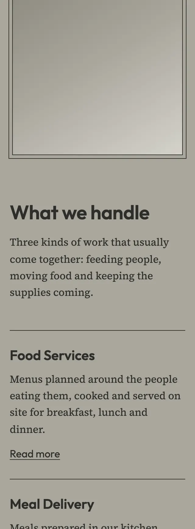
- The hero is a 50/50 split with the headline on charcoal and a photo slot in a double ruled frame, and a white double ring seal sits half in each field.
- A narrow centered ledger lists the week's work in two columns, each row closed by a double rule that echoes the two rings of the seal.
Desktop and mobile