Design concepts · Coffee and cafes
Concept: Cafe, Bonita
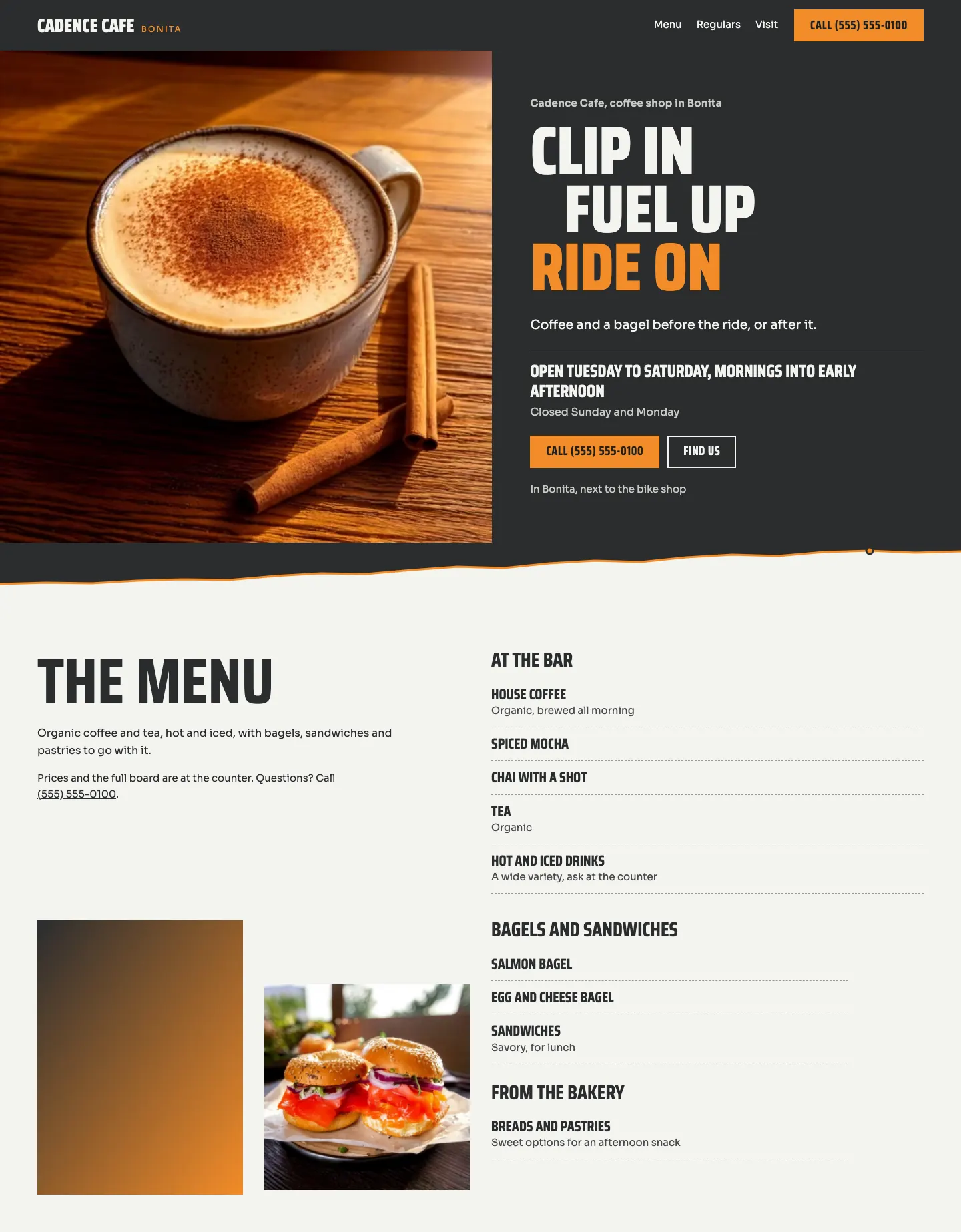
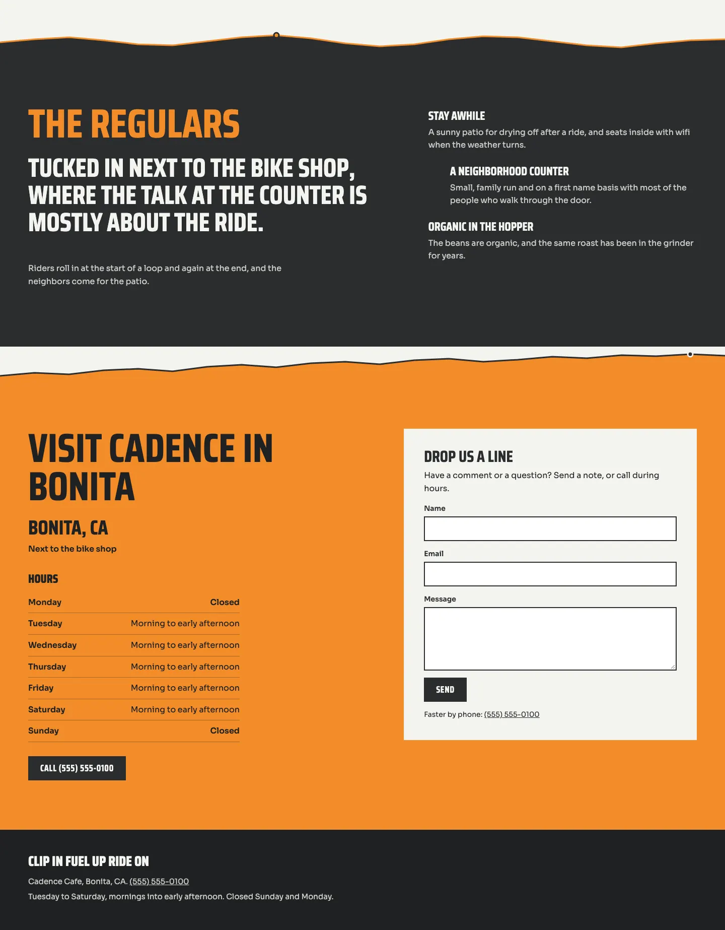
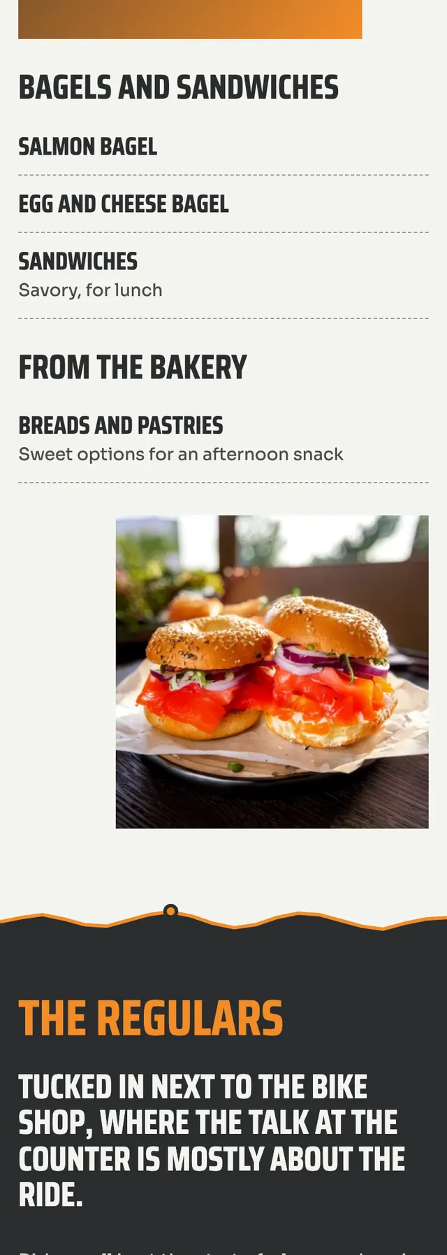
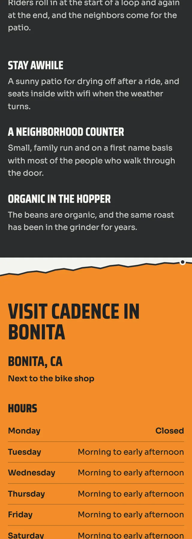
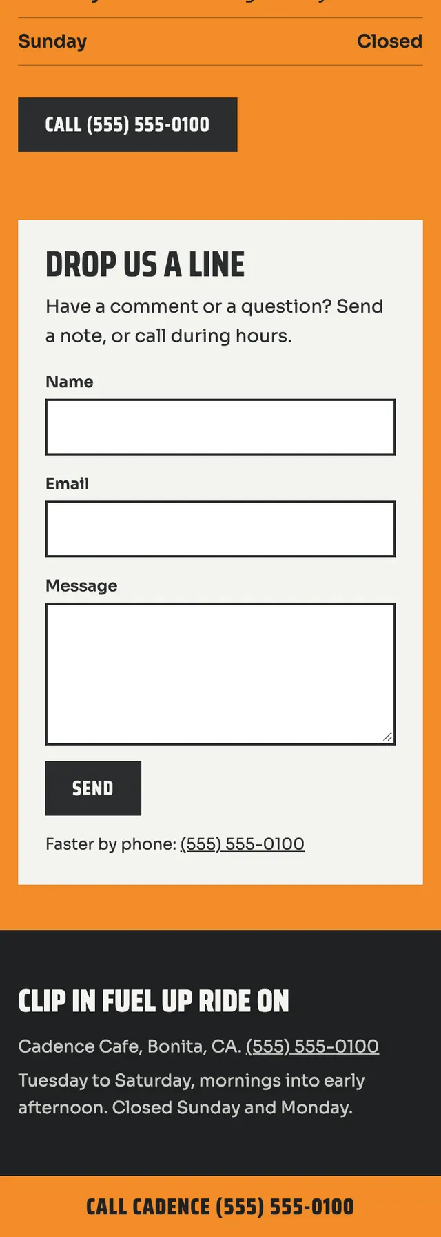
A neighborhood cafe that doubles as the cyclists' stop beside a bike shop, laid out so scrolling the page feels like riding one route, with road elevation profiles marking each break.
A design concept, not a client site. The name and every detail of the business it was drawn for have been replaced.
The design decisions
- Narrow uppercase Saira Condensed gives the headings a road sign and race number feel and lets a three line hero motto stack tall and staggered, with Sora for body text.
- The palette is asphalt grey and chalk white bands alternating like road surface and chalk marks, lit by a single sunrise orange used for the last hero line, buttons and the visit block.
- Every section break is a different elevation profile line (a climb, rollers, a switchback) drawn in orange with a dot on the summit, as a rider would read off a climb.
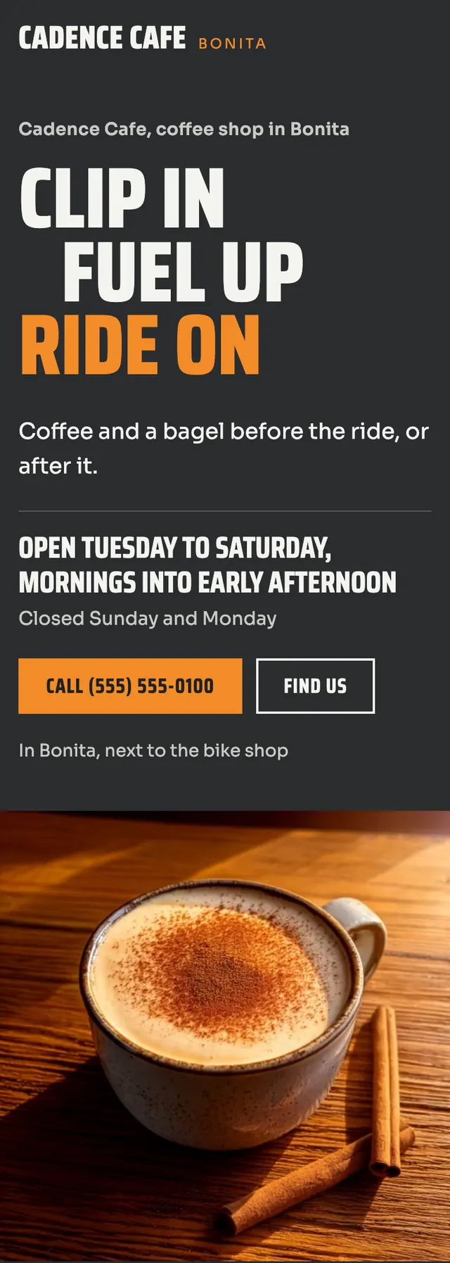
- The hero is a split: a square drink photo shown whole at its native ratio flush on the left, with the stacked motto, hours, call button and location on the right; on smaller screens it stacks with the copy first.
Desktop and mobile